cuuute! I like the simple/classic aesthetic you chose - especially the straw. I kinda wish the mouse would've wandered around the background (counter in the back/in a cabinet) to activate the entire space. otherwise, I think it's pretty darn cute.
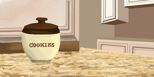
So cute! The cookie jar is really nicely rendered, and I love the textures you're playing with on the counter top, though, it looks a bit too 3D for being a flat counter. Make sure to give the milk a shadow, and maybe some kind of shine on the counter to show its flat smoothness.
OHMYGOD YES YOU CHOSE THE BEST STORY. THE BEST. YOU WIN.
I adore this. I love the texture for the counter - you can instantly read it as a kitchen counter. Great! I think the perspective on your objects don't quite mix - the cup is different from the jar, is different from the part in the back. Also, that is a very small cookie jar in comparison to that glass! And also they are not lined up properly! If the mouse can reach the straw while on the jar, either the straw has to go way back (which it usually wouldn't) or the glass should be next to the jar (which it isn't). This pictures is playing all sorts of visual tricks on me! Still, great job!
I love this story. I could tell what it was before I even saw the title. I like the bright happy look that you gave your scenes. One thing I wish I could see better was the cookie. It looks like it gets chopped off at the bottom of the picture. Maybe you could shrink the glass of milk a little so the mouse and cookie have more breathing room at the bottom.
BAWWW THIS IS SO CUTE. I love your illustrative style!
I like the way you handled the environment and lighting. I think it would be cool if the mouse was standing up and pawing at or holding the straw in the last image. I think it'd help add some familiarity and character to him since he's sitting pretty contained in all of the pictures. Very nice glass of milk! OuO
This, is aaabsolutely adorable. I'm really in love with how you colored the countertop. Actually, I just kind of love how you colored all of this. That mouse is so cute! The one thing that's bothering me is the cupboard in the far back- it seems oddly low/skewed compared to the rest of the perspective.
This looks really nice!! I love how you're using colors in the bkgrd that you're sharing with the counter and the cookie jar! I think the countertop texture is really nice, too! I love the way you've rendered the milk glass as well - really nice shines in the see through section of the milk glass! One thing I think could make it even stronger is if you were to add some reflective light - or a little bit of the counter color in the mouse and the milk! You know what i mean? just brush a little bit of that color as if the fur or the glass is reflecting some of the counter it's on! That might unify color even more in those pieces and make it all seem together! I think you did a great job leading from one piece to the next with how the elements come into the picture. One think that might be fun is if there were a couple more kitcheny elements in the shot that could add some personality to the space! Like - is it a grandma's kitchen? or a college age person's kitchen? Know what I mean? Maybe there are other things on the counter, like mapkin holders, or a dish towel, or whatever... Thsr might also be fun to look at and could bring in even more color! I think the last thing is that you could add a ittle bit of texture or shading to the back walls - the super flat ones - so that they look nice and renedered like the rest of your piece! Those are the only areas without texture, and everything else looks awesome! Thanks for being so upbeat and open to practicing all these crazy tools & programs this semester! It was so fun and I totally loved seeing all of the things you've made this semester! Have a super fun break!!! :) See you soon!!


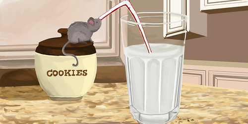
This is all kinds of adorable! I especially love the texture on the marble countertop and the glass of milk.
ReplyDeletecuuute! I like the simple/classic aesthetic you chose - especially the straw. I kinda wish the mouse would've wandered around the background (counter in the back/in a cabinet) to activate the entire space. otherwise, I think it's pretty darn cute.
ReplyDeleteSo cute! The cookie jar is really nicely rendered, and I love the textures you're playing with on the counter top, though, it looks a bit too 3D for being a flat counter. Make sure to give the milk a shadow, and maybe some kind of shine on the counter to show its flat smoothness.
ReplyDeleteOHMYGOD YES YOU CHOSE THE BEST STORY. THE BEST. YOU WIN.
ReplyDeleteI adore this. I love the texture for the counter - you can instantly read it as a kitchen counter. Great! I think the perspective on your objects don't quite mix - the cup is different from the jar, is different from the part in the back. Also, that is a very small cookie jar in comparison to that glass! And also they are not lined up properly! If the mouse can reach the straw while on the jar, either the straw has to go way back (which it usually wouldn't) or the glass should be next to the jar (which it isn't). This pictures is playing all sorts of visual tricks on me! Still, great job!
I love the way you used painter. the textures and lighting is really nice. I like how you got some depth in there with the kitchen in the background.
ReplyDeleteThe extra crumbs on the counter is super nice. also the type on the cookie container is nicely done.
The only thing I would look at is the texture in the countertop it is a little too much. Maybe flatten it out a bit.
Over all super sweet!
I love this story. I could tell what it was before I even saw the title. I like the bright happy look that you gave your scenes. One thing I wish I could see better was the cookie. It looks like it gets chopped off at the bottom of the picture. Maybe you could shrink the glass of milk a little so the mouse and cookie have more breathing room at the bottom.
ReplyDeleteBAWWW THIS IS SO CUTE. I love your illustrative style!
ReplyDeleteI like the way you handled the environment and lighting. I think it would be cool if the mouse was standing up and pawing at or holding the straw in the last image. I think it'd help add some familiarity and character to him since he's sitting pretty contained in all of the pictures.
Very nice glass of milk! OuO
so cute, I like the texture you have for the table, and the cup looks super cool. nice details and background
ReplyDeleteThis, is aaabsolutely adorable. I'm really in love with how you colored the countertop. Actually, I just kind of love how you colored all of this. That mouse is so cute! The one thing that's bothering me is the cupboard in the far back- it seems oddly low/skewed compared to the rest of the perspective.
ReplyDeleteThis looks really nice!! I love how you're using colors in the bkgrd that you're sharing with the counter and the cookie jar! I think the countertop texture is really nice, too! I love the way you've rendered the milk glass as well - really nice shines in the see through section of the milk glass! One thing I think could make it even stronger is if you were to add some reflective light - or a little bit of the counter color in the mouse and the milk! You know what i mean? just brush a little bit of that color as if the fur or the glass is reflecting some of the counter it's on! That might unify color even more in those pieces and make it all seem together! I think you did a great job leading from one piece to the next with how the elements come into the picture. One think that might be fun is if there were a couple more kitcheny elements in the shot that could add some personality to the space! Like - is it a grandma's kitchen? or a college age person's kitchen? Know what I mean? Maybe there are other things on the counter, like mapkin holders, or a dish towel, or whatever... Thsr might also be fun to look at and could bring in even more color! I think the last thing is that you could add a ittle bit of texture or shading to the back walls - the super flat ones - so that they look nice and renedered like the rest of your piece! Those are the only areas without texture, and everything else looks awesome! Thanks for being so upbeat and open to practicing all these crazy tools & programs this semester! It was so fun and I totally loved seeing all of the things you've made this semester! Have a super fun break!!! :) See you soon!!
ReplyDelete