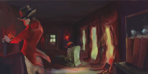
OHMAHGAH, the colors in this are so wonderful. I love the greens and yellows from outside and the reds and purples on the inside. The body of the red guy from the 2nd scene is a bit difficult for me to understand... maybe the lighting on his back needs to be changed a bit. Nicely done! :)
Oh Im guessing this story didn't end well... But it looks very nice. As always I love the colors you used. The composition is interesting to look at. It seems like there is a bit going on.
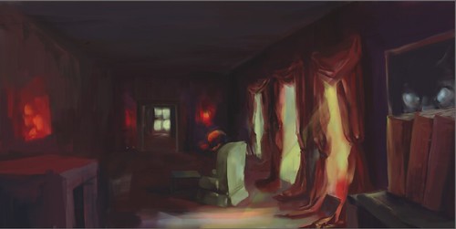
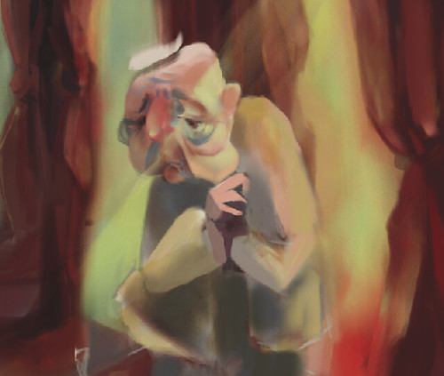
That old man is so cute. love the depth in the image.
You always have a great understanding of color. The color in this piece is one of my favorite parts. I can clearly see the succession of scenes. Great work.
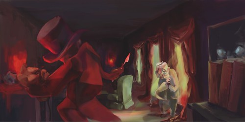
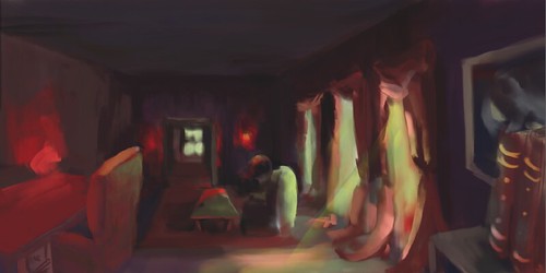
Did he just kill the poor lil kitty?? aww sad.... but great style. I love the interrior. The creepy curtains really make the scene. I also like how you used the burgundy color to add shadow to the space. One thing that sticks out a little is the creepy guy. His clothes look a little too boxy for the rest of the background.
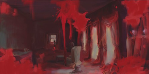
This is really great! Your painting skills are AWESOME! I think the last image, however, needs some work because it took me a while to realize that the floating blood bits were meant to look like they were on the camera! I recommend looking at some first person shooters or horror video games for examples of how to do this better!
Very nice! I wish you had more of the story so I could understand it better since I haven't been able to read that one, but nice set up, lots of progress from when I saw the sketch of this! 8D
I really like how you did the drapes, they keep catching my eye. And the lighting is very strong.
I'm pretty confused by the 3rd image, but I'm sure a story summary would clear it up. Really nice work! I love the space depth!
I really love how this turned out. The character design, the colors, the depth, the lighting, it's all really lovely! I'm not quite sure what the left figure in the second scene is doing though- I'm not sure if he's holding something, or if it's his hand. It doesn't look good, whatever it is! I'm also not quite sure what's happening between scene two and three. It definitely looks unpleasant, like there's been a massacre, but I'm not quite sure who's been violently assaulting who.
it is super cool and crazy, I think I told you so many times that whatever you do I can tell what it is yours! I like your color choice as always, and really love the way you play with all different tools and .....
I love the way you set up the environment - its really nice and deep! I love that you can see through to the next room, and it's as if we are looking in through the side of the room, over the shoulder of the guy holding the cat, or behind the desk or something. Love the lights steaming in, I could see you maybe pushing the color of the light on some of the furniture pieces more, too! That would be really nice and dramatic! I think you might also be able ot make the room just a tad lighter - you have so much great detail in the bsckground, that some of it gets a little lost in the shadows! I think you would probably be able to even take it into photoshop and lighten it up with levels, maybe? I think there is also something in painter that allows you to adjust lighting and levels -- I'll have to look for it and let you know where it is! i think maybe it's under lighting controls?? I love the way you've used color in this piece - that's somethign you're great at!! as always! I love that you close a palette that creates this dark, ominous mood! For the last scene, I think it would be cool to see how you could show the blood on some of hte objects even more ,and maybe make the splatters in the front a litltle more subtle? So it looks less like the blood got splattered on the camera, but would also be splattered on the environment. Overall this is nice! it's too bad you didn't post the story! I would have loved to see how the pacing of the story went in relation to your work! I think the first two scenes area easy to read together -- i know where they're headed - the last one I get, but I think maybe if you could see some more clues to what happened to the red guy? Or some other things in the environment that could clue you in to how it all went down, that would be great! It's hard to tell if the blood is from the cats? or from the red guy or both! Thanks for everything this semester! You are a lot of fun to have in the class and chatting with you about cats, Adam, and all sorts of other stuff! It always makes my day!! Hope you're going to have an amazing break! Eat all the holiday food and do ALL the relaxing!! :)


The textures in this piece are SO much fun to look at! Great use of color as well!
ReplyDeleteOHMAHGAH, the colors in this are so wonderful. I love the greens and yellows from outside and the reds and purples on the inside. The body of the red guy from the 2nd scene is a bit difficult for me to understand... maybe the lighting on his back needs to be changed a bit. Nicely done! :)
ReplyDeleteOh Im guessing this story didn't end well... But it looks very nice. As always I love the colors you used. The composition is interesting to look at. It seems like there is a bit going on.
ReplyDeleteThat old man is so cute. love the depth in the image.
You always have a great understanding of color. The color in this piece is one of my favorite parts. I can clearly see the succession of scenes. Great work.
ReplyDeleteDid he just kill the poor lil kitty?? aww sad.... but great style. I love the interrior. The creepy curtains really make the scene. I also like how you used the burgundy color to add shadow to the space. One thing that sticks out a little is the creepy guy. His clothes look a little too boxy for the rest of the background.
ReplyDeletei love this! i love the colors you use when you paint! the story is creepy and dark but i like it! good job zoya!
ReplyDeleteThis is really great! Your painting skills are AWESOME! I think the last image, however, needs some work because it took me a while to realize that the floating blood bits were meant to look like they were on the camera! I recommend looking at some first person shooters or horror video games for examples of how to do this better!
ReplyDeleteVery nice! I wish you had more of the story so I could understand it better since I haven't been able to read that one, but nice set up, lots of progress from when I saw the sketch of this! 8D
ReplyDeleteI really like how you did the drapes, they keep catching my eye. And the lighting is very strong.
I'm pretty confused by the 3rd image, but I'm sure a story summary would clear it up. Really nice work! I love the space depth!
I really love how this turned out. The character design, the colors, the depth, the lighting, it's all really lovely! I'm not quite sure what the left figure in the second scene is doing though- I'm not sure if he's holding something, or if it's his hand. It doesn't look good, whatever it is! I'm also not quite sure what's happening between scene two and three. It definitely looks unpleasant, like there's been a massacre, but I'm not quite sure who's been violently assaulting who.
ReplyDeleteit is super cool and crazy, I think I told you so many times that whatever you do I can tell what it is yours! I like your color choice as always, and really love the way you play with all different tools and .....
ReplyDeleteI love the way you set up the environment - its really nice and deep! I love that you can see through to the next room, and it's as if we are looking in through the side of the room, over the shoulder of the guy holding the cat, or behind the desk or something. Love the lights steaming in, I could see you maybe pushing the color of the light on some of the furniture pieces more, too! That would be really nice and dramatic! I think you might also be able ot make the room just a tad lighter - you have so much great detail in the bsckground, that some of it gets a little lost in the shadows! I think you would probably be able to even take it into photoshop and lighten it up with levels, maybe? I think there is also something in painter that allows you to adjust lighting and levels -- I'll have to look for it and let you know where it is! i think maybe it's under lighting controls?? I love the way you've used color in this piece - that's somethign you're great at!! as always! I love that you close a palette that creates this dark, ominous mood! For the last scene, I think it would be cool to see how you could show the blood on some of hte objects even more ,and maybe make the splatters in the front a litltle more subtle? So it looks less like the blood got splattered on the camera, but would also be splattered on the environment. Overall this is nice! it's too bad you didn't post the story! I would have loved to see how the pacing of the story went in relation to your work! I think the first two scenes area easy to read together -- i know where they're headed - the last one I get, but I think maybe if you could see some more clues to what happened to the red guy? Or some other things in the environment that could clue you in to how it all went down, that would be great! It's hard to tell if the blood is from the cats? or from the red guy or both! Thanks for everything this semester! You are a lot of fun to have in the class and chatting with you about cats, Adam, and all sorts of other stuff! It always makes my day!! Hope you're going to have an amazing break! Eat all the holiday food and do ALL the relaxing!! :)
ReplyDelete