I think this is /awesome/. I LOVE the colors in this, and I think they work really well together, and you balanced them nicely. I also love the way you incorporated textures and showed depth. Nice font choice, and the text on the bottom works well. Great great work.
the use of texture in this piece is done very well. very subtle tones make that red pop nicely. I appreciate the simplicity of the color palette as well as the design overall.
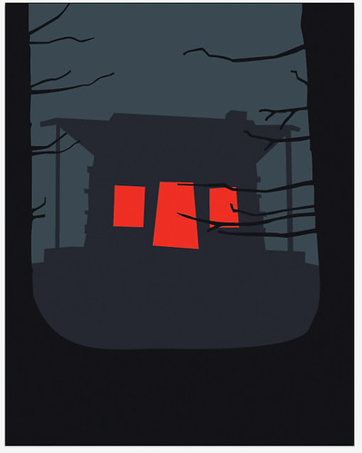
This is super eery and ominous and great! Definite horror movie vibe! The textures are well used and not overdone. I really enjoy the trees as a framing aspect! The imagery is simple, but effective.
The composition is very well planned out. I like your subtle use of texture It's just enough. The color palette is very creepy and I get an uneasy feeling with that transparent outline around the cabin. Very good use of Illustrator everything looks crisp. Well done.
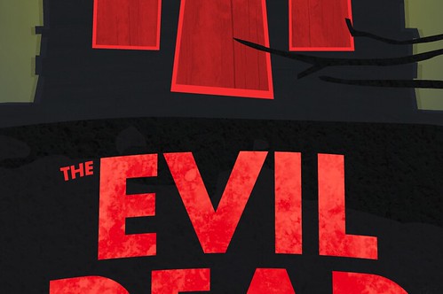
I like the subtle texture in the house and sky. I think that we lose the texture on the title but I would really like to see it so maybe you could make it more contrasty. Other than that, the text fits and is nicely place and the poster looks creepy.
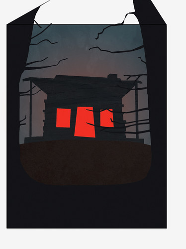
I really enjoy how the very flat-cut outs contrast with the textures and bright colors you chose. The very slight shadow/dark glow around the cabin really helps to make it pop just that much more, and I love the sickly yellow/green glow you added behind the entire thing. It feels well balanced as a composition, and you can definitely tell it's a horror movie.
the transparent halo effect around the shack is great! it conveys a great sense of night time haze/disorientation. the colors and the background glow compliment the intensity of the red very well. the title and windows/door look good, but they are of similar size and it might help if you pulled the title forward a bit so that its a little bigger. this may help give the two elements a little more visual contrast and movement between them
Kelsey this is awesome. You totally did it. This completely is everything I need in this project. You are a rockstar. Everything looks awesome- from your handling of the lighting, to the text, to the slug at the bottom and your use of type. I love that you're peeking through the trees at the house - there is no mistaking what the focus of the movie is, what tone you get from it, and what the hierarchy is of the poster. Your illustration of the house is just creepy and minimal enough to get the feeling across. I think you did an awsome job adding the textures in the background, the windows/ door and the ground beneath the house. You did an awesome job. Keep going, lady. :D

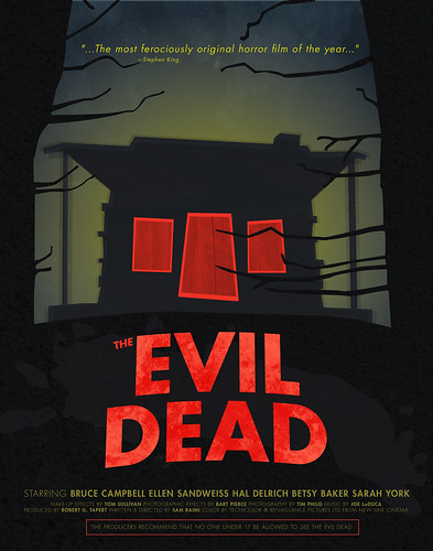
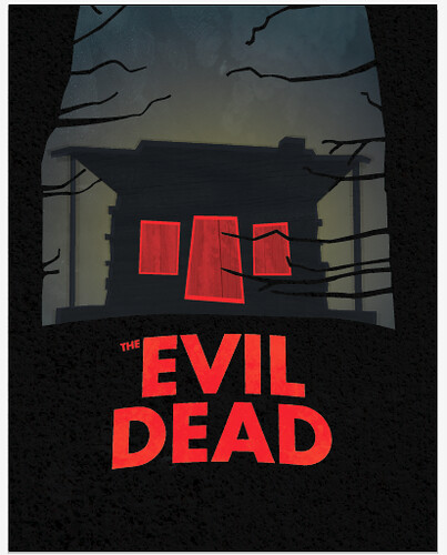
Very well done! I especially like the placement of the text.
ReplyDeleteI'd add a release date and a rating. Otherwise it looks great!
I think this is /awesome/.
ReplyDeleteI LOVE the colors in this, and I think they work really well together, and you balanced them nicely.
I also love the way you incorporated textures and showed depth. Nice font choice, and the text on the bottom works well.
Great great work.
Sam
the use of texture in this piece is done very well. very subtle tones make that red pop nicely. I appreciate the simplicity of the color palette as well as the design overall.
ReplyDeleteThis is super eery and ominous and great! Definite horror movie vibe! The textures are well used and not overdone. I really enjoy the trees as a framing aspect! The imagery is simple, but effective.
ReplyDeleteGreat job!
The composition is very well planned out. I like your subtle use of texture It's just enough. The color palette is very creepy and I get an uneasy feeling with that transparent outline around the cabin. Very good use of Illustrator everything looks crisp. Well done.
ReplyDeleteI like the subtle texture in the house and sky. I think that we lose the texture on the title but I would really like to see it so maybe you could make it more contrasty. Other than that, the text fits and is nicely place and the poster looks creepy.
ReplyDeleteI really enjoy how the very flat-cut outs contrast with the textures and bright colors you chose. The very slight shadow/dark glow around the cabin really helps to make it pop just that much more, and I love the sickly yellow/green glow you added behind the entire thing. It feels well balanced as a composition, and you can definitely tell it's a horror movie.
ReplyDeletethe transparent halo effect around the shack is great! it conveys a great sense of night time haze/disorientation. the colors and the background glow compliment the intensity of the red very well. the title and windows/door look good, but they are of similar size and it might help if you pulled the title forward a bit so that its a little bigger. this may help give the two elements a little more visual contrast and movement between them
ReplyDeleteKelsey this is awesome. You totally did it. This completely is everything I need in this project. You are a rockstar. Everything looks awesome- from your handling of the lighting, to the text, to the slug at the bottom and your use of type. I love that you're peeking through the trees at the house - there is no mistaking what the focus of the movie is, what tone you get from it, and what the hierarchy is of the poster. Your illustration of the house is just creepy and minimal enough to get the feeling across. I think you did an awsome job adding the textures in the background, the windows/ door and the ground beneath the house. You did an awesome job. Keep going, lady. :D
ReplyDelete