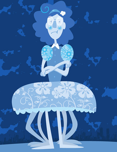
This is my monster from homework! There are two textures in her dress and two in the background! I used the brush for the swirl in the hair and mouth and arms

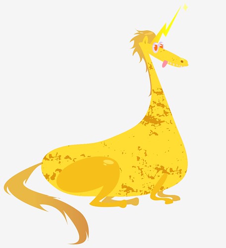
This is the one from class that I wasn't able to finish due to saving issues. There is a texture in his body and gradients in the hair, eyes, and horn. (that wasn't the assignment, but I just thought I would mention it!)

So I really like both of these, but the top one is my favorite The textures and colors seem really well thought out.
ReplyDeleteThe top one is definitely my favorite. I feel like the bottom one could use a LOT more texture.
ReplyDeleteI love her dress! !!!! the color pallet is really fitting, I just can't decide if I'd like a bit of texture in her hair.
ReplyDelete!!!!
Nice textures on the top. I like the color and hue variants you used.
ReplyDeleteI think her legs/dress/lower half could be moved over to the right a little bit because she feels somewhat off-center, but that's the only thing
Sam
Both are great but I really like the chubby gold unicorn. The only thing I can think of is adding a background to the unicorn one. Great color pallets for both images and great monster design.
ReplyDeleteNice color combination. It would be nice to see more textures. I like the texture on the body. Maybe you could add the other textures to make the background.
ReplyDeleteThese monsters are very well done. The second one takes the cake in my opinion, the texture is perfect for this kind of animal. The spots fit very well. nice work!
ReplyDeleteMaya these are super funny. I love the faces on both of them - they have a ton of personality. The top girl looks like squidward's sister or something. :D I love that you're playing with different kinds of textures - did you make the pattern in her dress? It really adds a lot to this piece! I also like that these have a limited color palette - as it's interesting to see how your use of color and shape really brings out the pieces in each monster. I think it works really well! I also like that you're using a subtle shading effect in these. The shiny spots on your dragon guy, and the shadows in her arms. It could be cool to see how you could bring that into other places on her, too! I love the texture in the background, it's nice because it feels organic in contrast to the geometric-ness of the patterns in her dress. great stuff.
ReplyDelete