
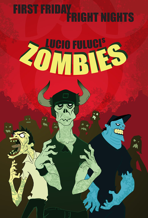
Had alot of fun with this one. Used textures and the blob brush which I've never used before but now that I've played with it for this whole project I'm hooked on it. Also did some warping of text never thought I would need it but it worked for this assignment. Used all the tricks we learned in class to put this one together.
I'd like to see more text on this one, maybe a quote, or information about the movie on the bottom (release date, actors, rating, etc.)
ReplyDeleteAlso I think it could be more centered, since the off-center title distracts me.
Also I'd make more aspects of the poster blue, or differentiate the zombies. The blue guy stands out more than the other two, but he's in the back.
Other than that I like the line quality and I think the characters look good
nice textures too
I agree with the comment above. Other than the title of the movie, there's pretty much no text (although the title is placed very nicely, and I love the shadows). I'd also center the title text. I'd also center the zombies in the foreground. They feel a little off to me.
ReplyDeleteI love the really gritty texture on the background.
Other than those things, great job!
This looks really great! I can really see this as like a spoof horror movie or animated horror movie! I just really love the characterization of the zombies. I like the treatment of the title, but it sort of gets lost because it is red-tint against red and the first thing I see is the green and then the blue because they are so bright and because red-green compliment! I would suggest only having one green main zombie - or at least dulling the left one down more (or making it yellowy?) because it messes up the hierarchy otherwise.
ReplyDeletegreat job with the zombies, and making the crowd fade into the background. I like the title, except that its darkness and redness makes it fall back with the background compared with the brightly colored zombies up front. maybe you could figure out a way to make the "ZOMBIES" title sortof mimic the effect of the zombie figures being close and bright then fading away into the distance. the a little bit of extra typographic information (credits, dates, and/or rating stuff) would make it look extra finished and profesh!
ReplyDeleteThe characters look really nice and it looks like you've gotten the hang of the blob brush! It looks great inked in illustrator - thank you so much for trying that out! It looks fantastic! I like the textures that you're using in the bodies. I could see you using a couple more gross ones, since it's awesome to see it show up on the skin of your zombies. Especially how it works on the left guy's hand-to-arm transition. Maybe there is a scaly texture one guy can have, and a cracked on another guy can have or something like that. That way you can add a little more detail. The backgroudn texture and hoard of guys looks awesome. Great job on creating an atmosphere. I would love to see this at a bigger size? Do you think you can repost it at 500px wide? let me know if you need any help with this and I can help you with flickr! i'd also love to see you use the rest of the type so we know it's a movie - like - the credits at the bottom, or some kind of tag line? I see that some other people mentioned this, but it's worth it and is something I'll be looking for in a movie poster. The last thing I think you could add is a different skin color for one of the two green guys- maybe it just varies a little bit? It could help to focus on the main front guy if two of them were a little different in color. Great job - I'm looking forward to seeing your next stuff!
ReplyDelete