I really like the transformation with this one. Seeing how it started at the top I think you did a lot of great stuff with this one! I like what you did with the lighting/black shadows and I'd like to know how you did that!
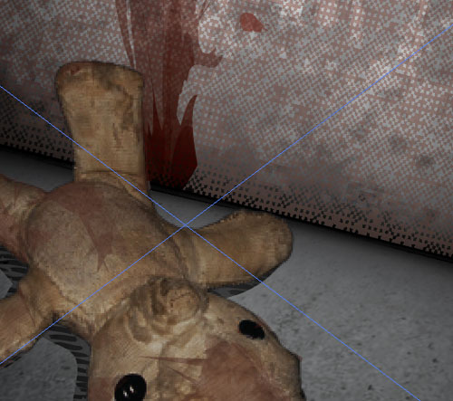
I think the doll looks a bit pixelated overall, and I think you could clean up some of the edges, mostly by the right side of its head. they seem a bit sharp and dark
I think the text placement looks good. Its hard for me to tell but is there a grey outline around your text? If so I'd remove it so it reads easier
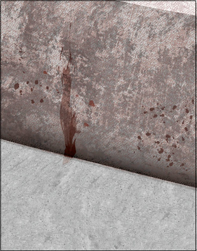
Also, maybe find some real blood or paint spatter textures for the wall. There's plenty out there :)
I feel like you did a wonderful job having all the various textures and elements you're incorporating in the piece- the heavy shadow really emphasizes the doll as well. I like your subtle use of color as well, the soft reds work well with the warm grays. Text is well placed too.
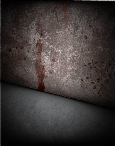
first of all, this looks pretty good overall. my only tiny problem is that the the bigger smear looks a little artificial compared to the realism of everything else. i think the transparency of it may just be a little too constant. it would be better if it were a bit more splotchy. the type at the very bottom is cramped in a little close to the edge too. otherwise good lighting, and composition.
I love how you're combining Illustrator and Bitmaps - there are some really awesome things happening in this! I think you've done a great job choosing textures and images to bitmap that really make you get the gritty, creepy feeling. You're lighting also does a great job of focusing you in on the bear - like you've been walking through a dark abandoned area and shined a flashlight on this spot. I also like that you're creating a smear in illustrator. Almost all of the textures and shadows look really nice and super convincing. I agree with Cole - there is just one point on the blood smear that looks kind of unnatural, the one pointy piece that is sticking out on the right, but that could be easily fixed! The rest of it is well handled and blends nicely into the texture of the other shapes. I thik you've done a great job with text - Maybe the kidnapped word can get just a little more vibrant- that way you might not have to use the white around it? I do think you've handled the placement well - it feels like you could also maybe add a tag line -- like "creepiest movie of the summer" .. or whatever is better than that. It seems like that could be added in the blank space under "kidnapped" over near the right. This is awesome. Great job.

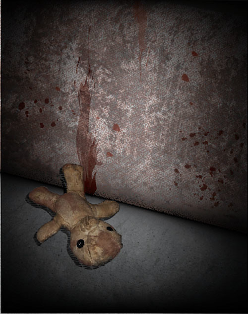
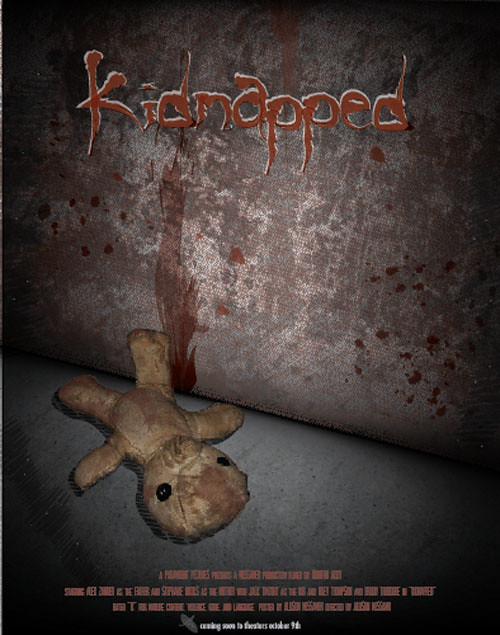
I love the grittiness of the textures. The lighting is also really nice! Great job!
ReplyDeleteI really like the transformation with this one. Seeing how it started at the top I think you did a lot of great stuff with this one! I like what you did with the lighting/black shadows and I'd like to know how you did that!
ReplyDeleteI think the doll looks a bit pixelated overall, and I think you could clean up some of the edges, mostly by the right side of its head. they seem a bit sharp and dark
I think the text placement looks good. Its hard for me to tell but is there a grey outline around your text? If so I'd remove it so it reads easier
Also, maybe find some real blood or paint spatter textures for the wall. There's plenty out there :)
Sam
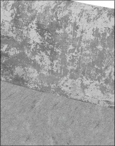
You played a lot with texture and it's pretty obvious. I like the progression you displayed
ReplyDeleteI feel like you did a wonderful job having all the various textures and elements you're incorporating in the piece- the heavy shadow really emphasizes the doll as well. I like your subtle use of color as well, the soft reds work well with the warm grays. Text is well placed too.
ReplyDeletefirst of all, this looks pretty good overall. my only tiny problem is that the the bigger smear looks a little artificial compared to the realism of everything else. i think the transparency of it may just be a little too constant. it would be better if it were a bit more splotchy. the type at the very bottom is cramped in a little close to the edge too. otherwise good lighting, and composition.
ReplyDeleteI love how you're combining Illustrator and Bitmaps - there are some really awesome things happening in this! I think you've done a great job choosing textures and images to bitmap that really make you get the gritty, creepy feeling. You're lighting also does a great job of focusing you in on the bear - like you've been walking through a dark abandoned area and shined a flashlight on this spot. I also like that you're creating a smear in illustrator. Almost all of the textures and shadows look really nice and super convincing. I agree with Cole - there is just one point on the blood smear that looks kind of unnatural, the one pointy piece that is sticking out on the right, but that could be easily fixed! The rest of it is well handled and blends nicely into the texture of the other shapes. I thik you've done a great job with text - Maybe the kidnapped word can get just a little more vibrant- that way you might not have to use the white around it? I do think you've handled the placement well - it feels like you could also maybe add a tag line -- like "creepiest movie of the summer" .. or whatever is better than that. It seems like that could be added in the blank space under "kidnapped" over near the right. This is awesome. Great job.
ReplyDelete