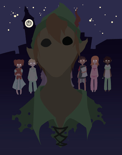
I enjoy this a lot! The text is great, the image is great, the colors are great! However Pan has this shadow at the back of his head that merges with the clock tower and makes them looked joined, which is probably not a thing you want! Also the shadows about his mouth, while accurate, are disconcerting because of the shape and make him look sort of cat-mouthed. Like :3
This is pretty scary. I agree with the color palette and I think your highlights are nice. I feel that if you squint at the piece the highlights are more appealing. Which means they are too stark? Although now that I think about it more he appears to be dreamlike, or a mirage in water or something. Spooky.
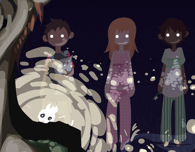
I love the textures on the outfits and at the bottom of the picture. Your color choice makes your piece look like a dark night and the glowing eyes adds to the creepiness. If you wanted to make it look even more demonic, you could show some teeth on peter pan.. just enough to make it look like a sneer.
LOL peter pan in the projects. Well obviously This should be made into a movie you can run and tell that homeboy. But seriously great colors and great use of textures. I really like how you made all the children glowy in the background it makes it even more eerie. I love the way you did the sky it sort of has a Van Gogh feeling but with a twist of contemporary added to it. Great work.
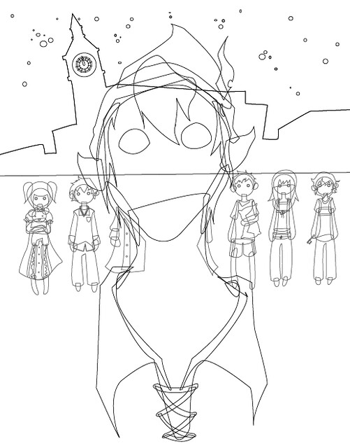
I love seeing your process on this. It looks fantastic. I the way you've handled the lighting wit the blob brush really adds a lot to the piece. It's almost like his face is made of cellulite. That is probably not what you want to hear... hm. Still, I think it definitely makes him INCREDIBLY creepy and does a TON for the tone of your poster. I love how you've added the same texture in the back of the sky. I also like your sense of humor in the slug at the bottom. I would take all of your type and scale it down to about 75% of what it is right now so you can get a little more breathing room at the bottom of your poster. Since it's so white, it drags the attention away from your illustration! I could see you doing the bottom text in an alternate colorway, too - if that would help? Maybe a light purple? Or something like that? Great job on the lighting and coloring of all this. You definitely took a great story and made it super creepy! One more thing - I'm not sure you really need the big black outline around his head! I think your illustration will be great without it = it just seems like it breaks up the skyline a little too much. I loved seeing the outline of the clock - and wasn't sure if it was blending into that shape around his head, or what? Super creepy. Great job.

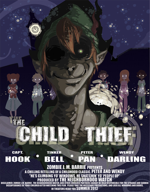
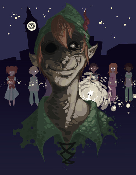
This is WONDERFULLY demented! I love it! It looks very Tim Burton-esque.
ReplyDeleteThe only thing I would maybe do is bump up the contrast on Peter Pan.
CLIMBIN IN YO WINDOWS
ReplyDeleteOLOLOLOLOLOLOLOLOLOLOL
OLOLOLOLOLOLOLOLOLOLOL
OLOLOLOLOLOLOLOLOLOLOL
OLOLOLOLOLOLOLOLOLOLOL
OLOLOLOLOLOLOLOLOLOLOL
OLOLOLOLOLOLOLOLOLOLOL
OLOLOLOLOLOLOLOLOLOLOL
OLOLOLOLOLOLOLOLOLOLOL
OLOLOLOLOLOLOLOLOLOLOL
OLOLOLOLOLOLOLOLOLOLOL
OLOLOLOLOLOLOLOLOLOLOL
OLOLOLOLOLOLOLOLOLOLOL
OLOLOLOLOLOLOLOLOLOLOL
OLOLOLOLOLOLOLOLOLOLOL
OLOLOLOLOLOLOLOLOLOLOL
OLOLOLOLOLOLOLOLOLOLOL
OLOLOLOLOLOLOLOLOLOLOL
OLOLOLOLOLOLOLOLOLOLOL
OLOLOLOLOLOLOLOLOLOLOL
OLOLOLOLOLOLOLOLOLOLOL
I enjoy this a lot! The text is great, the image is great, the colors are great! However Pan has this shadow at the back of his head that merges with the clock tower and makes them looked joined, which is probably not a thing you want! Also the shadows about his mouth, while accurate, are disconcerting because of the shape and make him look sort of cat-mouthed. Like :3
ReplyDeleteSo he is like >:3
This is pretty scary. I agree with the color palette and I think your highlights are nice. I feel that if you squint at the piece the highlights are more appealing. Which means they are too stark? Although now that I think about it more he appears to be dreamlike, or a mirage in water or something. Spooky.
ReplyDeleteI love the textures on the outfits and at the bottom of the picture. Your color choice makes your piece look like a dark night and the glowing eyes adds to the creepiness. If you wanted to make it look even more demonic, you could show some teeth on peter pan.. just enough to make it look like a sneer.
ReplyDeleteLOL peter pan in the projects. Well obviously This should be made into a movie you can run and tell that homeboy. But seriously great colors and great use of textures. I really like how you made all the children glowy in the background it makes it even more eerie. I love the way you did the sky it sort of has a Van Gogh feeling but with a twist of contemporary added to it. Great work.
ReplyDeleteI love seeing your process on this. It looks fantastic. I the way you've handled the lighting wit the blob brush really adds a lot to the piece. It's almost like his face is made of cellulite. That is probably not what you want to hear... hm. Still, I think it definitely makes him INCREDIBLY creepy and does a TON for the tone of your poster. I love how you've added the same texture in the back of the sky. I also like your sense of humor in the slug at the bottom. I would take all of your type and scale it down to about 75% of what it is right now so you can get a little more breathing room at the bottom of your poster. Since it's so white, it drags the attention away from your illustration! I could see you doing the bottom text in an alternate colorway, too - if that would help? Maybe a light purple? Or something like that? Great job on the lighting and coloring of all this. You definitely took a great story and made it super creepy!
ReplyDeleteOne more thing - I'm not sure you really need the big black outline around his head! I think your illustration will be great without it = it just seems like it breaks up the skyline a little too much. I loved seeing the outline of the clock - and wasn't sure if it was blending into that shape around his head, or what? Super creepy. Great job.