The layering on the nose and eyes is done very well. As well as the cheeks and forehead. Oh, and the eyebrows. Basically the whole thing looks very well done. You seem to have gotten the hang of parts where gradient is important, shadows and highlights.
This looks awesome. I love that you spent time in the details of the face and that you really considered how the contours of the face work within the shapes you've created. The way you've used the transparency menu with opacity is great as well - ans the freckles look real. I think taht you've done an awesome job mastering the pen tool and it looks like it's easy for you. The only thing I think you could do is add more of the linework texture (if that is something about your original drawings that you like to keep - it could be easy for you to use the multiple/opacity slider to get that look as well. This is fantastic. I especially love where you're using pink to put life back into the face. (side of nose....etc.)You did a really great job. Thanks for also posting from flickr perfectly!!
I really like this. It is a very well represented replica of the first image. In the illustration the eyes capture my attention the most. They are illustrated very wonderfully!
Your use of layering is amazing, in my opinion. I really appreciate that you took the time to make different sized freckles as opposed to having a set size. The eyes are wonderfully piercing. The only suggestion I can think of is to smooth out the left side of the face so that the curve doesn't have that odd jagged moment..
Hands down, the nose is my favorite. You chose to include enough gradient layers to have it make sense, but not too many to make it chaotic with the freckles. Obviously, the pen tool works well for you.
I love the amount of detail you put into it. I would just try to smooth out the left side of the face. The quickest way to do this is the pathfinder tools. Amazing work!!!!!

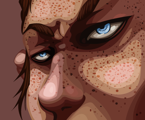
Oh my gosh, I love how this turned out. This guy seems so intense and you did a really good job in crating a form with simple shapes.
ReplyDeleteimpressive! i think you've done a great job layering color values throughout
ReplyDeleteThe layering on the nose and eyes is done very well. As well as the cheeks and forehead. Oh, and the eyebrows. Basically the whole thing looks very well done. You seem to have gotten the hang of parts where gradient is important, shadows and highlights.
ReplyDeleteLOVE IT! I love how close turned out!!! The skin tones and shapes and shades are so accurate . Awesome job!
ReplyDeleteThis looks awesome. I love that you spent time in the details of the face and that you really considered how the contours of the face work within the shapes you've created. The way you've used the transparency menu with opacity is great as well - ans the freckles look real. I think taht you've done an awesome job mastering the pen tool and it looks like it's easy for you. The only thing I think you could do is add more of the linework texture (if that is something about your original drawings that you like to keep - it could be easy for you to use the multiple/opacity slider to get that look as well. This is fantastic. I especially love where you're using pink to put life back into the face. (side of nose....etc.)You did a really great job. Thanks for also posting from flickr perfectly!!
ReplyDeleteI really like this. It is a very well represented replica of the first image. In the illustration the eyes capture my attention the most. They are illustrated very wonderfully!
ReplyDeleteYour use of layering is amazing, in my opinion. I really appreciate that you took the time to make different sized freckles as opposed to having a set size. The eyes are wonderfully piercing. The only suggestion I can think of is to smooth out the left side of the face so that the curve doesn't have that odd jagged moment..
ReplyDeleteHands down, the nose is my favorite. You chose to include enough gradient layers to have it make sense, but not too many to make it chaotic with the freckles. Obviously, the pen tool works well for you.
ReplyDeleteI love the amount of detail you put into it. I would just try to smooth out the left side of the face. The quickest way to do this is the pathfinder tools. Amazing work!!!!!
ReplyDelete