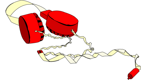
The recreation of the headphones looks right on. The colors in the one you made seem a little off though. The cord is two different colors in your image and only one in the other.
You did a great job with remaking the form of the object, though I think the piece would have been much stronger with a bit more shading? Even just removing/lightening the dark outline on the wire/lighter parts of the object would have helped.
I think it's a little silly that you took a 3d peice and turned it into a flat shape with line work. I like the finished result, it makes an interesting image but it does deviate from the assignment a little bit I think. Maybe focusing on the tones more would be helpful.
i agree that a bit of shadowing would really finish this off. especially adding the shadows being cast on the the floor/surface would help ground the object
Really like the shapes in this image and you recreated them very well. The only thing i would try is adding a subtle gradient onto the red circles just to give it a little more volume. It would help to give it the highlight for the one on the left.
I think either you could go the rout everyone was saying and add more shading, or you could go the opposite and make this even flatter and more graphic! I think it would be worth while to play around both ways.
I love the way that this turned out looking more illustrative with the black linework. Although you didn't do the shading (As everyone is talking about) I think this could be a really good style for you to consider working in for future assignments. It still has a human quality about it that gets lost in a lot of illustrator artwork. For the sake of practice, it would be good to see where you would put shading - using the transparency tool - I'm not sure if you used it anywhere in this assignment, but that would defintiely be cool to see the shine - or the shadow using transparency. Great job with Flickr, too!

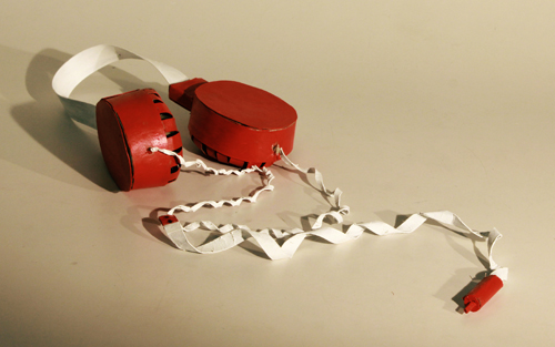
The recreation of the headphones looks right on. The colors in the one you made seem a little off though. The cord is two different colors in your image and only one in the other.
ReplyDeleteThis is an interesting style, I like the line quality.
ReplyDeleteIf you wanted to, you could go back and put some shadow layers in your image. It would give the picture depth and make the cords look more realistic.
ReplyDeleteYou did a great job with remaking the form of the object, though I think the piece would have been much stronger with a bit more shading? Even just removing/lightening the dark outline on the wire/lighter parts of the object would have helped.
ReplyDeleteI think it's a little silly that you took a 3d peice and turned it into a flat shape with line work. I like the finished result, it makes an interesting image but it does deviate from the assignment a little bit I think. Maybe focusing on the tones more would be helpful.
ReplyDeletei agree that a bit of shadowing would really finish this off. especially adding the shadows being cast on the the floor/surface would help ground the object
ReplyDeleteReally like the shapes in this image and you recreated them very well. The only thing i would try is adding a subtle gradient onto the red circles just to give it a little more volume. It would help to give it the highlight for the one on the left.
ReplyDeleteI think either you could go the rout everyone was saying and add more shading, or you could go the opposite and make this even flatter and more graphic! I think it would be worth while to play around both ways.
ReplyDeleteVery well illustrated line work. The colors could be used a bit more to show the light source. But for this being a 3D object, nice job brochacho.
ReplyDeleteI love the way that this turned out looking more illustrative with the black linework. Although you didn't do the shading (As everyone is talking about) I think this could be a really good style for you to consider working in for future assignments. It still has a human quality about it that gets lost in a lot of illustrator artwork. For the sake of practice, it would be good to see where you would put shading - using the transparency tool - I'm not sure if you used it anywhere in this assignment, but that would defintiely be cool to see the shine - or the shadow using transparency. Great job with Flickr, too!
ReplyDelete