It's easy to see that you understand the tonal shifts of skin (which is nice), now I'd just add some more layers + extra details. The only area I'd say is falling flat as the piece stands is around the eye brow.
I think that this piece could have used a little more transparency. Also it would have been really cool if you had figured out a way to add those intense sparkles that are in the original image.
I really like the colors for this! You picked out good shapes for the color that suit the plans of the face well - almost like a topographical map! I am not sure if I am glad that the eye sparklies are missing or not - I think they could have been a fun experiment!
I think it's illustrated rather well, though I have to say some of the tonal work seems a little to far spaced/separated as a whole image. I think the use of transparencies/gradients would have been cool to add up by the skin of the eye. Also, I'd be totally on board for more sparkles!
Great job finding the highlights and the shadows! It looks like you're really getting some of the major areas down - It would be great to play with opacity so you can get some more subtle shifts in the color between the layers. Maybe try and just blend them by taking each upper layer and tweaking it down to 80 or 90% opacity? I think you could also add a couple more details in the eye - where it gets a little lighter, and maybe put some pink into the area of her upper eyelid where it gets a little purple? Maybe it's just another layer or two! I think the small details like in the nostril and the ridge of hte nose are great- keep going with this! I think your post might have also gotten thin? Are you using the 500px wide format? I can help if you need it! let me know!

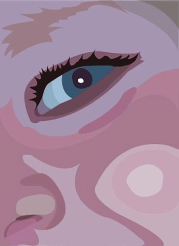
I'd maybe add a little more detail around the eyebrow/upper eye region. Otherwise it looks really good!
ReplyDeleteIt's easy to see that you understand the tonal shifts of skin (which is nice), now I'd just add some more layers + extra details. The only area I'd say is falling flat as the piece stands is around the eye brow.
ReplyDeleteI think that this piece could have used a little more transparency. Also it would have been really cool if you had figured out a way to add those intense sparkles that are in the original image.
ReplyDeletei like the variation of skin tones you used. the only thing i would suggest is adding a little more detail around the pupil and corner of the eye
ReplyDeletemaybe you can make the nose part more clearly, all others are really cool
ReplyDeleteThe shapes that you created with the pen tool are a bit jagged. Smoother shapes would really emphasize the digital nature of this piece.
ReplyDeleteI really like the colors for this! You picked out good shapes for the color that suit the plans of the face well - almost like a topographical map! I am not sure if I am glad that the eye sparklies are missing or not - I think they could have been a fun experiment!
ReplyDeleteI think more transparencies would help make more subtle shifts on the skin, helping it feel more rounded and natural
ReplyDeleteI think adding some more tone variances would help add more volume too.
Try placing both photos in the same post next time. It'll help with comparison.
-Sam A
I think it's illustrated rather well, though I have to say some of the tonal work seems a little to far spaced/separated as a whole image. I think the use of transparencies/gradients would have been cool to add up by the skin of the eye. Also, I'd be totally on board for more sparkles!
ReplyDeleteGreat job finding the highlights and the shadows! It looks like you're really getting some of the major areas down - It would be great to play with opacity so you can get some more subtle shifts in the color between the layers. Maybe try and just blend them by taking each upper layer and tweaking it down to 80 or 90% opacity? I think you could also add a couple more details in the eye - where it gets a little lighter, and maybe put some pink into the area of her upper eyelid where it gets a little purple? Maybe it's just another layer or two! I think the small details like in the nostril and the ridge of hte nose are great- keep going with this! I think your post might have also gotten thin? Are you using the 500px wide format? I can help if you need it! let me know!
ReplyDelete