I LOVE the textures! I really get the "B-movie" vibe from this! I would maybe at a little more text to this (the rating of the movie, when it premieres, etc.)
I am jealous of your bitmap understanding. Your bitmap is constructed very well. I can't do that to save my life. Anywho, I can tell this is a horror film. But it also gives of the comedy vibe. A horrifying comedy, these genres could produce something great. Also, It appears you knew exactly(or close to) what you wanted and found a way to construct it in a deliberate manner. Bueno!
I was hoping somebody would do something like a cheesy horror movie poster. The title as well as the text work really well. I would like to see maybe a little bit more of these critters on the cover tho. Great work
I think the piece as a whole, as well as the textures you used are nicely incorporated, but I'm not quite sure it gives a very clear scary vibe? The monsters almost look like gorilla noses/mouths to me. Are they the finished products of the lineart you have in the last progress shot? I feel like if you made the monsters a bit bigger/more imposing, they'd be more intimidating and it'd give off more of a "scary movie" vibe.
I LOVE the use of bitmaps in this. It looks like a screenprint and I love how you're taking a vintage approach to it. the focus on the crittes in the bubbles is really nice -and your use of white as a focal point is done really well against the other colors. I love the way you're doing the type for the title as well. I think you should add some of the other movie information at the base of the poster- you're starting to do it, but the big slug could be designed in a way that would fit with your aesthetic, but keep all the information we need (like rating, producer, film studio.. whatever). great job, again - I loe hte textures so much. It's a really interesting and minimal take on using the shapes in illustrator, while focusing more on bitmaps and textures, but I really think it works wonderfully.

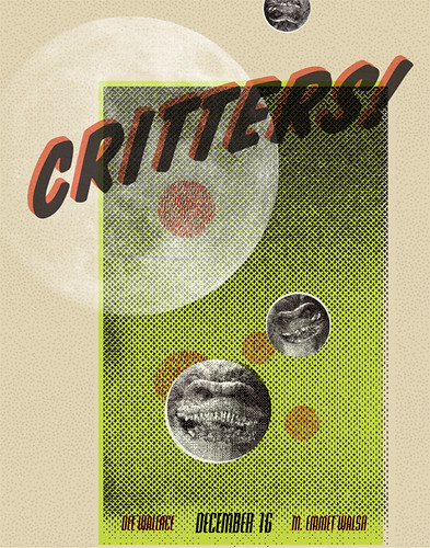
I LOVE the textures! I really get the "B-movie" vibe from this! I would maybe at a little more text to this (the rating of the movie, when it premieres, etc.)
ReplyDeleteI think this looks great, I could totally see this as a screen print, and at first glance I thought it was!
ReplyDeleteColors work well with this one
Sam
I am jealous of your bitmap understanding. Your bitmap is constructed very well. I can't do that to save my life. Anywho, I can tell this is a horror film. But it also gives of the comedy vibe. A horrifying comedy, these genres could produce something great. Also, It appears you knew exactly(or close to) what you wanted and found a way to construct it in a deliberate manner. Bueno!
ReplyDeleteI was hoping somebody would do something like a cheesy horror movie poster. The title as well as the text work really well. I would like to see maybe a little bit more of these critters on the cover tho. Great work
ReplyDeleteI think the piece as a whole, as well as the textures you used are nicely incorporated, but I'm not quite sure it gives a very clear scary vibe? The monsters almost look like gorilla noses/mouths to me. Are they the finished products of the lineart you have in the last progress shot? I feel like if you made the monsters a bit bigger/more imposing, they'd be more intimidating and it'd give off more of a "scary movie" vibe.
ReplyDeleteI LOVE the use of bitmaps in this. It looks like a screenprint and I love how you're taking a vintage approach to it. the focus on the crittes in the bubbles is really nice -and your use of white as a focal point is done really well against the other colors. I love the way you're doing the type for the title as well. I think you should add some of the other movie information at the base of the poster- you're starting to do it, but the big slug could be designed in a way that would fit with your aesthetic, but keep all the information we need (like rating, producer, film studio.. whatever). great job, again - I loe hte textures so much. It's a really interesting and minimal take on using the shapes in illustrator, while focusing more on bitmaps and textures, but I really think it works wonderfully.
ReplyDelete