I think your simplification of color variation works really well based on your original image. I appreciate that you didn't go over the top with your layers, it helps maintain an image that maintains simple appeal as well as potential to be used as a tshirt graphic or something of that nature.
I think that this piece is really cute, and I really liked the watercolor that you did of it. I think that a little bit of color variance could have helped out a lot though because the vector kind of loses some of it's liveliness.
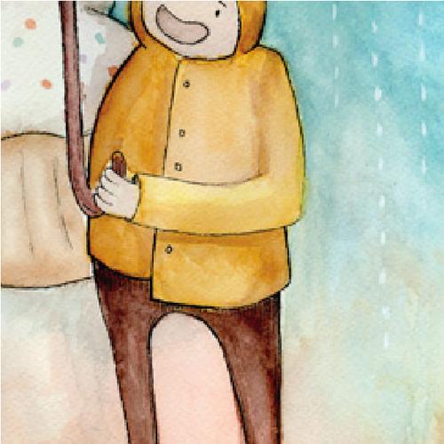
This is really nice. The way that you're using the pen tool is super clean and looks really good. The color variations in the coat and pants looks nice and not too separate.It would be neat to see how you would use the line tool on the rest of the detail in the coat and buttons, to achieve the linework-look since it's an important part of your previous drawing. Great interpretation of the whole color palette. This looks great. Your posting from flickr looks perfect! Nice work.
I really like how this has turned out! This is definitely a good style transition for this image and I like that the raincoat now looks shiny, which is how raincoats usually are! I could really see this being a great ad if you took it further and finished the entire image!
I really like the way you worked with this one. I think there's a good balance of color and shapes, and I find it to be a really charming coloring style.
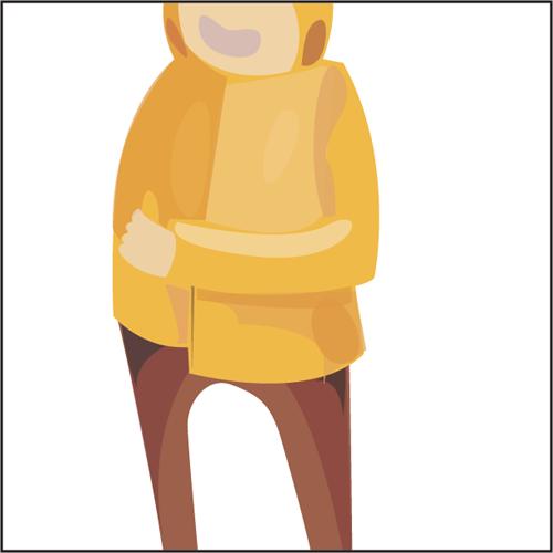
I think you could add a lot to it by just adding a BG with shapes to make a gentle gradient. I think it would help the figure and colors pop. I like to see the whole thing as a vector and not just the person. Don't forget his eye! He has a really cute face
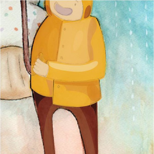
This is really cool. I love how its simple and how you shapes are so clean and perfect.You get that kind of wet, shiny texture from the shapes and color choices you did. It would be cool to see the background too but overall i like it!

I think your simplification of color variation works really well based on your original image. I appreciate that you didn't go over the top with your layers, it helps maintain an image that maintains simple appeal as well as potential to be used as a tshirt graphic or something of that nature.
ReplyDeleteI think that this piece is really cute, and I really liked the watercolor that you did of it. I think that a little bit of color variance could have helped out a lot though because the vector kind of loses some of it's liveliness.
ReplyDeleteThis is really nice. The way that you're using the pen tool is super clean and looks really good. The color variations in the coat and pants looks nice and not too separate.It would be neat to see how you would use the line tool on the rest of the detail in the coat and buttons, to achieve the linework-look since it's an important part of your previous drawing. Great interpretation of the whole color palette. This looks great. Your posting from flickr looks perfect! Nice work.
ReplyDeleteI really like how this has turned out! This is definitely a good style transition for this image and I like that the raincoat now looks shiny, which is how raincoats usually are! I could really see this being a great ad if you took it further and finished the entire image!
ReplyDeleteI really like the way you worked with this one. I think there's a good balance of color and shapes, and I find it to be a really charming coloring style.
ReplyDeleteI think you could add a lot to it by just adding a BG with shapes to make a gentle gradient. I think it would help the figure and colors pop. I like to see the whole thing as a vector and not just the person. Don't forget his eye! He has a really cute face
Nice post layout as well.
-Sam A
should have put in the buttons and the eye/eyebrow! great job otherwise
ReplyDeleteI really like the middle post without the black lines, it looks very clean and stylistic.
ReplyDeleteThis is really cool. I love how its simple and how you shapes are so clean and perfect.You get that kind of wet, shiny texture from the shapes and color choices you did. It would be cool to see the background too but overall i like it!
ReplyDelete