I think this image was really well suited to being brought into Illustrator. I really like the strong blacks and though you lost some texture I think this is very nearly as strong as the original, although I miss some of the smaller marks that come with your brush work.
I'd like to see this all in one post since it would be easier to compare the two, and keep it organized. I like how you translated it though. The shapes are strong and so is the composition. It would be nice to see some more highlights though like you had in your original. I think it would help add even more depth. Nice transparency though :)
I really like how you use blocks of color to fill in large shapes over the black line work. You seem comfortable in making small details (shirt / hair), and it'd be nice to see some of that brought in to create depth + texture.
I like this image a lot, it must of taken you forever to deal with all of the very specific line work in this. I think it would have been nice if you tried to retain the texture of the original more though because I think that is one of the things that makes the first one really dynamic.
Despite the shift to Illustrator, I still get a graphic vibe from it, if that makes any sense. You should try and get the brush strokes from the original into the Illustrator image.
I love the way that your new version looks like a wood-block print. there is something great about the motion lines that creates that kind of look? Maybe it's the sharp-ness? I think that you'll now be able to achieve that brush look when you make your own custom brushes, which will be awesome. You found the gradient tool! HAHA! I like where you used transparency , It shows that you're using it a little bit with the large blue oval - also - the style that your original drawing is in, is great for for what you're doing in illustrator. I love the digital inking yo udid with the pen tool. Great job on that! You should edit your post to get both images up in the same piece so people can see your original side by side with this one! I'll show you how to do that in class next time! Great job on this!

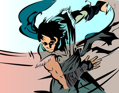
I think this image was really well suited to being brought into Illustrator. I really like the strong blacks and though you lost some texture I think this is very nearly as strong as the original, although I miss some of the smaller marks that come with your brush work.
ReplyDeleteI'd like to see this all in one post since it would be easier to compare the two, and keep it organized.
ReplyDeleteI like how you translated it though. The shapes are strong and so is the composition. It would be nice to see some more highlights though like you had in your original. I think it would help add even more depth. Nice transparency though :)
-Samantha A
This looks straight out of a comic book. NIce use of gradient and transparency.
ReplyDeleteYou might want to post both images on one go.
ReplyDeleteThe replica is very nice. you kept a lot of the detail, and the color looks about the same as the other image.
I really like how you use blocks of color to fill in large shapes over the black line work. You seem comfortable in making small details (shirt / hair), and it'd be nice to see some of that brought in to create depth + texture.
ReplyDeleteI like this image a lot, it must of taken you forever to deal with all of the very specific line work in this. I think it would have been nice if you tried to retain the texture of the original more though because I think that is one of the things that makes the first one really dynamic.
ReplyDeleteDespite the shift to Illustrator, I still get a graphic vibe from it, if that makes any sense. You should try and get the brush strokes from the original into the Illustrator image.
ReplyDeleteReally like the color palette and graphic feel of sharp shapes. Great job with illustrator. Don't really see anything to change.
ReplyDeleteI love the way that your new version looks like a wood-block print. there is something great about the motion lines that creates that kind of look? Maybe it's the sharp-ness? I think that you'll now be able to achieve that brush look when you make your own custom brushes, which will be awesome. You found the gradient tool! HAHA! I like where you used transparency , It shows that you're using it a little bit with the large blue oval - also - the style that your original drawing is in, is great for for what you're doing in illustrator. I love the digital inking yo udid with the pen tool. Great job on that! You should edit your post to get both images up in the same piece so people can see your original side by side with this one! I'll show you how to do that in class next time! Great job on this!
ReplyDelete