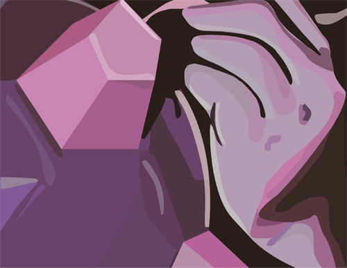
This is pretty close to the original image. The only thing I would maybe change is adding a few shades of pink as well (you can see a lot of pink AND purple in the original).
you did a very nice job looking at all the shadows and color variations in the original picture. I would agree that the color is something you might want to look at again.
The color choices look great in this one, and I think you were able to translate the pixelated image into a much cleaner form. My advice I suppose would be to spend a little more time getting aquatinted with the pen tool. A better understanding of it will improve you're choice of curvature in the shapes, as well as being more precise with how many you use. I say that because some tones in the fingers seem a little overdone for me.
If you want the image to have the same colors as your original, you can take the eyedropper tool and it will pick up the images that are on your original to use for your new image.
Considering the quality of your image this is pretty damn excellent (not to say that it would be otherwise). I do wish the color shift at the wrist was a bit more gradual. It does look like an abrupt shift, but at least one more middle tone between them and it would be spot on.
Although the colors in the two images are not the same, I actually think I prefer the color choices in the vectored image! They are bold and give a very strong mood! There are some parts on the hand that get a bit jagged but over all this is very nice!
Like the colors and shapes very smooth. You could try replacing some of the shapes in the hand with gradients for an even smoother transition. Nice job on the jewel looks very crisp.
Hey, you did a really great job with this! I love how you're using the planes on the hand and in that cone-thing. It looks nice and clean in the areas that are supposed to be sharp, and nice and organic in the hand! I am super happy you got the color working in the shadows of the hand. Great job. I think it would be cool to see how you could add a couple more textures in teh bottom of the ball-thing as it does that gradient under the shadow of the hand? Maybe some kind of slow blend from that dark purple to the light purple? I dont know what that is, but I hope you know what I mean! great mob posting with flickr, Totally perfect. Thanks a million! Great work.


This is pretty close to the original image. The only thing I would maybe change is adding a few shades of pink as well (you can see a lot of pink AND purple in the original).
ReplyDeleteyou did a very nice job looking at all the shadows and color variations in the original picture. I would agree that the color is something you might want to look at again.
ReplyDeleteThe color choices look great in this one, and I think you were able to translate the pixelated image into a much cleaner form. My advice I suppose would be to spend a little more time getting aquatinted with the pen tool. A better understanding of it will improve you're choice of curvature in the shapes, as well as being more precise with how many you use. I say that because some tones in the fingers seem a little overdone for me.
ReplyDeleteIf you want the image to have the same colors as your original, you can take the eyedropper tool and it will pick up the images that are on your original to use for your new image.
ReplyDeleteConsidering the quality of your image this is pretty damn excellent (not to say that it would be otherwise). I do wish the color shift at the wrist was a bit more gradual. It does look like an abrupt shift, but at least one more middle tone between them and it would be spot on.
ReplyDeleteAlthough the colors in the two images are not the same, I actually think I prefer the color choices in the vectored image! They are bold and give a very strong mood! There are some parts on the hand that get a bit jagged but over all this is very nice!
ReplyDeleteLike the colors and shapes very smooth. You could try replacing some of the shapes in the hand with gradients for an even smoother transition. Nice job on the jewel looks very crisp.
ReplyDeleteI think you did a really god job, the original picture is not that clear, but I can clearly see the details on you digital one.
ReplyDeleteHey, you did a really great job with this! I love how you're using the planes on the hand and in that cone-thing. It looks nice and clean in the areas that are supposed to be sharp, and nice and organic in the hand! I am super happy you got the color working in the shadows of the hand. Great job. I think it would be cool to see how you could add a couple more textures in teh bottom of the ball-thing as it does that gradient under the shadow of the hand? Maybe some kind of slow blend from that dark purple to the light purple? I dont know what that is, but I hope you know what I mean! great mob posting with flickr, Totally perfect. Thanks a million! Great work.
ReplyDelete