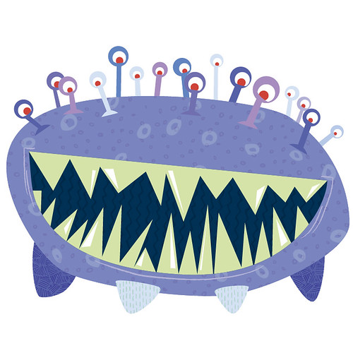
here's my little guy - his front + back legs each have a texture, his skin has two variations of the same texture and his mouth has one. I only used two different pencil brushes for his mouth lines.
This is really adorable and freaky! I love the textures and the eyes and the teeth and and everything! I sort of wish it had more legs, though. But over all, this looks like it would be very in place in, say, Monsters Inc. or something! It's a great design and a great use of Illustrator!
Great eyes definitely has a monsters inc feel. Great color palette and textures. The only thing I would do with it is add a background of some kind. Doesn't need to be to intense just something to give it placement. Awesome design.
I still think this is really cute~ I love your use of textures, especially with how you're playing with scale of the pattern on the main body. Having the smaller circles with the larger circles on top makes a really lovely effect~ I enjoy how it takes an extra second to find some of the softer textures- like the one inside the mouth. I like the little lines you added around the mouth as well~
I love the subtle color shift where you're using textures. This is great. I think you've done a great job choosing textures that also fit with the places that you've used them on. Especially the mouth texture! I also like that you're working with a limited color palette, but that you're really paying attention to how the lights and darks push some pieces forward and backward. He's still a flat-looking guy, but I think that adds a lot. It could be neat to see how you could push the space even further? Maybe play with transparency and give him a couple shadows? Or - i love the linework that youre using, maybe that could show up some other places, too? Nice job, I love how subtle those textures are!

Nice layering and use of depth.
ReplyDeleteI love the colors you used
looks great!
Sam
This is really adorable and freaky! I love the textures and the eyes and the teeth and and everything! I sort of wish it had more legs, though. But over all, this looks like it would be very in place in, say, Monsters Inc. or something! It's a great design and a great use of Illustrator!
ReplyDeleteThis monster is absolutely adorable! One thing I'd maybe do is place it in a warm-colored background to make the colors pop even more.
ReplyDeletegreat subtle use of texture, I especially like the texture in the darker purple nubs and the skin
ReplyDeleteVery cool. The different textures you have definitely work very well with it.
ReplyDeleteGreat eyes definitely has a monsters inc feel. Great color palette and textures. The only thing I would do with it is add a background of some kind. Doesn't need to be to intense just something to give it placement. Awesome design.
ReplyDeleteI still think this is really cute~ I love your use of textures, especially with how you're playing with scale of the pattern on the main body. Having the smaller circles with the larger circles on top makes a really lovely effect~ I enjoy how it takes an extra second to find some of the softer textures- like the one inside the mouth. I like the little lines you added around the mouth as well~
ReplyDeleteThis is such a cute little monster. The textures are subtle but definitely add a lot to to piece. I love the body overlapping texture the most.
ReplyDeleteI love the subtle color shift where you're using textures. This is great. I think you've done a great job choosing textures that also fit with the places that you've used them on. Especially the mouth texture! I also like that you're working with a limited color palette, but that you're really paying attention to how the lights and darks push some pieces forward and backward. He's still a flat-looking guy, but I think that adds a lot. It could be neat to see how you could push the space even further? Maybe play with transparency and give him a couple shadows? Or - i love the linework that youre using, maybe that could show up some other places, too? Nice job, I love how subtle those textures are!
ReplyDelete