AWESOME! I really like the way you handled the different shades in the petal. I would like to see more like in the background and such or zoom in more but I think you did a great job!
You did a wonderful job with mimicking the colors of the piece- nice job with recreating the general shape of the flower as well! One idea that you might try would be to feather some of the shapes to help better-mimic the way that the gradient works, especially in the lower lip/petal of the flower?
I think what you have so far looks great. It would be nice to see how it looks as stand alone though, without the image behind it. It would be cool to see even more of this as a vector
I agree! I really want to see this closer. Maybe next time upload them as separate images or join them vertically, one on top of the other, so we can get a closer view?
It's hard to tell which pieces are Illustrator and which are the original from such a small picture - can you blow this one up next time and post at 500px wide per piece? I can see when I click through on Flickr and that helps! From what I can see, you did a great job sampling colors on the one flower.It looks like you're creating some fun gradients with the way you're layering shapes. It would be good to make some shapes that also might follow the grain of the petal. You start to do it with the pink area- which looks great! you're really getting good depth in the flower as well with the dark inside. The only other thing to consider is creating some shapes that are less pointy in places since this is such a fluid image. Nice work!
Your use of of layering was very nicely handled, successfully putting across the gradients of color in the original. I think you could have maybe put a couple of black layers at the base of the flower piece to give it a bit more of a fade out. I think it would be amazing to see more of the little flower pieces done with the pen tool as well.

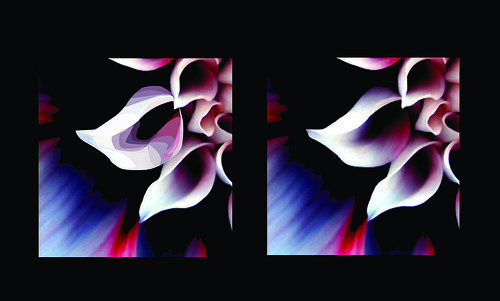
The flowers illustrator work looks good from what I can see. I think it would be great if you cropped it more so we could see it closer.
ReplyDeleteThe flower looks really pretty! One thing I might do, as Alli said, is zoom in on the flower (or work more with the background as well).
ReplyDeleteNiiiiiice. You capture every aspect of the color shift as well. It makes me want to know what the image would look if it was all an illustration.
ReplyDeleteLooks like you have a basic understanding of shading and colors. There was a lot of gradient to work with in this one and I think you handled it well.
ReplyDeleteAWESOME! I really like the way you handled the different shades in the petal. I would like to see more like in the background and such or zoom in more but I think you did a great job!
ReplyDeleteYou did a wonderful job with mimicking the colors of the piece- nice job with recreating the general shape of the flower as well! One idea that you might try would be to feather some of the shapes to help better-mimic the way that the gradient works, especially in the lower lip/petal of the flower?
ReplyDeleteI think what you have so far looks great. It would be nice to see how it looks as stand alone though, without the image behind it. It would be cool to see even more of this as a vector
ReplyDelete-Sam A
I agree! I really want to see this closer. Maybe next time upload them as separate images or join them vertically, one on top of the other, so we can get a closer view?
ReplyDeleteIt's hard to tell which pieces are Illustrator and which are the original from such a small picture - can you blow this one up next time and post at 500px wide per piece? I can see when I click through on Flickr and that helps! From what I can see, you did a great job sampling colors on the one flower.It looks like you're creating some fun gradients with the way you're layering shapes. It would be good to make some shapes that also might follow the grain of the petal. You start to do it with the pink area- which looks great! you're really getting good depth in the flower as well with the dark inside. The only other thing to consider is creating some shapes that are less pointy in places since this is such a fluid image. Nice work!
ReplyDeleteYour use of of layering was very nicely handled, successfully putting across the gradients of color in the original. I think you could have maybe put a couple of black layers at the base of the flower piece to give it a bit more of a fade out. I think it would be amazing to see more of the little flower pieces done with the pen tool as well.
ReplyDelete