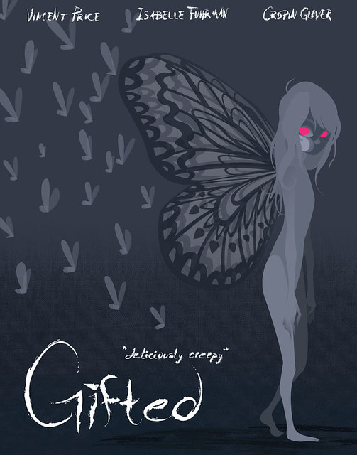
I think this looks great, Maya! I really like the hand-drawn feel of the text.
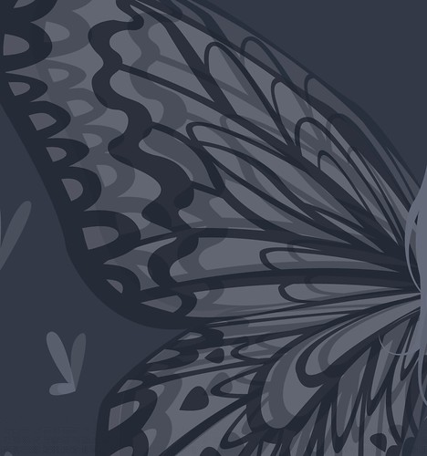
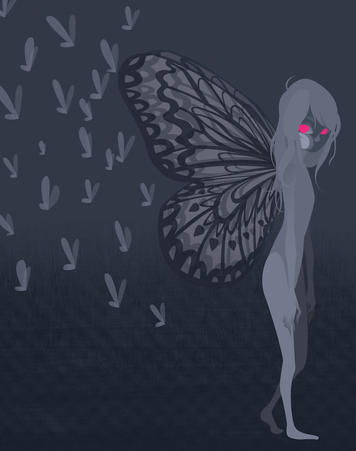
I think it'd be nice to have some more text at the bottom about the movie or rating, something like that. I like the depth you have though Also the wings look great
I agree with Sam. I LOVE the text, and I really like the imagery you used. It fills the page really nicely. But aside from the actors names, there's very little information. I'd add at least a rating and a release date.
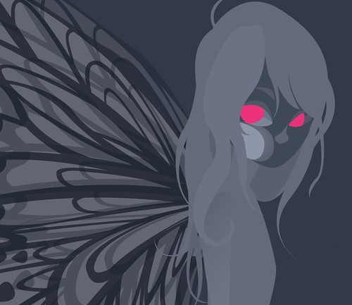
I like this. It reminds me almost of some sort of evil tinkerbell that is super powerful. I didn't notice the background at first, but when I did, it was very eye appealing. I love it. The shadows fit appropriately. Which creates a more lively ora surrounding the character. I would want to see more of the gritty texture in the character of the final poster. But still, other than that. Nicely done!
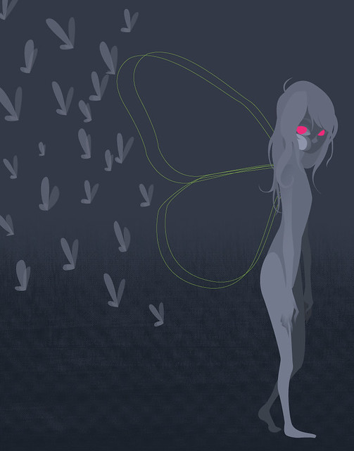
I like the detail in the wings and face, it's very soft and cool. I'm not sure how scary it is but idk if you were going for the steven king effect. The composition I think works except I would like to see some type of a background or orient for me to see where these flying things are coming from.
Really like the text it has a very magical but creepy when placed in that environment. The Wings look amazing. Really nice colors and composition would have liked to see more design in the background. Great work.
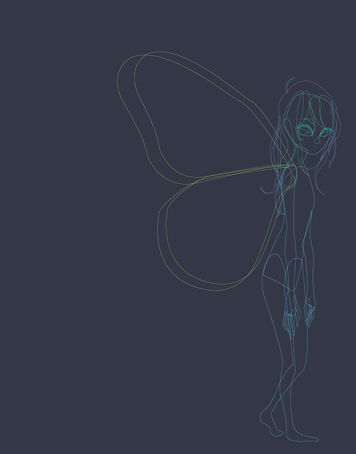
I love seeing your process on this - you're doing a fantastic job creating shapes in the program. Everything feels nice and organic! Which is difficult to do! you've really got a nice handle on the program so far! I loe how you're using the texture in the background to ground her - i could see you using it in a couple other places. maybe there is an alternate texture in her wings that was overlayed a little? Or- maybe a texture in her hair so it could be contrasted against the smoothness of her skin? I think the lighting is really nice on her body, though - and I could see you even intensifying it - as if she was shiny, or if she ahd a couple more details in her body - kind of like how you've handled the fingers. I love that part. Also - if I wasn't married, Crispin Glover would be my alternate boyfriend choice. I think you need to know this.
I think you could also fade out some of the little bugs - so they look liek some of them are going back in space. Also - add a little more movie information. Maybe you could find a place to add the rating, the slug, or some more of the "motion picture" stuff that ususally is included on the bottom of the poster!

I think this looks great, Maya! I really like the hand-drawn feel of the text.
ReplyDeleteI think it'd be nice to have some more text at the bottom about the movie or rating, something like that.
I like the depth you have though
Also the wings look great
Sam
I agree with Sam. I LOVE the text, and I really like the imagery you used. It fills the page really nicely. But aside from the actors names, there's very little information. I'd add at least a rating and a release date.
ReplyDeleteI like this. It reminds me almost of some sort of evil tinkerbell that is super powerful. I didn't notice the background at first, but when I did, it was very eye appealing. I love it. The shadows fit appropriately. Which creates a more lively ora surrounding the character. I would want to see more of the gritty texture in the character of the final poster. But still, other than that. Nicely done!
ReplyDeleteI like the detail in the wings and face, it's very soft and cool. I'm not sure how scary it is but idk if you were going for the steven king effect. The composition I think works except I would like to see some type of a background or orient for me to see where these flying things are coming from.
ReplyDeleteReally like the text it has a very magical but creepy when placed in that environment. The Wings look amazing. Really nice colors and composition would have liked to see more design in the background. Great work.
ReplyDeleteI love seeing your process on this - you're doing a fantastic job creating shapes in the program. Everything feels nice and organic! Which is difficult to do! you've really got a nice handle on the program so far! I loe how you're using the texture in the background to ground her - i could see you using it in a couple other places. maybe there is an alternate texture in her wings that was overlayed a little? Or- maybe a texture in her hair so it could be contrasted against the smoothness of her skin? I think the lighting is really nice on her body, though - and I could see you even intensifying it - as if she was shiny, or if she ahd a couple more details in her body - kind of like how you've handled the fingers.
ReplyDeleteI love that part.
Also - if I wasn't married, Crispin Glover would be my alternate boyfriend choice. I think you need to know this.
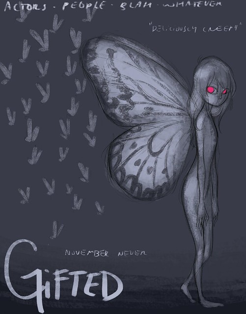
I think you could also fade out some of the little bugs - so they look liek some of them are going back in space. Also - add a little more movie information. Maybe you could find a place to add the rating, the slug, or some more of the "motion picture" stuff that ususally is included on the bottom of the poster!
Nice job! :)