I really enjoy the placement of your textures, especially in the eyes! And the sort of metal tube claw thing is really neat too! The shiny metallic-ness of that really contrasts with the textures!
The shiny tentacle things are awesome, and I like the bloodish texture on the claw. I think you could incorporate a bit more of a lighting element on your monster (like in the eyes or on the face) in order to show that same lighting as your tentacles.
I like the arms of your monster. It makes it look less flat. Your hand/claw looks kind of flat. I think it would be seen better if the red texture was all over it instead of at the tips.
the green squiggly texture around the mouth makes me think he just had snack of some alien spaghetti but when i look at his claw hand stained with red my mind wonders into dark places. Great work on the eyes and arms. Really like the solid shapes you made and textures. I would keep the gradient and maybe add some line work in the background maybe a space ship or something. Great work.
GAH! Terrifying alien man! Did he eat another alien that has both green and red blood? This is super funny and I love that you're messing around with these super glowy colors. I love how you've used the texture on his claw - it's like a caked-over blood patch. It also looks really neat to see the textures that you've used in his eyes are a larger scale - it looks like they're reflecting something that he's standing by. Mabye it's also because you're bringing in the color from the background. It would be neat to see what could happen if you did the background with similar colors but made the gradient thing more subtle? Almost adding some of your own shapes back there so the gradient was a bonus on top of some kind of atmosphere? The control you have on the metal arm things is really nice. it really looks like you've got the hang of the pen tool. Great job.

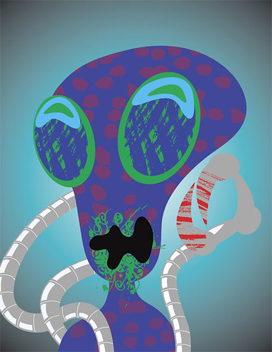
I really enjoy the placement of your textures, especially in the eyes! And the sort of metal tube claw thing is really neat too! The shiny metallic-ness of that really contrasts with the textures!
ReplyDeleteThe metal cords are really well done! I also like the textures in the eyes. The red does seem a little jarring though!
ReplyDeleteThe shiny tentacle things are awesome, and I like the bloodish texture on the claw. I think you could incorporate a bit more of a lighting element on your monster (like in the eyes or on the face) in order to show that same lighting as your tentacles.
ReplyDeleteI like the arms of your monster. It makes it look less flat. Your hand/claw looks kind of flat. I think it would be seen better if the red texture was all over it instead of at the tips.
ReplyDeletethe green squiggly texture around the mouth makes me think he just had snack of some alien spaghetti but when i look at his claw hand stained with red my mind wonders into dark places. Great work on the eyes and arms. Really like the solid shapes you made and textures. I would keep the gradient and maybe add some line work in the background maybe a space ship or something. Great work.
ReplyDeleteThis monster is funny and messy. The texture adds plenty to this design. His eyes and mouth are my favorite. good work
ReplyDeleteGAH! Terrifying alien man! Did he eat another alien that has both green and red blood? This is super funny and I love that you're messing around with these super glowy colors. I love how you've used the texture on his claw - it's like a caked-over blood patch. It also looks really neat to see the textures that you've used in his eyes are a larger scale - it looks like they're reflecting something that he's standing by. Mabye it's also because you're bringing in the color from the background. It would be neat to see what could happen if you did the background with similar colors but made the gradient thing more subtle? Almost adding some of your own shapes back there so the gradient was a bonus on top of some kind of atmosphere? The control you have on the metal arm things is really nice. it really looks like you've got the hang of the pen tool. Great job.
ReplyDelete