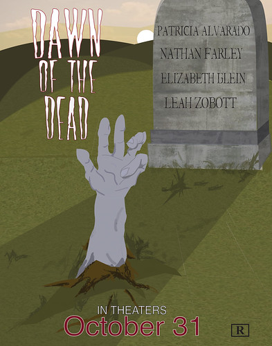
I like the texture and the patchiness of the grass. I also really like that you included a shadow from the tombstone, but I feel like the hand should also have a shadow (slightly darker than the one from the tombstone). I'd also center the text a bit more on the tombstone, as well as add more text. Other than that, it looks great!
I think the position of the hand and the tombstone is great but I don't feel that scared because it looks too much like daylight. Maybe if you muted the colors in everything or just made them all a few shades darker, it would have a darker feel to the piece. You could also add more hues in the sky to make it look more creepy instead of sunny.
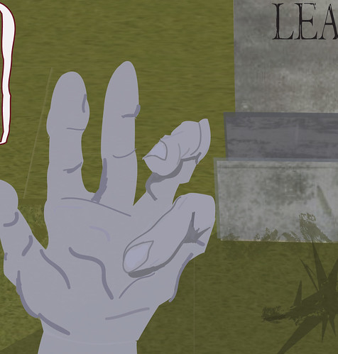
It looks like you are really getting the hang of AI. The only thing I would work on is the hand. It is a little jagged and I think you could really blend the brush strokes in more without loosing the "dead hand" look. I LOVE the lighting in this poster. It is very real looking. The choice of textures on the grass and headstone are also very nice.
I really like the layout of this and how you decided to position the text. I think if you want to push across the idea of dawn a bit more, you could make the sky darker, maybe with red tones or something. Adding a texture to the hand or maybe a couple more layers to it would balance it out a bit more with the tombstone.
you've made a few blades of grass with a brush of some sort, i think you could add some more to make the existing ones seem more cohesive. look at real gravestones to see what the lettering looks like. the names you've got now seem like they were done in a hurry and awkwardly spaced/sized. the title type is looking better, but its placed a little close to the top edge at a square angle. placing it at an angle in consideration with the hand would maybe make it a little more dynamic
I really like where you're going with this! the textures that your'e using for the gravestone are really awesome- I could see you adding another layer of bitmaps on it to gritty it up! Maybe some kind of mossy texture, or something. or cracks! Taht would be amazing. I also think that what Cole said about the text on the tombstone is right on - maybe it's just that you lay out the names a little differently. Maybe make the scale of the type a little smaller and not so spaced out - and even taking the transparency down a little so it blends into the tombstone and looks a little more integrated! IT's super easy to do that - just let me know if you need help! I could also see you adding a texture to the hand - since you did a great job adding it to other elements of the poster, it could be cool to see how that could enhance the skin texture! It looks like you're doing a great job creating atmosphere with the hills. Maybe you could even add a hit of a highlight on the edge of hte tombstone or the edge of the hand sine the sun is setting behind it - it could be a really neat lighting effect. The last thing I would add is the rest of the movie info - like all of the ratings, producer info, and all that stuff that is normally found at the bottom of the poster. You definitely have room for it - and you could shrink the "in theaters Oct 31 part a little in order to make it look nice. Nie job on the textures and the brushes! I would love to see you use them more! :)

I like the texture and the patchiness of the grass. I also really like that you included a shadow from the tombstone, but I feel like the hand should also have a shadow (slightly darker than the one from the tombstone). I'd also center the text a bit more on the tombstone, as well as add more text. Other than that, it looks great!
ReplyDeleteI think the position of the hand and the tombstone is great but I don't feel that scared because it looks too much like daylight. Maybe if you muted the colors in everything or just made them all a few shades darker, it would have a darker feel to the piece. You could also add more hues in the sky to make it look more creepy instead of sunny.
ReplyDeleteIt looks like you are really getting the hang of AI. The only thing I would work on is the hand. It is a little jagged and I think you could really blend the brush strokes in more without loosing the "dead hand" look.
ReplyDeleteI LOVE the lighting in this poster. It is very real looking. The choice of textures on the grass and headstone are also very nice.
I really like the layout of this and how you decided to position the text. I think if you want to push across the idea of dawn a bit more, you could make the sky darker, maybe with red tones or something. Adding a texture to the hand or maybe a couple more layers to it would balance it out a bit more with the tombstone.
ReplyDeleteThis comment has been removed by the author.
ReplyDeleteyou've made a few blades of grass with a brush of some sort, i think you could add some more to make the existing ones seem more cohesive. look at real gravestones to see what the lettering looks like. the names you've got now seem like they were done in a hurry and awkwardly spaced/sized. the title type is looking better, but its placed a little close to the top edge at a square angle. placing it at an angle in consideration with the hand would maybe make it a little more dynamic
ReplyDeleteI really like where you're going with this! the textures that your'e using for the gravestone are really awesome- I could see you adding another layer of bitmaps on it to gritty it up! Maybe some kind of mossy texture, or something. or cracks! Taht would be amazing. I also think that what Cole said about the text on the tombstone is right on - maybe it's just that you lay out the names a little differently. Maybe make the scale of the type a little smaller and not so spaced out - and even taking the transparency down a little so it blends into the tombstone and looks a little more integrated! IT's super easy to do that - just let me know if you need help!
ReplyDeleteI could also see you adding a texture to the hand - since you did a great job adding it to other elements of the poster, it could be cool to see how that could enhance the skin texture! It looks like you're doing a great job creating atmosphere with the hills. Maybe you could even add a hit of a highlight on the edge of hte tombstone or the edge of the hand sine the sun is setting behind it - it could be a really neat lighting effect. The last thing I would add is the rest of the movie info - like all of the ratings, producer info, and all that stuff that is normally found at the bottom of the poster. You definitely have room for it - and you could shrink the "in theaters Oct 31 part a little in order to make it look nice. Nie job on the textures and the brushes! I would love to see you use them more! :)