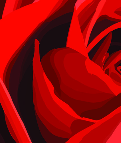
I like the image you chose, and I think the composition and reds look nice together the way they're arranged. I think some of the vector edges could've been a bit neater though, and make sure both images are the same size when you edit them before posting.
You have a nice use of gradient in steps on the larger pedals; it doesn't feel like you've missed an important shade. It gets a little confusing in the center of the rose without the reference image / everything starts to blend together into flat shapes. Also, I would just work on having smoother edges to your shapes for a more polished look.
I really like the steps of red into the deeper shadows, but I agree that yor edges do get rather jaggedy! Also I think it would have been nice if you brought out some of the lighter highlights. You seem to have tried to capture a couple of them, but they are a bit brighter in the original and I think your image could benefit from that pink!
I like how you chose to create the petals using the contours of the roses - and that your color gradients follow the curves of those petals. I think you also did a really good job going between more subtly tones of red, so the jumps between them aren't too harsh. I could see you adding a small hot-shine on the top of some of the very edges of the petals, and maybe now that you are learning the pathfinder, it will make some of the petal-making easier!! There are a couple jaggedy edges that you could even use the smooth tool on if you wanted to make them more fluid -- like on the edge of one of the petals there is a little blip, but it's an easy fix! I think you did a great job. Thank you for taking the time to do this! Flickr looks good, too! I'll help you get that one image bigger so it won't default smaller for you next time!!

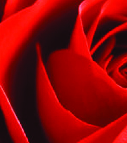
I like the way you layered the shading on this one, i think it creates a clear sense of depth.
ReplyDeleteI like the image you chose, and I think the composition and reds look nice together the way they're arranged. I think some of the vector edges could've been a bit neater though, and make sure both images are the same size when you edit them before posting.
ReplyDelete-Sam A
I appreciate how you studied every shade of red. It feels like you paid very close attention the the color shifts!
ReplyDeleteYou have very nice gradient in your flower. The colors match well but some of the lines are a little crooked.
ReplyDeleteYou have a nice use of gradient in steps on the larger pedals; it doesn't feel like you've missed an important shade. It gets a little confusing in the center of the rose without the reference image / everything starts to blend together into flat shapes. Also, I would just work on having smoother edges to your shapes for a more polished look.
ReplyDeleteI really like that you created a sense of depth. That looks great. I'd maybe clean up some of the edges though.
ReplyDeleteI really like the steps of red into the deeper shadows, but I agree that yor edges do get rather jaggedy! Also I think it would have been nice if you brought out some of the lighter highlights. You seem to have tried to capture a couple of them, but they are a bit brighter in the original and I think your image could benefit from that pink!
ReplyDeleteVery nice shapes. I noticed a few anchor points that stick out a bit. To fix that you can use the direct selection tool to get rid of them.
ReplyDeleteI like how you chose to create the petals using the contours of the roses - and that your color gradients follow the curves of those petals. I think you also did a really good job going between more subtly tones of red, so the jumps between them aren't too harsh. I could see you adding a small hot-shine on the top of some of the very edges of the petals, and maybe now that you are learning the pathfinder, it will make some of the petal-making easier!! There are a couple jaggedy edges that you could even use the smooth tool on if you wanted to make them more fluid -- like on the edge of one of the petals there is a little blip, but it's an easy fix! I think you did a great job. Thank you for taking the time to do this! Flickr looks good, too! I'll help you get that one image bigger so it won't default smaller for you next time!!
ReplyDelete