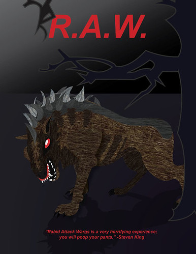
Gotta say I love the textures in this one. I think you used them very well. I kind of wish the tree had some more detail in it. The outline makes it stand out a lot from the dog, and the top of the tree at the top of the poster is a bit confusing. I couldn't tell what it was at first. Good color choice Maybe add something else to the background to hint more at what the movie is about?
The textures on this are awesome and I love your color choices for the creature and the background. The text is a little off-putting to me being that the shape of the letters are so clean looking. Making them look a bit more ragged or even just adding a texture to them would make them flow better with the poster. Also, the bright red text is a bit startling to me, it would be great if it was just a bit darker, perhaps.
The textures are pretty intense, but I think there is too much contrast between the image of the monster and the background. While your beast is full of interesting textures, your background is smooth, clean gradients. Perhaps blending the two sublty would be a step forward in this piece.
I like that you added shadows on your creature. It makes it look less flat. Your tree though does look flat. Maybe you could add texture to it along with some shadow. Also, adding some texture to the ground would definitely let us know more about where the character is.
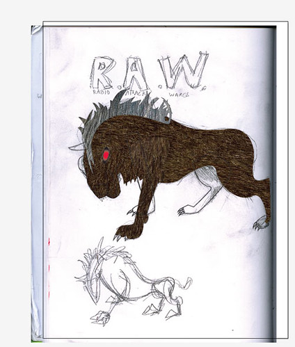
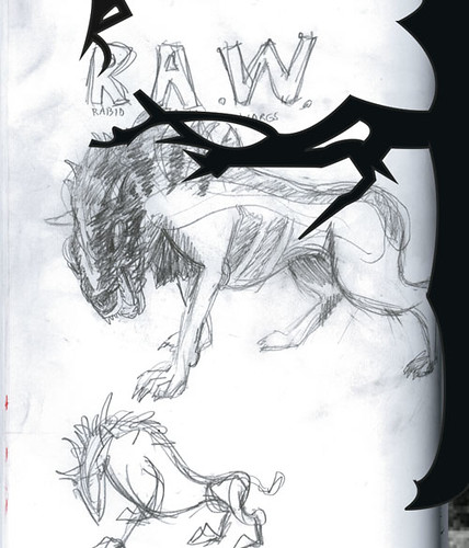
the gradient background and simple, default type sortof cheapen the great textures and detail you've achieved in the monster. the rough title from your sketch looks a lot more fitting of the content and mood you're going for. you could also try adding (or at least hinting at) more the presence of more wargs.
I like the textures and the color scheme it feels very dark and 80's horror filmish. The font is ok but the branch above it looks like the letter R it would be interesting to see the RAW be spelled with custom letters like that. Great work on the warg.

Gotta say I love the textures in this one. I think you used them very well. I kind of wish the tree had some more detail in it. The outline makes it stand out a lot from the dog, and the top of the tree at the top of the poster is a bit confusing. I couldn't tell what it was at first.
ReplyDeleteGood color choice
Maybe add something else to the background to hint more at what the movie is about?
Sam
The textures on this are awesome and I love your color choices for the creature and the background. The text is a little off-putting to me being that the shape of the letters are so clean looking. Making them look a bit more ragged or even just adding a texture to them would make them flow better with the poster. Also, the bright red text is a bit startling to me, it would be great if it was just a bit darker, perhaps.
ReplyDeleteThe textures are pretty intense, but I think there is too much contrast between the image of the monster and the background. While your beast is full of interesting textures, your background is smooth, clean gradients. Perhaps blending the two sublty would be a step forward in this piece.
ReplyDeleteI like that you added shadows on your creature. It makes it look less flat. Your tree though does look flat. Maybe you could add texture to it along with some shadow. Also, adding some texture to the ground would definitely let us know more about where the character is.
ReplyDeletethe gradient background and simple, default type sortof cheapen the great textures and detail you've achieved in the monster. the rough title from your sketch looks a lot more fitting of the content and mood you're going for. you could also try adding (or at least hinting at) more the presence of more wargs.
ReplyDeleteI like the textures and the color scheme it feels very dark and 80's horror filmish. The font is ok but the branch above it looks like the letter R it would be interesting to see the RAW be spelled with custom letters like that. Great work on the warg.
ReplyDelete