Way to go with posting. It looks correct. I can really see the original image in the one you made. I would love to see some more textures/colors in the cheeks and the skin tone.
I think you could've played more with lighting in your vector image. There are a lot of subtle tones around your nose lips and face in the photo that could help add more volume to the image
I think that a couple more shapes and looking closer at the original image could have helped a little bit. The image is easy to read however it feels flat in comparison to the original. Possibly playing with transparency would have helped.
For some reason, I enjoy the mischievous look of this illustration. Without even viewing the whole character, It makes me feel as if this woman is planning something devious. Which always makes for an interesting story.
I think the parts where there are shadows around the nose and mouth could have been integrated with a little more transparency. They seem very dark, more like marks than shades.
You did a nice job with capturing the shapes of the different pieces, especially in the lips. I do wish that you had added a bit more of shading/shadows to the piece though- especially under the nose and at the sides of the face. I feel like this'd help it appear much more 3D and reduce that really sharp contrast with the background color.
Great job replicating the purples in the skin tone from the original picture. I think you did a great job getting the main shapes in, now it would be great for you to do some additional shapes on top, using opacity to get some round-ness in the cheeks and the lips! There are a lot of great areas that could also use a little bit of pink - like in the cheeks - where you could draw a shape and then lower the opacity of the pink shape to- like - 15% and see the cheek come to life! Practice making a couple more fluid shapes for some of the higher elevated areas of the face. Then it'll feel softer, much like the picture! Great posting from flickr, this looks perfect.

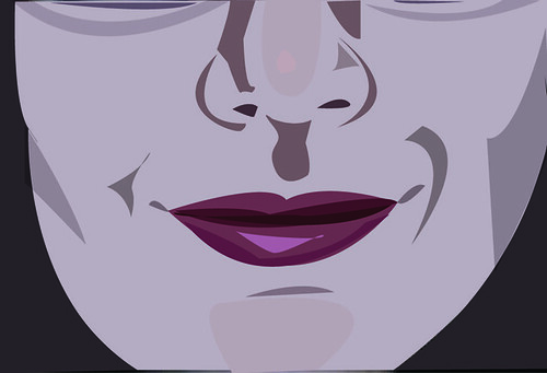
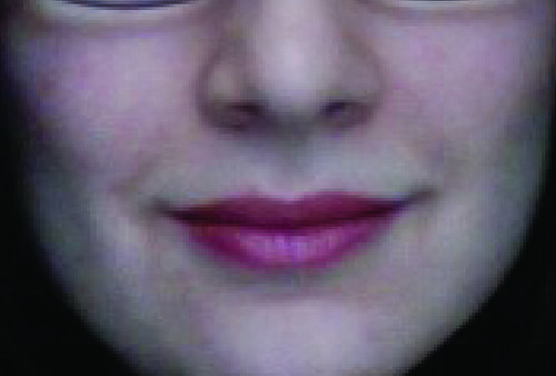
Way to go with posting. It looks correct.
ReplyDeleteI can really see the original image in the one you made. I would love to see some more textures/colors in the cheeks and the skin tone.
Your image is really cool, love the lips. I wish i could see more skin tones on your cheeks and nose but other than that i think you did well.
ReplyDeletePost set up works very well
ReplyDeleteI think you could've played more with lighting in your vector image. There are a lot of subtle tones around your nose lips and face in the photo that could help add more volume to the image
I think that a couple more shapes and looking closer at the original image could have helped a little bit. The image is easy to read however it feels flat in comparison to the original. Possibly playing with transparency would have helped.
ReplyDeleteFor some reason, I enjoy the mischievous look of this illustration. Without even viewing the whole character, It makes me feel as if this woman is planning something devious. Which always makes for an interesting story.
ReplyDeleteA bit more shadowing at the sides of the cheeks would help break the flatness of the primary face color
ReplyDeleteI think the parts where there are shadows around the nose and mouth could have been integrated with a little more transparency. They seem very dark, more like marks than shades.
ReplyDeleteYou did a nice job with capturing the shapes of the different pieces, especially in the lips. I do wish that you had added a bit more of shading/shadows to the piece though- especially under the nose and at the sides of the face. I feel like this'd help it appear much more 3D and reduce that really sharp contrast with the background color.
ReplyDeleteGreat job replicating the purples in the skin tone from the original picture. I think you did a great job getting the main shapes in, now it would be great for you to do some additional shapes on top, using opacity to get some round-ness in the cheeks and the lips! There are a lot of great areas that could also use a little bit of pink - like in the cheeks - where you could draw a shape and then lower the opacity of the pink shape to- like - 15% and see the cheek come to life! Practice making a couple more fluid shapes for some of the higher elevated areas of the face. Then it'll feel softer, much like the picture! Great posting from flickr, this looks perfect.
ReplyDeleteExcellent choices of construction and value in each shape, if anything I would just add more shapes to get more value.
ReplyDelete