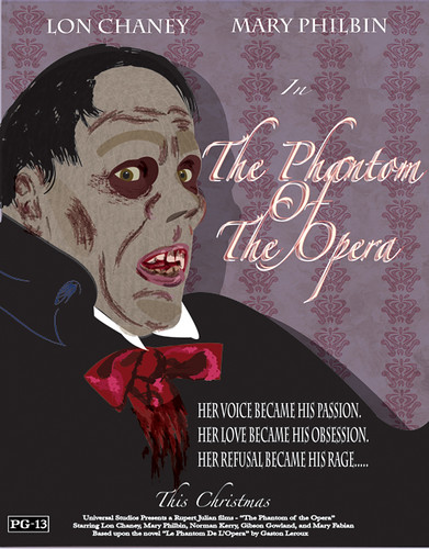
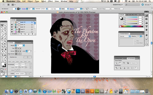
I love the amount of texture you got into the poster. The bow tie looks very shiny and the face has a nice weathered look. I seems like you have an understanding of how to use illustrator. The texture in the background could use a little work. It is distracting for me. Maybe if the icons are smaller or dimmer it will work better.
I just noticed the shadow on the wall from the face. That is a nice touch.
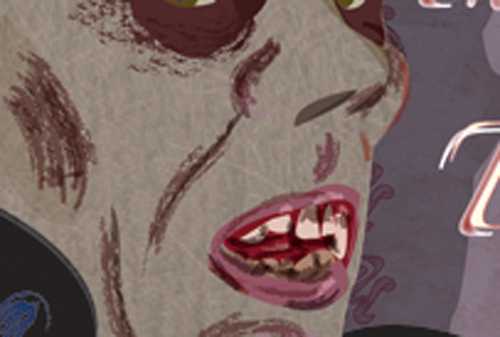
Man okay those teeth are super freaking me out. They look super gross! This definitely looks creepy and vintage-y! Maybe not exactly like a horror movie, but pretty good! However I think your font choices and placements need some revision. Also it looks sort of fuzzy on the close up and I am worried that your textures will not expand well.
His face is pretty gritty with texture which makes him look nasty. I like the variety of texture, but I feel that It could be used in more parts of this piece.
I lovelovelove the way you used your textures in this, it really contributes to the grossness of the guy. I like the shadow you gave him too. I think giving the image more darks or shadows can further push the scary horror feeling. Maybe giving your main title a teeny shadow would give it more depth like your guy has.
You're always very good with color choices, everything compliments itself very well in that regard. I would probably clean up around the eyes and eyebrows a bit so it looks more integrated with his face. The type is very nice too, looks like a real movie
You've got some wonderful textures in the face here- it almost looks like zombie Phantom of the Opera! The texture in the hair is beyond lovely, and the bow is well done as well~ The ear seems to be blended oddly into the side of his head, and the shadows above the eyes seem a bit strange/less thoughtful, to me. I think your text placement is well spaced, and I love the fact that you added the shadow to place him right up against the wall.
Reba, this is awesome. I LOVE how you've handled the stylization of his face. Especially his mouth. It looks awesome and really gritty. I think his eyebrow shadows could be softened around the edges a little with the same brush you use on his cheeks. It looks really really nice. I love how you've handled his hair, too - it has a great texture. The backgroudn wallpaper is an awesome addition to the piece - really nice pattern to complement the tone! Thanks for also including all of the movie information, title and actors names! The only thing I would modify is to have only one layer of type for the title, because it's got two layers, it gets a little hard to read. Maybe because it's such a skinny font? I like the idea of a script font, but maybe there is one that is a little thicker, or maybe just taking the white layer away would do it! I think you could also shrink the "her voice became his passion...." text to about 50% of what it is right now. It looks great there, but it gets a little close to his tie. I'd also shrink the title a little so it's not as close to his face. Great job on this. It looks like you've got some really nice tricks in Illustrator!


I love the amount of texture you got into the poster. The bow tie looks very shiny and the face has a nice weathered look. I seems like you have an understanding of how to use illustrator.
ReplyDeleteThe texture in the background could use a little work. It is distracting for me. Maybe if the icons are smaller or dimmer it will work better.
I just noticed the shadow on the wall from the face. That is a nice touch.
Nice job!
Man okay those teeth are super freaking me out. They look super gross! This definitely looks creepy and vintage-y! Maybe not exactly like a horror movie, but pretty good! However I think your font choices and placements need some revision. Also it looks sort of fuzzy on the close up and I am worried that your textures will not expand well.
ReplyDeleteHis face is pretty gritty with texture which makes him look nasty. I like the variety of texture, but I feel that It could be used in more parts of this piece.
ReplyDeleteI lovelovelove the way you used your textures in this, it really contributes to the grossness of the guy. I like the shadow you gave him too. I think giving the image more darks or shadows can further push the scary horror feeling. Maybe giving your main title a teeny shadow would give it more depth like your guy has.
ReplyDeleteYou're always very good with color choices, everything compliments itself very well in that regard. I would probably clean up around the eyes and eyebrows a bit so it looks more integrated with his face. The type is very nice too, looks like a real movie
ReplyDeleteYou've got some wonderful textures in the face here- it almost looks like zombie Phantom of the Opera! The texture in the hair is beyond lovely, and the bow is well done as well~ The ear seems to be blended oddly into the side of his head, and the shadows above the eyes seem a bit strange/less thoughtful, to me. I think your text placement is well spaced, and I love the fact that you added the shadow to place him right up against the wall.
ReplyDeleteReba, this is awesome. I LOVE how you've handled the stylization of his face. Especially his mouth. It looks awesome and really gritty. I think his eyebrow shadows could be softened around the edges a little with the same brush you use on his cheeks. It looks really really nice. I love how you've handled his hair, too - it has a great texture. The backgroudn wallpaper is an awesome addition to the piece - really nice pattern to complement the tone!
ReplyDeleteThanks for also including all of the movie information, title and actors names! The only thing I would modify is to have only one layer of type for the title, because it's got two layers, it gets a little hard to read. Maybe because it's such a skinny font? I like the idea of a script font, but maybe there is one that is a little thicker, or maybe just taking the white layer away would do it! I think you could also shrink the "her voice became his passion...." text to about 50% of what it is right now. It looks great there, but it gets a little close to his tie. I'd also shrink the title a little so it's not as close to his face.
Great job on this. It looks like you've got some really nice tricks in Illustrator!