"Another story of fishing conflict between Raven and gulls comes from the Tsimshian of Alaska: Raven had caught a number of small fish—olachen—which he was cooking over a fire. When he called the gull, many gulls came and ate all of the fish. Angered, Raven punished the gulls by throwing them into the fire, and that is why many gulls in Alaska have black wing tips." (Taken from
link)
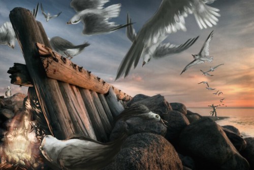
Progress Shots:
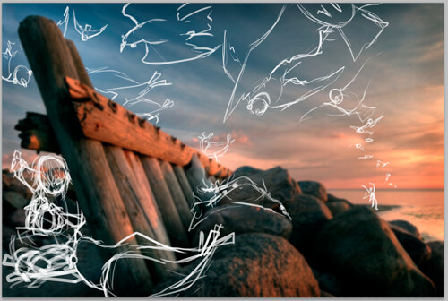
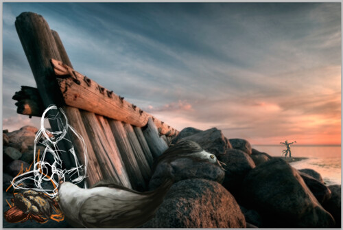
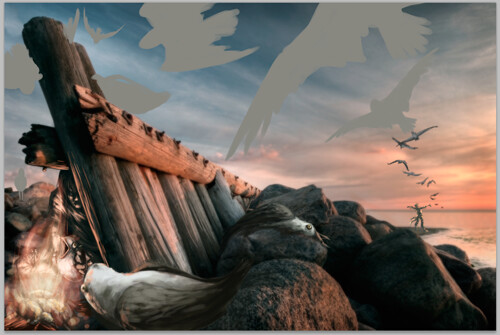
Detail Shots:


This image works wonderfully! I really like the painterly textures you gave the seagulls!
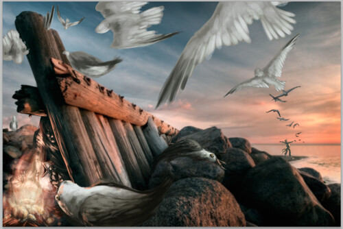
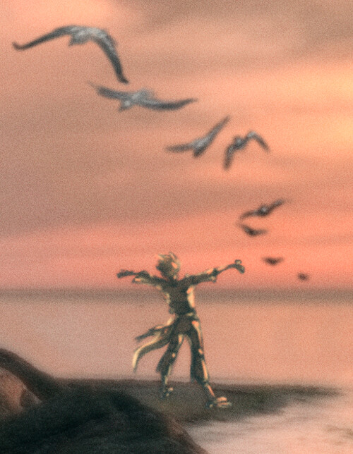
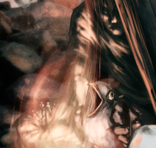
ReplyDeleteWell! You managed to do it. I love how you tucked that figure away - it is perfect placement! The way you handled the fire is completely gorgeous as well! It looks unearthly - like a fiery aurora! The lighting on the closest seagull is gorgeous! I think the farther ones could be touched by the light of the sky a little more.
ReplyDeleteThis is great. I like the fact that you paid attention to every detail, even the man standing on the beach. I didn't notice him at first glance, but when I did, I felt as if a whole new story was being told.
ReplyDeleteholy moly! you obviously spent SO MUCH TIME on this. Great job integrating. I am so jealous of your attention to detail and skillz. sweet
ReplyDeleteI love the way you've handled the space in this piece. there's an obvious way that you are supposed toe read it - and it's really nice having direction for how my eye moves around this. I think you've done a great mob with the way you've handled the character in the way background - and all of the birds that are cominng from his direction. It looks wonderful because you've paid attention to hazing out the characters and making them feel really grainy and atmosheric like the rest of the photo out there. I also like how yo'uve added orange to his body. This is something that I think could make your birds even more exciting. It seems like if you added just a hit of reflected light on their feathers, that matched the colors of the sunset - as you do with he figure - that that would be a perfect way for them to seem wonderfully integrated. In fact, I think that you should definitely do just that! The more I look at the way that you're bringing light into the close figure, the light on the fence, the light on the rocks... everything seems to have that great orange glow. THat would be a PERFECT way to get your birds feeling wholly integrated. I also think that you could sharpen, or add a tiny bit of detail to the bird that is in the immediate foreground -- and then (as much as it pains me to say this) maybe blur out the figure behind the fence just a tiny bit. That way the focus matches that of the photo! Overall, this is done wonderfully. I love the space, your choice of the original image, and the way you've used the foreground, middleground, bkgrd. awesome job on this!
ReplyDelete