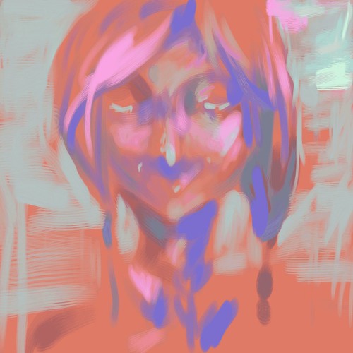
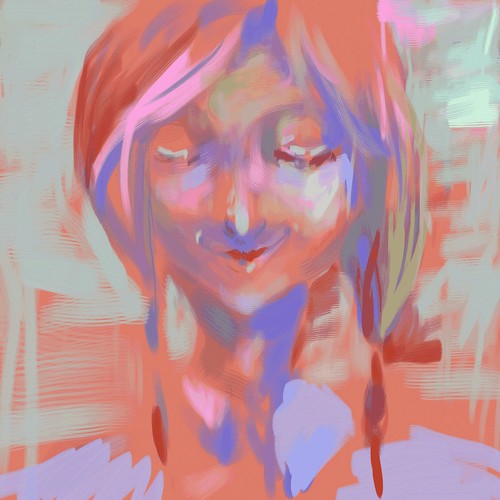
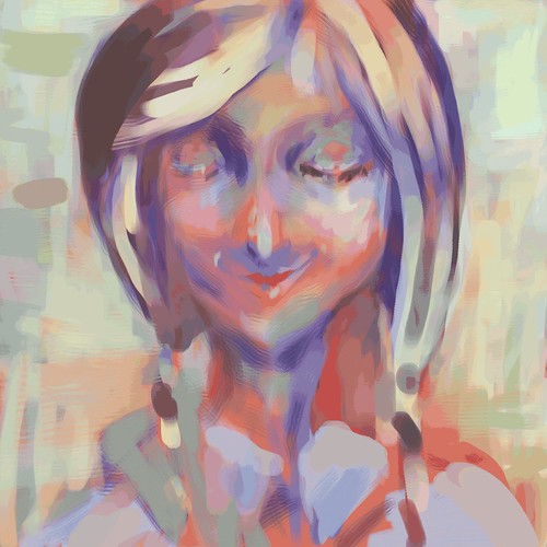
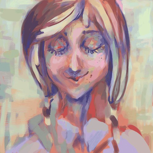
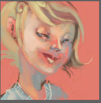
This is a humanized version of the toriningen in the game Yume Nikki. I really liked working this way and I lovelovelove painter so much! I like using a combination of the soft colored pencil and chalk and acrylics also I used the real pointed eraser that really helped a lot!
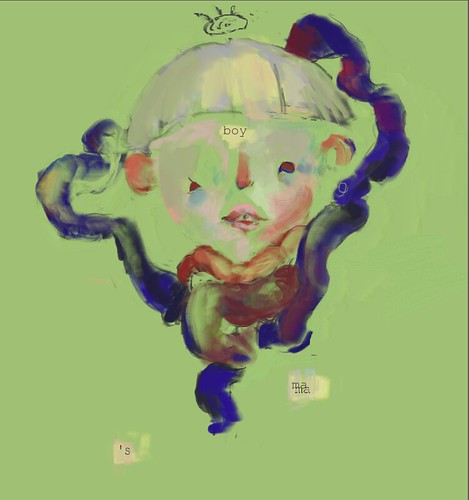
Process shots:
Final:
Also here are some other painter portraits that I am working on:

I feel like you could make one more pass on your final piece. I think you've got a really good start, but it also feels just a little incomplete to me.
ReplyDeleteI love how expressive you get with your colors and brush strokes! The placement of your colors is gorgeous and I love her expression.
ReplyDeleteyour style is very painterly, but sometimes for these assignments muddy. a bit more definition and contrast would make this piece really stand out
ReplyDeleteThe dark browns and purples really help give this realistic depth, and although the coloring in general seems sporadic, it's not sloppy. Instead it looks quite visceral and dreamy. Nice!
ReplyDeleteI love how expressive this is and I enjoy your color choices. I think she still needs just one more layer of definition to pull her from the background, though.
ReplyDeleteAs always, I'm jealous of your ability to use color like this, it looks fantastic! I almost miss the scratchy brush texture you have in the last progress shot you have here- especially in the cheeks, I love how the colors blended together.
ReplyDeleteI can tell that you have a specific style and color palette to your pieces that make them all look tied in together. That is awesome.For this piece though, it would be nice to see some more defining edges like in her clothing and neck area. It starts to get lost in the background a little.
ReplyDeleteGod, your work always has a lot great color!
ReplyDeleteI love your broad mark-making on this. It is nice to see how your color builds up in your process! One thing that I especially like is seeing how you're adding color to the whole piece at the same time = you're very daring with it and it's inspiring!! I love how the face is finalized, I think the shirt could have just a touch more color added so it's on the same level of the face! Maybe you could also add a sharper section of the shirt - maybe just in the collar area, so you keep that really great atmospheric quality you've created as the image gets closer to the edge of the art board. The other thing I think you've done really well with this is : as i squint my eyes, I see how yo'ure playing wiht value. It is really refreshing to see that no matter how you play with color, yo'ure still thinking of value.
ReplyDeleteExcited to see what else you make with painter! Seems right up your alley!! Keep going! :)