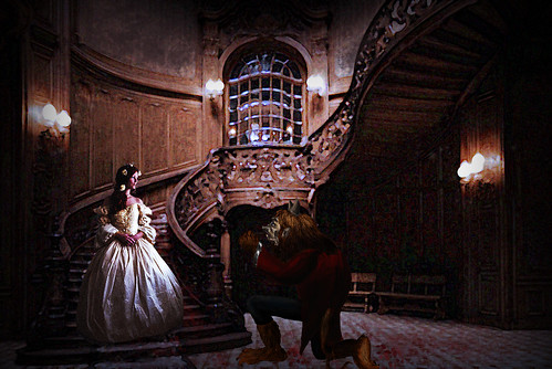
This is the ORIGINAL fairy tale (not the Disney version). More info can be found here: http://en.wikipedia.org/wiki/Beauty_and_the_beast
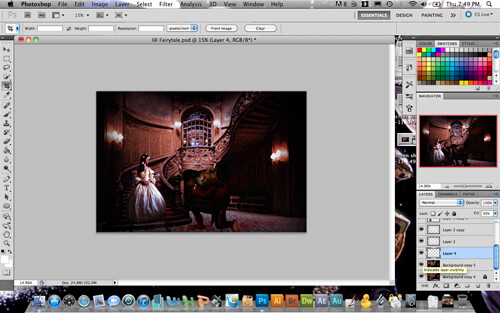

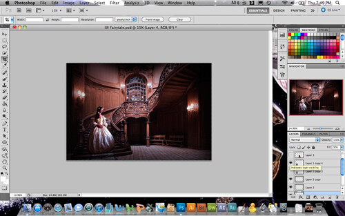
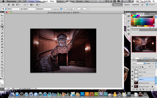
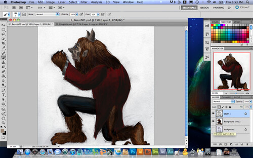
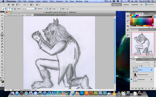
The Beast was drawn and painted by me.
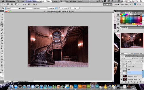
Background: http://www.istockphoto.com/stock-photo-4403406-casino-stairs.php?st=89cbd40
Model: http://mizzd-stock.deviantart.com/gallery/?q=princess+#/d3f36ud

I really like the way you incorporated the beast and the lady. Did you draw the lady? I would love to see it in the same style as the beast.
ReplyDeleteExcellent work in merging the characters with the environment, the beast is well constructed. The dramatic lighting like this should have been pushed more in the Disney movie. The beast's back side, because of that light in the right of the photo, I think should be lit up a bit more. This would also make him a little bit more visible too because from far away it's a little too dark to see him. Great job Reba :)
ReplyDeleteThe lady was from a stock image. I gave her a paint dab filter and a colored pencil filter to make her more integrated. I also did this to the background.
ReplyDeleteThe interaction between your drawing and the lady work really well! I feel like you could maybe lower the sharpness of your lady to match the softness of the beast and the environment. The beast could be lit from behind a bit from that light. You did a great job!
ReplyDeleteI really like seeing your process on this! I think you've done a great job creating a vignette around the scene, to bring our eyes into the center. I think the images that you've chosen ( Belle and the background) work well togehter and the way that you've treated her dress at the bottom - by making it darker and closer in tone to the rest of the work, is nice as well. I also like how the majority of the work is done in the gloomy color palette- as you've done the beast. I like how he's fading into the darkness near the bottom. One thing that would be nice is to maybe even darken Belle just a bit more, maybe add a warm orange overlay ( or some other kind of warm overlay over a part of her dress so that the color of the lighting matches just a tiny bit more! I like how you've started to bring in textures to some of hte piees and I would encourage you to keep going. There is a lot of great texture in the beast that I could see you add to the background elements as well - this will help tie him in even further. I do like, however, how you've treated the scene. After reading the excerpt from wikipedia that you referenced, I imagine that this part is one of the many times he asks her to marry him. Great job on this and nice combination of painterly techniques and photos.
ReplyDelete