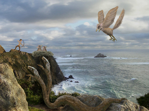
I really like how you incorporated the snake. I think you could add a bit more shadow or texture to the male figure on the left to make him less flat compared to his surroundings.
I think the lighting on the snake head is working the best out of your added characters. The others don't seem to reflect the right-to-left light source, and therefore look more like stickers on the photo.
The animals and character are really cool looking. I think you might need to fix the composition a little bit so as to give the viewer a certain place of action to focus. If the character with the bow is supposed to be more important (I'm not sure) he could be a bit bigger or maybe have some colors that would make him pop out compared to the other characters.
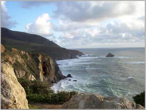
This is a really cool combination of photoshop and painted imagery. I love what you've done to the photo in order to make it your own, and to make the scene much more focused. I particularly like how you've created only one jutting peak for the main guy to stand on - this helps frame the scene well. I think the way you're treating the characters is really fun, especially how you're rendering the shape - it seems like it's a nice, fairly natural combination of paint and photo -- I could see you blurring the mouth edges slightly so that the rim of the snake's cut-out mouth has a little bit of a hazyness. this will help it feel like it turns in space more. I also like how you're incorporating a lot of great textural elements in to the creatures. I think it would be great to see what you can do to add a little more natural feeling into the man. I think what I mean is that when I look at him, he feels like he's entirely painted, which gives him a little bit of a different style than the way that yo'uve handled the rest of the creatures? Maybe there is some kind of captured texture that you can incorporate into his clothing? Maybe his bow and arrow is treated a little bit differently? The other thing that I could see you doing is to try to give him a little more focus by playing with the saturation of him and his outfit. I think right now he is probably the second or third thing in the image that you look at -- maybe he deserves to be more prominant? Not bigger or anything, but maybe there is a way to point him out more? Great job on this!

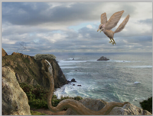

I really like how you incorporated the snake. I think you could add a bit more shadow or texture to the male figure on the left to make him less flat compared to his surroundings.
ReplyDeleteI think the lighting on the snake head is working the best out of your added characters. The others don't seem to reflect the right-to-left light source, and therefore look more like stickers on the photo.
ReplyDeleteThis comment has been removed by the author.
ReplyDeleteThe animals and character are really cool looking. I think you might need to fix the composition a little bit so as to give the viewer a certain place of action to focus. If the character with the bow is supposed to be more important (I'm not sure) he could be a bit bigger or maybe have some colors that would make him pop out compared to the other characters.
ReplyDeleteThis is a really cool combination of photoshop and painted imagery. I love what you've done to the photo in order to make it your own, and to make the scene much more focused. I particularly like how you've created only one jutting peak for the main guy to stand on - this helps frame the scene well. I think the way you're treating the characters is really fun, especially how you're rendering the shape - it seems like it's a nice, fairly natural combination of paint and photo -- I could see you blurring the mouth edges slightly so that the rim of the snake's cut-out mouth has a little bit of a hazyness. this will help it feel like it turns in space more. I also like how you're incorporating a lot of great textural elements in to the creatures. I think it would be great to see what you can do to add a little more natural feeling into the man. I think what I mean is that when I look at him, he feels like he's entirely painted, which gives him a little bit of a different style than the way that yo'uve handled the rest of the creatures? Maybe there is some kind of captured texture that you can incorporate into his clothing? Maybe his bow and arrow is treated a little bit differently? The other thing that I could see you doing is to try to give him a little more focus by playing with the saturation of him and his outfit. I think right now he is probably the second or third thing in the image that you look at -- maybe he deserves to be more prominant? Not bigger or anything, but maybe there is a way to point him out more? Great job on this!
ReplyDelete