i really like how you approached this, the color scheme, the lighting, everything is awesome! i love it! it seems like you understand how to use this program nicely. bravo
I enjoy the colors you used a lot! Very sunset-y! I think his expression is a bit stiff, but it actually doesn't look out of place. It works. I wish you could pull in some of those golden tones into the background because even though I love the treatment of the man, he feels very separate from the background.
The colors you're bringing into this- especially the blues/purples you're using as shadows, work together really nicely. I feel like you could've added a bit more depth to the face, perhaps bringing in the blue/purple shadows you've used everywhere else?
I think the way you played with colors on him work so well. The purples and yellows work beautifully together. The bubblegum pink background kinda throws me off a bit though, maybe some kind of blue or green would work a bit better. I think this piece would really benefit from having the contrast bumped up a bit, giving it a bit more depth.
Haha wow this would have really fooled me! This looks like it was really done in chalk pastel. I love the colors, working with light and shadow more might help make this man really come to life!
I like your interpretation of using all hot colors for him - i think the use of the light yellow on the brim of his hat , and the shiens in his glasses are really nice, along with the way that the light hits the collar of his shirt and his shoulders. Nice job! I could also see you adding a bit of light into the brow a little bit more, or maybe the apples of his cheeks! One thing I think you've done really well, too - is bringing in the color troughout the whole piece - like - I can see where you've added a nice amount of purple into the shadows. I could see you even getting daring with it under the brim of the hat, too - or maybe under his chin on the right hand side, almost liek the light gets cooler in places of extreme shadows!

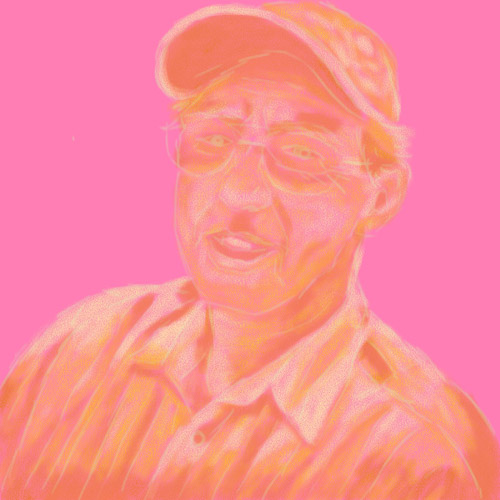
The colors you used work well. The lighting and the brush strokes look good. Very nice!
ReplyDeletei really like how you approached this, the color scheme, the lighting, everything is awesome! i love it! it seems like you understand how to use this program nicely. bravo
ReplyDeleteI enjoy the colors you used a lot! Very sunset-y! I think his expression is a bit stiff, but it actually doesn't look out of place. It works. I wish you could pull in some of those golden tones into the background because even though I love the treatment of the man, he feels very separate from the background.
ReplyDeleteThe colors you're bringing into this- especially the blues/purples you're using as shadows, work together really nicely. I feel like you could've added a bit more depth to the face, perhaps bringing in the blue/purple shadows you've used everywhere else?
ReplyDeleteyeah! love the colors and the builds. great choices
ReplyDeleteI think the way you played with colors on him work so well. The purples and yellows work beautifully together. The bubblegum pink background kinda throws me off a bit though, maybe some kind of blue or green would work a bit better. I think this piece would really benefit from having the contrast bumped up a bit, giving it a bit more depth.
ReplyDeleteHaha wow this would have really fooled me! This looks like it was really done in chalk pastel. I love the colors, working with light and shadow more might help make this man really come to life!
ReplyDeletereally like the color of this one,and the high light works really well
ReplyDeleteI like your interpretation of using all hot colors for him - i think the use of the light yellow on the brim of his hat , and the shiens in his glasses are really nice, along with the way that the light hits the collar of his shirt and his shoulders. Nice job! I could also see you adding a bit of light into the brow a little bit more, or maybe the apples of his cheeks! One thing I think you've done really well, too - is bringing in the color troughout the whole piece - like - I can see where you've added a nice amount of purple into the shadows. I could see you even getting daring with it under the brim of the hat, too - or maybe under his chin on the right hand side, almost liek the light gets cooler in places of extreme shadows!
ReplyDelete