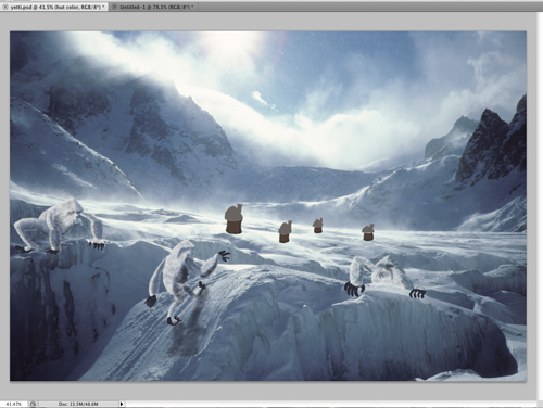
This was integrated really nicely! I kind of find the crouching yeti on the left a little distracting, but other than that it looks great! The shadow on the yeti walking up the mountain is a really nice touch.
I love the textures that you used on your yeti's and on the rooftops of your houses. I am also glad that you added a shadow under the yeti that is walking up the building. Maybe you could add more shadows under the other ones as well. Also, good job with pulling the colors from the original image into your characters.
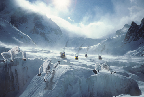
This is pretty awesome. The execution of the characters pulls me in to thinking that the landscape is animated as well. They really fall into place nicely. Good work.
Your creatures are incorporated really nicely! The shadow beneath the walking one looks great. I think you can put a bit more detail into the hands and feet to match the detail in the body.
The greatest part is in your character development and placement of them. I like the little houses but they could probably be blended with the background a little more but great pull of colors. I really like the yeti on the left I would like to see a bit more detail in the eyes but great textures and placement on the hill. The yeti on the right blends into the snow a bit but with the light they way it is I think that is supposed to do that. I like the the way the hands stand out and pulls you in to see the rest of him. The middle guy is my favorite with the traditional yeti pose and the great cast shadow. The only thing I would do with it is fill in the eyes a little more but not to much so they don't distract from the rest. Great job on the overall design I think the illustrations and photo merge well together.
Great photo to use! This is a gorgeous setting for a great topic. This photo lends itself to a great use of foreground, middle ground bkgrd. I love tha tyou've included both characters and dwellings .I 'm not sure if the dwellings are from some humans that live there? Or if they're supposed to be further back and they're actually for the yetis. I t seems that they're pretty small, so I"m going to guess they're for the people. I love how youre using the slope in the foreground to be the entry into the picture for the characters. I also like how you're using the crevices of the ice to hide the yetis in. I think it would be great to see a yeti or two in the way background for some scale reference, and to get some more atmospheric, blurry creatures back there! I love how you're keeping you painting style soft for these guys - i think it definitely looks nice with the haziness of the original photo. I do think that it could be cool to see how you could push the darks on the yetis even a little bit further? Maybe that would give them a tiny bit more contrast and make them pop out a little more? In fact, it might just be one or two of them that you would like to try that with? It seems tha the light is coming from behind them, so maybe the things that are up in the foreground with us can get darker there! I also think it could be cool for you to blur out some of hte houses in the background, so it seems like there is some mist, or some atmosphere as they recede in space. You know how everything is a lot sharper and more contrasty in the foreground? And much more hazy and less saturated in the bkground? that could be an awesome way to push that part of hte piece!

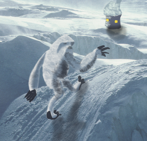
This was integrated really nicely! I kind of find the crouching yeti on the left a little distracting, but other than that it looks great! The shadow on the yeti walking up the mountain is a really nice touch.
ReplyDeleteI love the textures that you used on your yeti's and on the rooftops of your houses. I am also glad that you added a shadow under the yeti that is walking up the building. Maybe you could add more shadows under the other ones as well. Also, good job with pulling the colors from the original image into your characters.
ReplyDeleteThis is pretty awesome. The execution of the characters pulls me in to thinking that the landscape is animated as well. They really fall into place nicely. Good work.
ReplyDeleteYour creatures are incorporated really nicely! The shadow beneath the walking one looks great. I think you can put a bit more detail into the hands and feet to match the detail in the body.
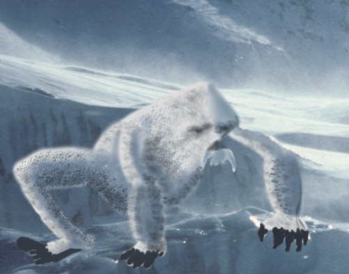
ReplyDeleteSo cute. Creepy crawly yetis. Great colors and beautiful photo.
ReplyDeleteThe greatest part is in your character development and placement of them. I like the little houses but they could probably be blended with the background a little more but great pull of colors. I really like the yeti on the left I would like to see a bit more detail in the eyes but great textures and placement on the hill. The yeti on the right blends into the snow a bit but with the light they way it is I think that is supposed to do that. I like the the way the hands stand out and pulls you in to see the rest of him. The middle guy is my favorite with the traditional yeti pose and the great cast shadow. The only thing I would do with it is fill in the eyes a little more but not to much so they don't distract from the rest. Great job on the overall design I think the illustrations and photo merge well together.
ReplyDeleteGreat photo to use! This is a gorgeous setting for a great topic. This photo lends itself to a great use of foreground, middle ground bkgrd.
ReplyDeleteI love tha tyou've included both characters and dwellings .I 'm not sure if the dwellings are from some humans that live there? Or if they're supposed to be further back and they're actually for the yetis. I t seems that they're pretty small, so I"m going to guess they're for the people. I love how youre using the slope in the foreground to be the entry into the picture for the characters. I also like how you're using the crevices of the ice to hide the yetis in. I think it would be great to see a yeti or two in the way background for some scale reference, and to get some more atmospheric, blurry creatures back there! I love how you're keeping you painting style soft for these guys - i think it definitely looks nice with the haziness of the original photo. I do think that it could be cool to see how you could push the darks on the yetis even a little bit further? Maybe that would give them a tiny bit more contrast and make them pop out a little more? In fact, it might just be one or two of them that you would like to try that with? It seems tha the light is coming from behind them, so maybe the things that are up in the foreground with us can get darker there! I also think it could be cool for you to blur out some of hte houses in the background, so it seems like there is some mist, or some atmosphere as they recede in space. You know how everything is a lot sharper and more contrasty in the foreground? And much more hazy and less saturated in the bkground? that could be an awesome way to push that part of hte piece!