You've laid a good value foundation for the shapes of the face, but I think you could push it by darkening some darks (especially in the recessed area of the eyes). It gets close in the shadowed area of the neck, but the rest of the face is a little bit too neutral and flat.
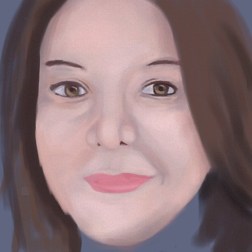
You did a really nice job making this actually look like you! It'd be nice to see the shading in the hair look a bit more separated from the shading on the skin- maybe adding in a bit more long thin strands, or adding in some stray hairs?
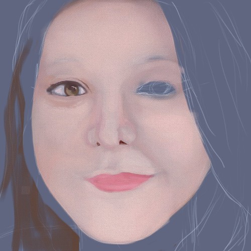
Good start! I think one of the reasons it looks unfinished is because of the texture, try mixing textures up so that they can seem more thoughtful. Maybe using what you have now for an under painting and work more planes into the face :)
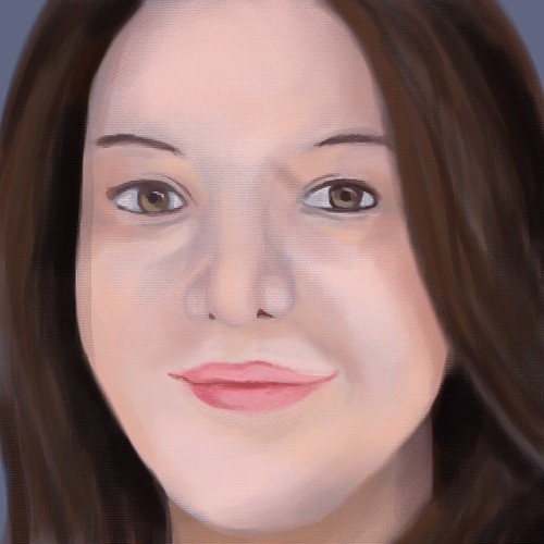
Nice job Rachel, I can see your getting more comfortable with your digital art side! I like the softness of the piece, but if there was a bit more definition then you would be able to capture more of your real life facial features. Overall, BUENO RAQUEL.
Great work on the blending of colors. I think the textured canvas was a nice design choice. Very realistic to life painting and looks like the process is similar as well. Would like to see some more variations in the color tones such as pinks or reds into different shadows of the face and maybe play with the strands of hair too. Great job.
I love how this looks like how you would build up a pastel drawing, there's really nice blending in the face! I also really like how you're adding variations of the peach color! Especailly the more orange color that shows up as an accent around the face! I love it! Keep pushing it! I could see you doing hte same with shadows- maybe pick a complementary color and throw it on another layer and see what happens if you gently bring it into the shadows of your face a little more - I think it would be fantastic! I love how you're working with this, it looks really easy for you. I also think it would be worth trying to do one more layer of super hot highlights on the tip of your nose, or maybe on a couple stray hairs - I said this to a couple other people, too - but it is one of those things where after you have a chance to sit with it, come back to it and just try putting a touch of super-highlights on! See what happens! I think it will add that extra great layer of detail/ dimension!! Great job.

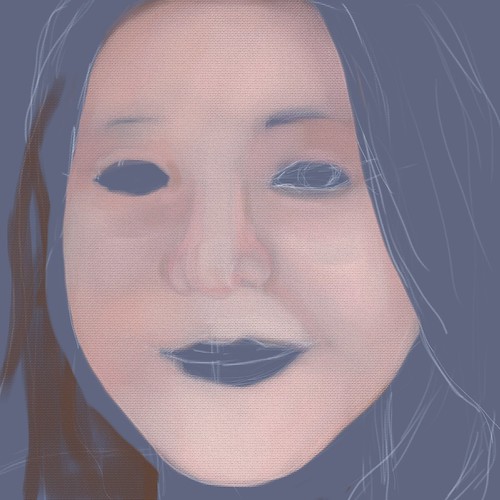
You've laid a good value foundation for the shapes of the face, but I think you could push it by darkening some darks (especially in the recessed area of the eyes). It gets close in the shadowed area of the neck, but the rest of the face is a little bit too neutral and flat.
ReplyDeleteYou captured your likeness really well, but I'd try to push the values just a little bit more.
ReplyDeleteNice process! Very realistic colors. I think you could push the contrast more, but I love the softness you have achieved in this!
ReplyDeleteYou did a really nice job making this actually look like you! It'd be nice to see the shading in the hair look a bit more separated from the shading on the skin- maybe adding in a bit more long thin strands, or adding in some stray hairs?
ReplyDeleteGood start! I think one of the reasons it looks unfinished is because of the texture, try mixing textures up so that they can seem more thoughtful. Maybe using what you have now for an under painting and work more planes into the face :)
ReplyDeleteNice job Rachel, I can see your getting more comfortable with your digital art side! I like the softness of the piece, but if there was a bit more definition then you would be able to capture more of your real life facial features. Overall, BUENO RAQUEL.
ReplyDeleteGreat work on the blending of colors. I think the textured canvas was a nice design choice. Very realistic to life painting and looks like the process is similar as well. Would like to see some more variations in the color tones such as pinks or reds into different shadows of the face and maybe play with the strands of hair too. Great job.
ReplyDeleteI love how this looks like how you would build up a pastel drawing, there's really nice blending in the face! I also really like how you're adding variations of the peach color! Especailly the more orange color that shows up as an accent around the face! I love it! Keep pushing it! I could see you doing hte same with shadows- maybe pick a complementary color and throw it on another layer and see what happens if you gently bring it into the shadows of your face a little more - I think it would be fantastic! I love how you're working with this, it looks really easy for you. I also think it would be worth trying to do one more layer of super hot highlights on the tip of your nose, or maybe on a couple stray hairs - I said this to a couple other people, too - but it is one of those things where after you have a chance to sit with it, come back to it and just try putting a touch of super-highlights on! See what happens! I think it will add that extra great layer of detail/ dimension!! Great job.
ReplyDelete