nice use of complimentary colors! Looking into anatomy a bit more would be helpful. drawing the plains of the face makes the face more realistic and proportional instead of drawing the physical features, i.e. eyes lips nose. Because as they are now they are swirling all over the place!
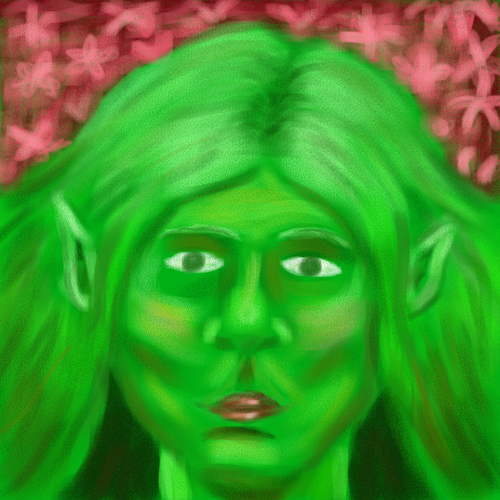
I really appreciate that you incorporated your character with the background since most people didn't really do that. I think you have your tones set out really nicely, but I think you could take it a step further and make your shadows a bit bolder, as well as adding some highlights. It would be so awesome to see that small addition of contrast. :)
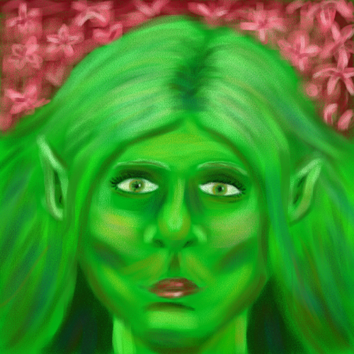
I love the way you've started with the green as the ultimate color for her skin tone. I think it's also nice that you're brining a little bit of reflected light into her face in the pinks of her cheeks and on the edge of her neck / hair. I could see you even intensifying it a little bit further, be daring! Maybe you could add some really hot red highlights in some strands of her hair on top that mimick the reflection of light from the flowers! I love how you've contrasted her with nice, warm colors - - love how you've handled the depth of the flowers up top, too - they look really full and have a great amount of space in them. they look deep. I think it would also be fun for you to continue to explore different colors in either her face or skin, and just to add a tiny bit of difference in one or the other, so that it looks like her hair is made of a slightly different material/texture than the rest of her face!
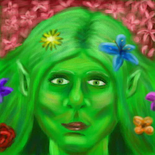
I like that you added the flowers to the piece. It makes it more interesting to look at. Over all your piece looks really soft. In some spots like the skin it looks good but I think the flowers and main facial features (eyes, lips) should be sharpened up a bit. I would go back in with a smaller brush and get a more sharp line to your objects.
Yes I can see the resemblance of the mother nature from Fantasia lol. Good planar analysis of the face, but like my painting also, I think you might need to push that contrast a little bit more and work it into the face more to get even more detail.
Feels like there some things that could be pushed further in the face structure and he hair strands. I must say the background design is nice. I would work some of the anatomy up it doesn't need to be realistic but following the general rules of anatomy can get some designs that seem accurate even if it's not real. Great work on the colors and blending.

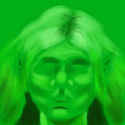
nice use of complimentary colors! Looking into anatomy a bit more would be helpful. drawing the plains of the face makes the face more realistic and proportional instead of drawing the physical features, i.e. eyes lips nose. Because as they are now they are swirling all over the place!
ReplyDeletei think this piece could use a bit more definition in the face. maybe experimenting with different brushes could be useful. very mother-nature-y
ReplyDeleteI really appreciate that you incorporated your character with the background since most people didn't really do that. I think you have your tones set out really nicely, but I think you could take it a step further and make your shadows a bit bolder, as well as adding some highlights. It would be so awesome to see that small addition of contrast. :)
ReplyDeleteI love the way you've started with the green as the ultimate color for her skin tone. I think it's also nice that you're brining a little bit of reflected light into her face in the pinks of her cheeks and on the edge of her neck / hair. I could see you even intensifying it a little bit further, be daring! Maybe you could add some really hot red highlights in some strands of her hair on top that mimick the reflection of light from the flowers! I love how you've contrasted her with nice, warm colors - - love how you've handled the depth of the flowers up top, too - they look really full and have a great amount of space in them. they look deep. I think it would also be fun for you to continue to explore different colors in either her face or skin, and just to add a tiny bit of difference in one or the other, so that it looks like her hair is made of a slightly different material/texture than the rest of her face!
ReplyDeleteI like that you added the flowers to the piece. It makes it more interesting to look at. Over all your piece looks really soft. In some spots like the skin it looks good but I think the flowers and main facial features (eyes, lips) should be sharpened up a bit. I would go back in with a smaller brush and get a more sharp line to your objects.
ReplyDeleteYes I can see the resemblance of the mother nature from Fantasia lol. Good planar analysis of the face, but like my painting also, I think you might need to push that contrast a little bit more and work it into the face more to get even more detail.
ReplyDeleteFeels like there some things that could be pushed further in the face structure and he hair strands. I must say the background design is nice. I would work some of the anatomy up it doesn't need to be realistic but following the general rules of anatomy can get some designs that seem accurate even if it's not real. Great work on the colors and blending.
ReplyDelete