
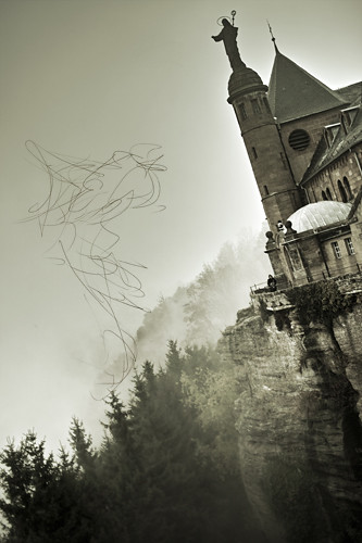
This is my original image for the Two Worlds Assignment. I was thinking of a Gothic theme for the piece.

I added the start of a gestural drawing for a dragon that I added later.
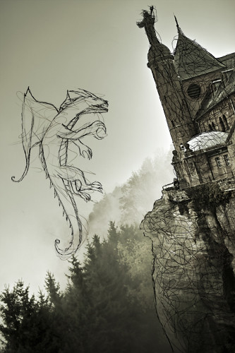
Here is the outline of the dragon, with some outlines and gestural lines over the photo.
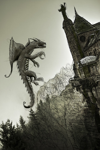
I added more lines, values, and textures to make the finished piece.
Ahhh it's hard to tell because they're small.
ReplyDeleteI like how you drew over the photo a lot, it's pretty sweet. I think it can flatten it out a bit if you handle most of the surfaces in such a similar manner. Maybe using different marks or lighter shades of grey or something for objects that might be farther away would help.
Goob job :D
This image is super sweet! The angle of the photo is really dynamic and so is the pose of the dragon. Using the limited colors with the dragon was a super smart choice and it instantly works with the castle. The lines are also really great because of their movement. I think the lines over the castle would make more sense if they outlined features of it, but were still kind of rough.
ReplyDeleteThis is way cool! I like how you added all of the scribbly effects to make it more cohesive. Your dragon looks so awesome in this environment. I would suggest playing with opacity on the background scribble lines. Like I feel that the lines off in the distance could be much lighter than the lines that are on the darker objects. nice work!
ReplyDeleteYou were really smart in bringing the scribbles into the photo. It allowed the dragon to become tied to the background. I think you should not have stopped at the hard surfaces, but brought it into the sky as well. Perhaps your lines would not need to be as dense, but I think there has to be something going on in the sky.
ReplyDeleteNice illustration.
Yaaaay someone did a dragon! I really like how you included scribbles into the building and into the background Yet the scribbles in the background seem a lot more chaotic than the scribbles on the castle thingy. Maybe trace things like you did on the building a little bit more?
ReplyDeleteLove how you drew over the castle, definitely helps it look more like a drawing to begin with. I'm a little distracted by the mark making on the hills though, maybe try a lighter color, closer in hue to the mountains or a different mark.
ReplyDeleteThe dragon is pretty sweet and I like how he is interacting with the castle.
The similar colors work really well to blend them together. I like the scribbles on the castle but I'm not so sure about around the trees. I might rotate the dragon a tiiiiiiiny bit but that's nitpicky
ReplyDeleteI think you did a great job of picking a theme and a photo that work really well together! I think that the mood of the piece is really strong, and that you feel like it's back in the middle ages or something!
ReplyDeleteI like how you're integrating linework throughout the other pieces of the photo - in addition to the dragon. I think it helps bring the whole piece together a little more!
I think you could play with color of the linework a little more - maybe in the church/castle? It gets a little bit dark, but I think it's close! I also like how it's subtle-y green - - it could be cool to see some reflective light on the dragon that was a green tint!
i feel liek im fallin over lookin at this image cuz of the angle lol i enjoy how you use your linework throughout the whole image. great color scheme as well!
ReplyDeleteThe scribbling on the castle really does help to integrate the photo and drawing, but I think maybe you should bring the opacity down on the scribbles on the castle or maybe paint over it a bit. At this point the dragon is much clearer than the castle. Also I kind of like the rocks in the next to last image better than in the final one.
ReplyDelete