

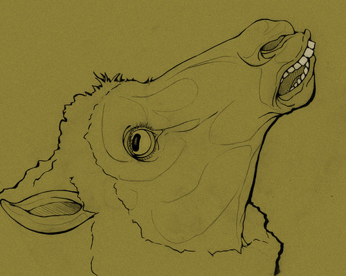
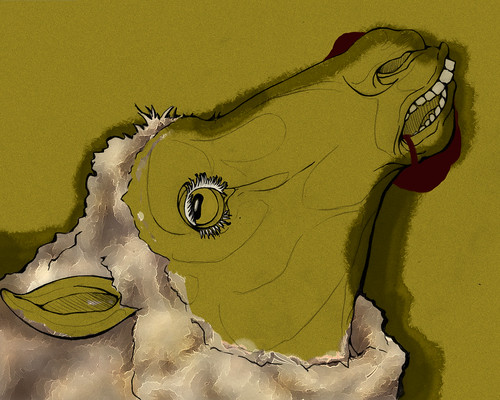
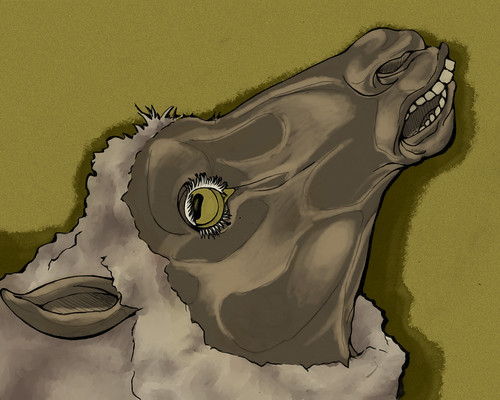
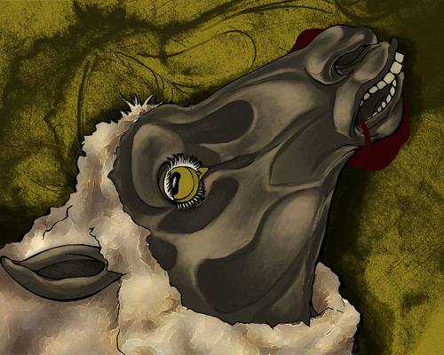
First assignment in Photoshop. Inspiration came from the old testament plagues of Egypt. The livestock were stricken with pestilence. I wanted to spend some more time making the sheep's skin more plague-y. With some red, irritated skin tones and some scabs and warts. But I am really proud of myself for completing an assignment to a stage of actual, real, visual completion. YEAHHH. This isn't my proudest composition or idea either. So I will save my efforts to make the next assignment even better!
This is awesome, I really like the texture over everything, and I like that you avoided typical plague imagery.
ReplyDeleteThe color palette expresses the mood perfectly, and I love what you've done with texture throughout the entire image. I have no idea how you did the wool, actually. it's really interesting!
ReplyDeleteI would actually love it if your linework hadn't gotten covered up by value as much as it did, because I love the line quality in your original drawing. I'm not really sure how you would make it more visible, though.. Playing more with the line color might do the trick. But that's totally based on my own taste, I just like linework :]
I love what you did with your piece! Through all of the layers you used, you created such nice drama. I would maybe add some of theat rough pencil texture in the backgroud of your final into your sheep at least just a bit. It would help make it a more cohesive. but overall, ver nice work!
ReplyDeleteThis is really nice. I think you have some strong line work qualities that really come through in the final illustration. I think your color choices are really smart, although I would have liked to see the face smoothed out a little more. It seems very Graffiti like and it's taking away from the image a little for me. But the wool is GREAT. The textures in the background are also great. And letting the background color come through in the eye is a nice touch. I think the blood could be reworked to give it a little more depth with consideration to highlights and shadow cores. But over all, I think it's nice, and you chose a plague that I think a lot of people over looked. Great originality.
ReplyDeleteThat's grotesque, in a good way. I find the look of the wool unsettling for some reason. It's almost like it's greasy or matted.I agree that your original line quality was quite nice, and I miss the fluidity that it had in the final piece.
ReplyDeleteI like the drawing you started it, its very strong! As others have said, i think a few swipes of charcoal would do this thing some good. try adding a little to the face and especially the hair. I'm not sure if you are using a photoshop filter or something, but i think it would be much more powerful if texture was added with shading.
ReplyDeleteHoly textures, Batman! I looove the wool partly because I don't know how you did it. The way you drew the sheep's face is also really cool with all the planar shapes and such. The painting on the face is really nice too. I'm not sure if that yellow is quite the right color for this, but it gives it that sickly 'plague look'. I would have liked to see more of a setting, but there are plenty of things here for me to look at.
ReplyDeleteGood image. Reminds me of the renaissance faces that horses always seem to be making, seriously they always look they are having a damned heart attack or something. You did a really good job capturing the animals face. The only complaint I have is with the fur, it seems like it is almost there, but some chunks a bit to purpley.
ReplyDeleteI like the idea that you zoomed in on the texture o the sheep and it's skin / eye etc. I like how you're showing the sickness in a couple was as well, specifically in the planar structure of the skin. The sheep really looks emaciated, or dried out, which adds to the mood. I like how you're experimenting with texture as well and think that your digital painting is really nice!
ReplyDeleteIt would be great for you to bring some of the red or yellow back into the sheep in some reflective lighting, or maybe as a small hint of color to unify the piece a little. Also - I think that you could maybe change the line color in the wool to a lighter color to meld more with the texture there. I love your original sketch, too - so maybe there is a way for you to showcase your linework in the final as well?
Also - great starting with a tonal ground, I think that's an awesome way to work because you can really bring out the lights / darks easily!
One thing that I think is really great about your piece is how you gave the different parts of the piece different textures. That makes it so it's like if I could touch each part of the piece, it would feel differently. It seems even more like a real thing with the way you use color shapes and how they really makes the sheep seem 3-dimensional. The only thing I think that could be improved on this piece would be to maybe add some shading or texture to the blood, since it's the only thing that really looks flat in the illustration. Oh, and I really like the bright white eyelashes on the sheep. I don't know why, I just do.
ReplyDeleteAnd great job on finishing this piece. It looks amazing.
damn this is super dope i really like this. just like a few fine tweaks i would say more texture or something to un-flatten the blood,eye, and teeth. wow im just blown away by all of wats going on in this image! the texture of the background adds a lot of feeling to the image which is successful!! that wool is crazy idk how you did that..
ReplyDelete