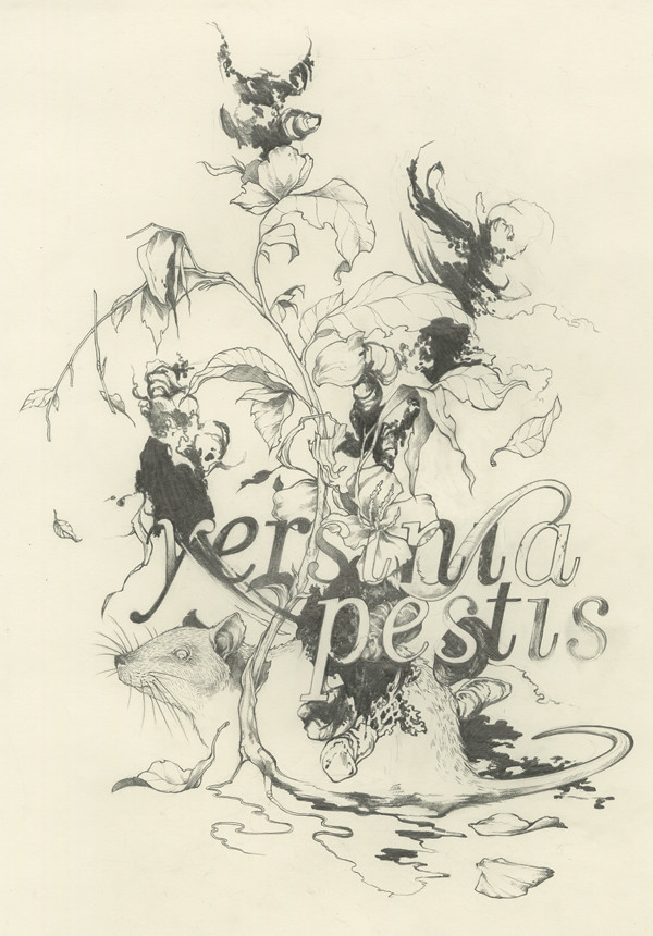
Original graphite drawing

Bringing it into Photoshop.. I added a background color, and changed the line color by selecting all the white in that layer through the channels palette, and deleting it to isolate the lines.
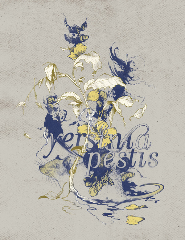
Here I've begun playing with color, keeping each fill and line color on its own layer so that they are easy to change. Since I wanted two different line colors, the greenish line color you see here is a layer above the blue lines, and turned into a clipping mask. I also added a paper texture from cgtextures.com (just a layer set to multiply over everything).
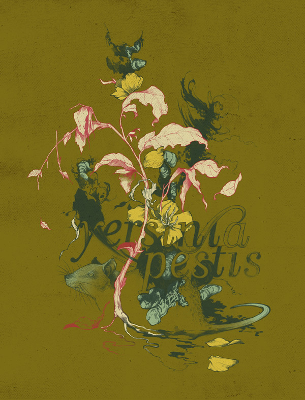
After a lot of experimenting I ended up with a much bolder color palette.
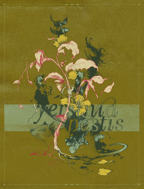
Finally, I added another layer of texture, a bar of color to call attention to the typography, and a border to anchor the illustration in place on the page. Not totally sure if I prefer this version over the previous or not...
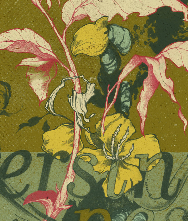
Detail
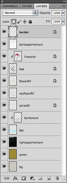
Here are my layers at the end!

These are so pretty, I love them all. I think the ones without the pink work the best (although the pink is super pretty), the ones with very few colours/cooler colours seem more appropriate with the plague subject matter. What a cute rat.
ReplyDeleteGood job making this look like you out of class stuff. The texture is really cool and I like how it looks like a book cover. I think maybe the rat could be more pronounced, and maaaaybe throw another yellow petal on the ground on the left side of it.
ReplyDeleteThis is a really nice cohesive piece! I agree with mason, props for getting it to tie into the other work you have been doing lately.
ReplyDeleteI'm a little torn too about which image I like best... Maybe try toning down the texture on the final image or making it dark rather than light. They are both strong though!
I love the concept behind this and the morphing of all of your elements(including type). The paper texture is subtle, and a really nice addition to customize it and make it seem a little less digital. I also appreciate your bold color choice (the sickly green is a huge plus for me). I think that there might be some things you can do with the different values in color (maybe it's the dark green that could be switched up a tiny bit to help emphasize the rat a little more? Or - maybe it's that the texture behind his face (green line) could fall through the middle of him more so that the chartreuse color silhouettes a little more (to pop his body out a little more?)
ReplyDeleteI also think that your integration of type and texture within in it is really nice, but maybe a color switch on that green would also allow you to read it a little more?
This is a really nice look for this piece (seems very screen-printed)
This is pretty damned great.
ReplyDeleteI really like your choice of colors in the blue gray one, the rat gets a little muddled in the green one. I think you could add that same stripe that you have behind it in the green one to the gray and it would work pretty effectively. Not the same color obviously, but it would be a nice touch.
I really like how the rat looks like it is rotting open into these flowers.
I love the blue and yellow one!
ReplyDeleteThe drawing itself is really neat. I get a vibe from it like it's a real scientific drawing (Grey's Anatomy-esque?) probably because of the Latin name too, haha.
I think the odd colors are appropriate for this because it gives it that sickly look. The paper-y texture in the final image also works well with it and makes it seem real.
Tegan, you're blowing my mind girl. Just when I think your image is finished, you take it a step further. This is really nice. What else can I say?
ReplyDeleteI really like the crisp detail of your line work and how it is characteristic of the thing that the line is supposed to be representing. I also like the overall design of the piece and the way that it fits with the theme of the plague. One thing that I think could be improved would be to maybe have a little more contrast in the piece. One final thing that I like is the small border details that you added. It makes the piece seem more professional.
ReplyDelete