This made me laugh. I think your thing was water and I'm not sure what the other aspect was, maybe sweat because of the runny nose...I think you could emphasize the runniness more, or maybe do water and dry, because old people look pretty dry...
Tehehe I love his facial expression! I'm assuming you went for water and sweaty? The sweaty somewhat comes across but other than the background color I would play with more of the blues in your palette. I can see you did a little bit in the shadowing, I did the same thing but maybe if you made his skin a little more blueish or something? Also maybe if you added a background to add to the watery...sweatyness?
I like the soft color palette you chose for this it does have the sense of being wet, as well as with the colors picked it seems to convey the water element nicely. I enjoy that you decided to be more illustrative with your figure as opposed to doing it more life like like everyone else. I get a good sense of your own personality in the work which works with the illustration portion of the assignment. All in all I think this was a very successful piece, the only thing I would even change is the use of a slight background.
This is pretty cute, I'm getting the wet/sweat idea. I just think it'd be great if you could give him a body to go with his face and maybe some sort of suggested background.
I really like you cartooning style man. What a weird old dude. I think it might help just the depth if you maybe put some darks behind him and maybe go a little darker on the face. You have are your forms there so I would say just go a bit darker and your set bro>
i love that you decided not to go for a totally realistic, rendered look for this. it's really refreshing to see something in a more cartoony style, but still painted well. it would be even better with different cropping or an added environment.
This reminds me of the creepy dude from those six flags commercials that they have. Except it is in winter and he has a wicked nose cicle going on. I like the image a lot, and like the overall affect of zaniness that it has.
I really like the design that you used for this piece. Its a very appealing image that works very well without being super realistic. I also like how almost symmetrical he looks. I think it adds a lot to the style of this piece. One thing that I think could be improved would just be to add a neck and part of a body to make it look more like a portrait than a floating head. Overall, though, I really like the simplicity of this piece and how well it shows the personality of the old man.
I think you did a really good job working with complements and having the blue show through for the shadows! This is definitely something you should continue with! I like how you're using the lightest elements on top and I could see you building some dark elements on top - maybe you could go back in with some blues that are darker and do some shadow-work, too? I like a couple of the comments about maybe adding some additional background texture or maybe including a little piece of his bust / body - I think you should keep going!


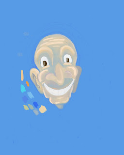

This made me laugh.
ReplyDeleteI think your thing was water and I'm not sure what the other aspect was, maybe sweat because of the runny nose...I think you could emphasize the runniness more, or maybe do water and dry, because old people look pretty dry...
Tehehe I love his facial expression! I'm assuming you went for water and sweaty? The sweaty somewhat comes across but other than the background color I would play with more of the blues in your palette. I can see you did a little bit in the shadowing, I did the same thing but maybe if you made his skin a little more blueish or something?
ReplyDeleteAlso maybe if you added a background to add to the watery...sweatyness?
I lold
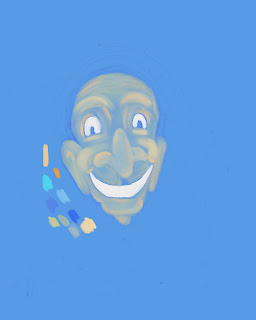
ReplyDeleteTry putting in some dark dark blue to make is pop a little more. Good call on the tiny bit of orange. It's very you and it fits the words well.
I like the soft color palette you chose for this it does have the sense of being wet, as well as with the colors picked it seems to convey the water element nicely. I enjoy that you decided to be more illustrative with your figure as opposed to doing it more life like like everyone else. I get a good sense of your own personality in the work which works with the illustration portion of the assignment. All in all I think this was a very successful piece, the only thing I would even change is the use of a slight background.
ReplyDeleteThis is pretty cute, I'm getting the wet/sweat idea. I just think it'd be great if you could give him a body to go with his face and maybe some sort of suggested background.
ReplyDeleteI really like you cartooning style man. What a weird old dude. I think it might help just the depth if you maybe put some darks behind him and maybe go a little darker on the face. You have are your forms there so I would say just go a bit darker and your set bro>
ReplyDeletei love that you decided not to go for a totally realistic, rendered look for this. it's really refreshing to see something in a more cartoony style, but still painted well. it would be even better with different cropping or an added environment.
ReplyDeleteThis reminds me of the creepy dude from those six flags commercials that they have. Except it is in winter and he has a wicked nose cicle going on. I like the image a lot, and like the overall affect of zaniness that it has.
ReplyDeleteI really like the design that you used for this piece. Its a very appealing image that works very well without being super realistic. I also like how almost symmetrical he looks. I think it adds a lot to the style of this piece. One thing that I think could be improved would just be to add a neck and part of a body to make it look more like a portrait than a floating head. Overall, though, I really like the simplicity of this piece and how well it shows the personality of the old man.
ReplyDeleteI think you did a really good job working with complements and having the blue show through for the shadows! This is definitely something you should continue with! I like how you're using the lightest elements on top and I could see you building some dark elements on top - maybe you could go back in with some blues that are darker and do some shadow-work, too? I like a couple of the comments about maybe adding some additional background texture or maybe including a little piece of his bust / body - I think you should keep going!
ReplyDelete