
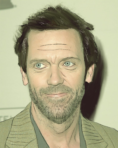
Here is my face drawing that I did of Hugh Laurie from House. I started by drawing some line work over the face and adding value to the hair and background.
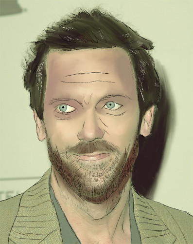
I then added value to the face and clothing and tried to refine the overall image.
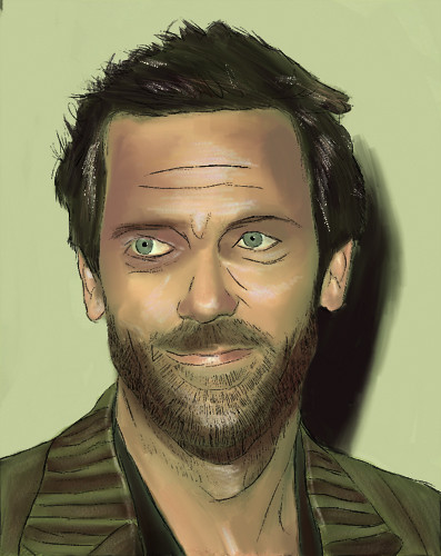
After that I adjusted the overall values and tones to make it have more depth and three dimensionality.
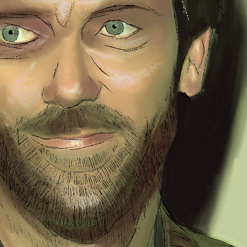
And a detail shot of the face.
I think it would've been cool if you hid the photo and made the lineart more subtle...right now it looks a bit like a layer of lineart over a photo. I think subduing the lineart and painting more over the photo and everything would make it look more unified.
ReplyDeleteThere is some really nice things happening here texturally. I like that you tried to explore and play with highlights on his face and in his hair. I am a little bummed that you painted directly over the photo. Perhaps, next time you might trace it but remove the under photo. This allows you to be a little more random with how you paint. I feel like the photo acted as a guide for you a little too much. This image really kind of plays it safe. But good job trying different techniques and new brushes.
ReplyDeleteI'm curious as to what your words were. Dry? Air?, those are what I'm thinking.
Good job.
I really like the line work you used over your painting layer. it works really well with the facial hair to add to his scruffyness.
ReplyDelete"Perhaps, next time you might trace it but remove the under photo. This allows you to be a little more random with how you paint. I feel like the photo acted as a guide for you a little too much"
ReplyDeleteI would have to agree with this. I see your style coming into this picture with your little line work and such but you should just get rid of that photo and just use it as reference and just start painting!!!
I would like to see your line work blended in because right now the flat lines really stick out from the blended colors behind them. Also, I think you should try to depart more from the colors of the photograph so that you create your own color palette. I think your shine/sweat effect works really well though.
ReplyDeleteI like the idea that you are working from reference, but I think that if you would have drawn this rather than working directly on top of it, it would have had a spontaneous, more human quality to your linework and strokes! I like that you're pulling colors from life as well and that you're beginning to enhance them here.
ReplyDeleteI would definitely try and push the boundaries of what you can do without working with the photo in this way - there are actually certain legal rights that the photographer has with the image and you'll want to make sure not to accidentally infringe upon those - Since you have the image included, it would be a red flag for sure.
I do like how you're working with linework and think that it would be cool to play with other colors of linework. Start playing with eliminating black and bringing the color in! You're already doing a great job with tone, now just push the color!
I love the texture of the linework you did in his beard!