

Ha I have no idea how I didn't notice immediately how weird his eyes were.

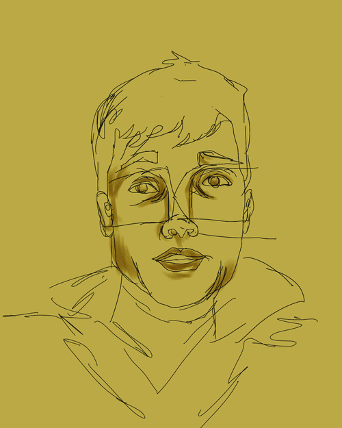
filled in the details, moved the eye down.

added in details and background, moved some of the features around of photoshop to make them look more like him.
I was going for Earth and Dry, but for kicks and giggles I made another with him as Earth and Fat.

Did a bit more work to add in the fat effect.

here's a detail of thin Ian's face.
GIF! click to animate.
hahaha i love that fat face! lol good choice of color pallet i also like how you can see your strokes you can see how layer your colors. good job!!!
ReplyDeleteI really like watching the gif animate and seeing all the crops and changes you did to the overall face, like moving his eyes around. Also the chipmunk cheeks thing that you did is pretty damn funny.
ReplyDeleteI would add some more darks to give the image a little bit more contrast. Overall the image is really good though.
I think you could improve the composition by making him wearing a jean jacket.
ReplyDeleteYou did a really good job making him have depth, its different from your usual pretty flat stuff. The color balance is interesting to look at. The background elements are pretty nice too. Maybe add a few more very dar parts.
Your gif makes this even more amazing! I like how you really put a lot of thought process into this by moving his eyes around and making sure they looked right. I can really get your element of earth from both the background color you chose and your palette choice. In the first one I don't really see dry too much, it would almost be cool if you put cracks in his face or something. The fat one is wonderful though! It's so funny to see it compared to the original.
ReplyDeleteYou should give fat Ian rippling neck rolls. Seriously. LIKE TONS OF NECKROLLS.
ReplyDeleteHahahahaaaa...oh...
ALSO THE WONKY EYES ARE SO FUNNY. <3
Other than that, this is awesome. I really like that you let the canvas colour show through. Looks like a vintage photo.
I love watching this transformation gif is really fantastic! I love how he doesnt get fat till the end of it you really put a lot of time in capturing his face before getting onto the smaller details. I think you handled everything with ease in this project I don't really have any critiques. I especially love in the animation how his hair changes as often as it does.
ReplyDeleteI really like your use of reds and greens in this piece. They're complementary colors so obviously the pop for the eye, but I think you used them in a subtle way. I like the depth you get in the eye sockets with the dark brown too. I think you could use a little more detail in some areas, but I do appreciate the painterly effect. I think your earthy and dry elements come out pretty clearly.
ReplyDeleteI love the depth you're getting with all of your color choices! you did a great job moving the more saturated colors around your canvas, too! I love seeing how your piece transforms from linework to painted piece - there is something really awesome about seeing your closeup because you have a lot of great color swatches creating the space rather than linework. One thing I think you could do is to move some more color into the background from some colors contained in the face. I think it might be cool to also put a couple highlights in his hair using some of the small, dry mediums. I think you did a great job choosing a dry medium to work with - and you color palette definitely fits the theme! Great job!
ReplyDelete