I really like how well you gave a painterly look to this piece. It really gives the image a sense of style and is very appealing to look at. I also like all of the crisp detail that you put into the piece, especially the hair. One thing I think you could do to improve this piece would be to put a blur effect into the background so that you would get more of a sense of depth. One other thing that I like, though, is the sense of softness that contrasts with the sharpness you have. Good job.
I love seeing the detail closeup of that piece - especially the hair! I think that the way you're handling the medium is really nice - the blocks of color and the painterly strokes you're making to work with light (especially on her chin!) I also really think you've done a great job using the light from behind her in the background to help frame her face. The contrast is really nice. I think the one thing that I think of when I noticed that you were going for Air and Sweaty - was the way you've left the bottom kind of painterly and "unfinished" - i dont have a better word for it, but I think that the atmospheric quality of you just letting the bottom of her shoulder float away is really nice and fits well. For Sweaty - I think I see it mostly in the way you've treated her hair. She doesn't seem like she has a shiny face at all, but more like her hair is frizzed and shiny - maybe a little greasy. It would be cool to see how you could blur out the area above her shoulder a little further - that is the only area that looks so strokey, maybe a dusting of a secondary color on top could make it seem as atmospheric as the rest? I think this is a fantastic medium for you and am excited to see what else you do with it! Great work!
Like usual your stuff looks really great. I like that you showed air and sweaty with the hair frizzing out like that. I would say my only negitive thing is I can see the tool, meaning I see digital shapes, which kinda bothers me. It's mostly on the china and noseCould just be me though.
My favorite part is the hair. Really cool color stuff going on there. Id like to se a tiiiiny bit more light stuff in the face, it's maybe a bit tooo subdued. The texture is a really nice response to the photo.
I love what you do with the strands of hair. They're so perfectly messy and random, and I appreciate that there are strands of blue and red in there and not just brown. I think you could push the sweaty quality a bit more pretty easily by adding some more extreme highlights. Also, the style you use says air quite well, but it'd be nice to see just a little more of the blues/whites in your color palette.
Looove the colors-- you also rendered this super well! I get air from this because of the wispy hair and I kiiind of get sweaty since her hair is messy. I think if there were a few more/thicker highlights on the left side of the hair, that would break the color up some more.

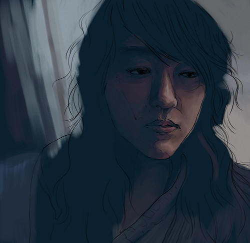
I really like how well you gave a painterly look to this piece. It really gives the image a sense of style and is very appealing to look at. I also like all of the crisp detail that you put into the piece, especially the hair. One thing I think you could do to improve this piece would be to put a blur effect into the background so that you would get more of a sense of depth. One other thing that I like, though, is the sense of softness that contrasts with the sharpness you have. Good job.
ReplyDeleteI love seeing the detail closeup of that piece - especially the hair! I think that the way you're handling the medium is really nice - the blocks of color and the painterly strokes you're making to work with light (especially on her chin!)
ReplyDeleteI also really think you've done a great job using the light from behind her in the background to help frame her face. The contrast is really nice.
I think the one thing that I think of when I noticed that you were going for Air and Sweaty - was the way you've left the bottom kind of painterly and "unfinished" - i dont have a better word for it, but I think that the atmospheric quality of you just letting the bottom of her shoulder float away is really nice and fits well. For Sweaty - I think I see it mostly in the way you've treated her hair. She doesn't seem like she has a shiny face at all, but more like her hair is frizzed and shiny - maybe a little greasy. It would be cool to see how you could blur out the area above her shoulder a little further - that is the only area that looks so strokey, maybe a dusting of a secondary color on top could make it seem as atmospheric as the rest? I think this is a fantastic medium for you and am excited to see what else you do with it! Great work!
Like usual your stuff looks really great. I like that you showed air and sweaty with the hair frizzing out like that. I would say my only negitive thing is I can see the tool, meaning I see digital shapes, which kinda bothers me. It's mostly on the china and noseCould just be me though.
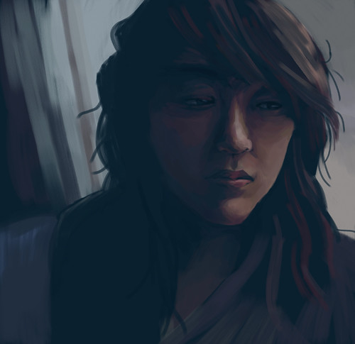
ReplyDeleteGreat job incorporating the blue of the background into her face. Looks like a real painting too!!!
ReplyDeleteHi Jean!
ReplyDeleteMy favorite part is the hair. Really cool color stuff going on there. Id like to se a tiiiiny bit more light stuff in the face, it's maybe a bit tooo subdued. The texture is a really nice response to the photo.
I love what you do with the strands of hair. They're so perfectly messy and random, and I appreciate that there are strands of blue and red in there and not just brown. I think you could push the sweaty quality a bit more pretty easily by adding some more extreme highlights. Also, the style you use says air quite well, but it'd be nice to see just a little more of the blues/whites in your color palette.
ReplyDeleteLooove the colors-- you also rendered this super well! I get air from this because of the wispy hair and I kiiind of get sweaty since her hair is messy. I think if there were a few more/thicker highlights on the left side of the hair, that would break the color up some more.
ReplyDelete