
i'm not positive if i prefer the look they added or if i would use it again, but it's something to keep in mind in the future.
things i used: pen tool, inner glow, outer glow, drop shadow, zigzag, probably some other stuff
adding vectors over sketch
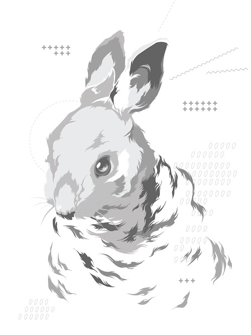
finished vectors - before color

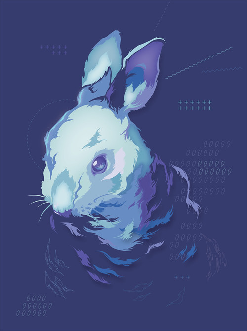
finished vectors - color
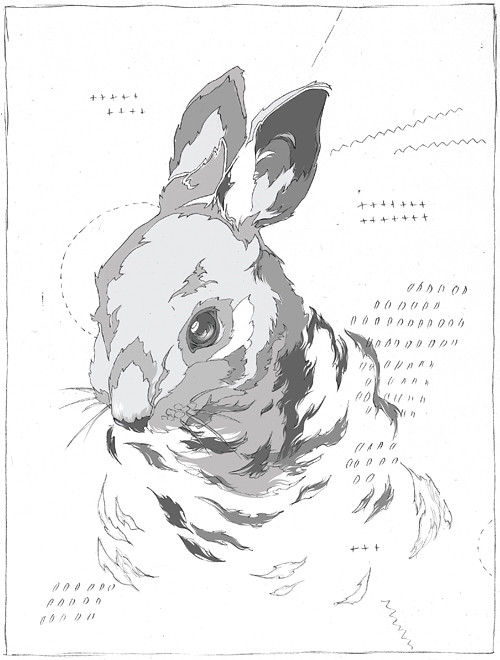
adding inner glows & drop shadows
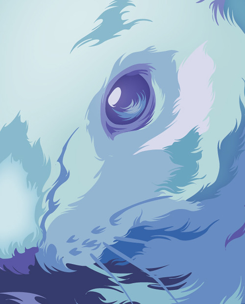
face detail
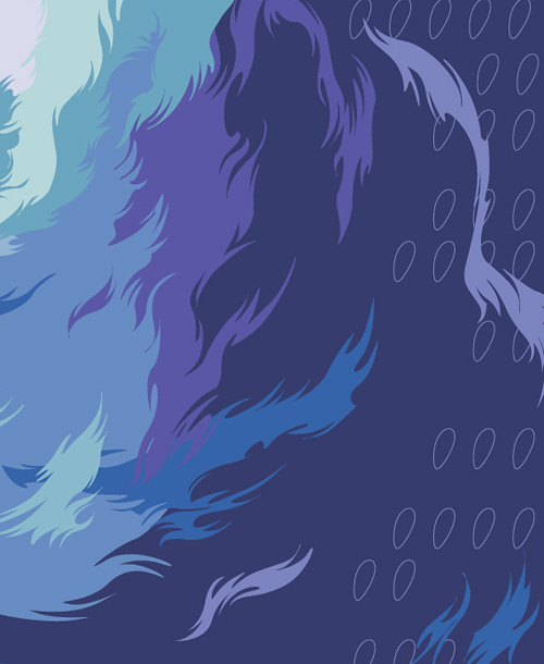
fur/background detail
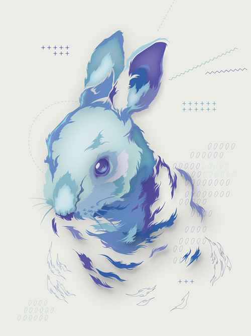
color variation
I like the very fine detail that you used to give a realistic feel for the rabbits fur. I also think that the color palette, with the use of a lot of contrast, works really well and the empty space adds a lot to the illustration. Something that could be improved would be to possibly change the small background shapes. I think you should have shapes there, but the ones you have now don't seem to fit with the rest of the piece. One final thing I like about your piece is the way you did the eye and with it being near the center to attract attention. good job.
ReplyDeleteGah, this is great. The minimalistic approach you took to this works really well with your style. I really prefer having the white background over the blue, it adds to the magic to me, almost like it is diapering.
ReplyDeleteThe glow really gives it some volume that's really interesting. It reminds me of A Scanner Darkly. It looks very movie poster to me. I feel like maybe you could move the bunny down a bit.
ReplyDelete+:
ReplyDeleteI like how you've adopted subtle ways of using the techniques to make something that you think fits with the quality you want. The ways that you're integrating the features work really well here and create an interesting cut-paper feeling.
I think that the drop shadows are an interesting effect, and although very Digital looking, seem like a great way to play with space and form.
Additionally, I think your color choices are very playful. IT seems that you could also play with variations in color (I think that your alternate is an interesting piece as well since the focus seems to be given to other areas of your piece rather than the rabbit's head) - I do think the darker of the two versions is really successful in both hierarchy and form.
-:
I think you could potentially play with other ways of integrating background elements? I think there is something really nice about the graphic bits that you've created, but they seem like extras? Maybe there is some way of using the same quality of line within the shapes you drew for your rabbit in the backgroudn as well?
I think the "fade-out" of the bunny texture is a great way to do this, maybe there could be additional ways to include this.
I could also see you playing with one more color - to draw our attention in? Maybe a complement? This could be done in the way that you're creating variations of color within the planes on his face? It is a great abstraction of a rabbit as it is, and might benefit from going WAY out of the monochromatic color zone to see what could happen.
I think the bunny is fine where it is because you have those little bits of outlined fur floating toward the bottom.
ReplyDeleteThe way you (very) subtly used the outer glow is really neat and super effective in the eye. I love how you constructed the fur on the bunny-- the drop shadows on the pieces are really effective at showing that it is fur. You totally made the effects work in the way you wanted them without it looking cheesy, so kudos!
Overall this is a fantastic piece. Your color choices and textures are amazing an so appropriate.I don't know how crazy I am about the plus signs and symbols and stuff. To me that seems a little to inconsistent. I only mean that as it gives it a computery feel. THe rabbit seems so organic to me, but it could just be me.
ReplyDeleteOther than that, seriously good work here.
Beautiful, this turned out amazing, you really use color in a great way as well as your handling with the fur turned out amazing. The glow is very subtle which I really enjoy I feel like it can be used very easily against a project where you seemed to man handle it to your specifications. Not really much of anything I would change, great job.
ReplyDelete