
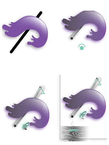
Progress Shots / Developing with vectors and: warp tool, gradient meshes, drop shadows, gradients, texture with the idea of creating depth and weird floaty magical qualities that formed some sort of face.
Final piece.
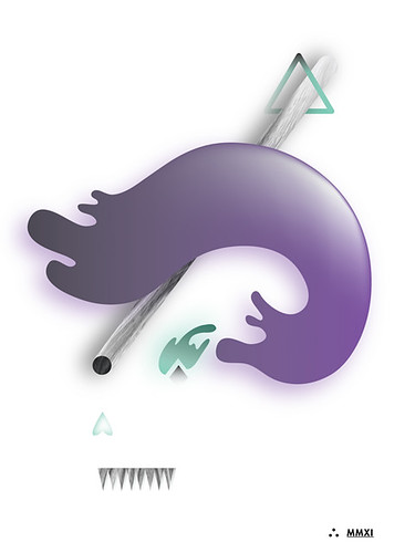
Click here for high resolution version
I love the really clean way that you interpreted the assignment. Your use of gradient mesh and the other shadow/glow effects looks really great here, and I like how the shapes have some dimension but still look flat when they interact with the photographic/textural elements.
ReplyDeleteI could see you doing a lot of these and making the composition more involved, or adding more objects in.
This is nit-picky and it might just be my screen but I'd like it if your green/teal objects got a little more vibrant; they seem greyed down in places where they could make the whole piece a lot punchier.
Very abstract. I think the glow would be more apparent on a dark background. The textured rod looks really cool and is a nice contrast to the other shapes. It looks like a magician's logo or something. I think maybe the purple swoosh could be a bit brighter.
ReplyDeleteI love the abstract shapes you created here as well with the wood texture on the wooden rod and triangles and bottom. The glow on the purple blob is very affective, very shiny, kinda gives it a 3D feel. I would agree with Teegan on the teal colors having a little more glow and less of the grey tone I think the teal blow works better than the other two objects. Overall creative piece
ReplyDeletethis is really interesting man. The Glow looks nice. The texture on the stick is super awesome. the wood grain is really realistic which makes for an interesting pairing against that purple blob shape.
ReplyDeleteI like the simple idea for the composition, it works very well. I also like the contrast of the detail, from the simple, clean coloring of the purple shape, to the detailed, textured look of the magic wand. I also like the little shapes that you used. The only thing I think you could improve on would be to have a border, so you can tell where the piece ends against a white background.
ReplyDelete+: this is a really nice, minimal way of using the tools and I think it totally fits with the theme. I can see your use of the different textures really helping form shape and space. It feels futuristic.
ReplyDeleteI think that the way you're also using some outside textures to create visual diversity in your piece is really well done. I love the woodgrain effect on the rod that is going through the piece, and I like how the texture helps us travel backwards - creating space.
-: you may even want to bring back a little of the glow that you're creating on the purple blob - it seems that you could rely on the shadow effect more than the radiating purple? Option 2 could be that, or using an alternate color to see how that would look?
Very cool minimal approach.