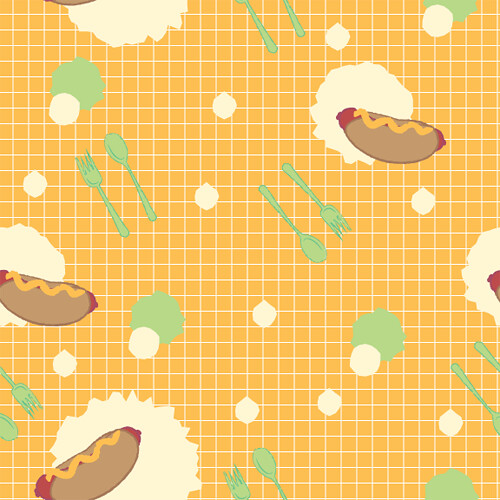
Both of these patterns look great. I think I am more fond of the supporting pattern, the colors really meld well. The complex pattern might work a tad better if the background color and the grid overlay are in the same family. Maybe a light blue background with your blue lines. I do like the grids though, they make me think of a school cafeteria or a supermarket.
This is adorable and I would love to have these on a bag or something haha. I can really tell which one is more complex and which one is the simple. The placement of the objects is really good, I can't tell where the squares end and begin. Yet with the color for the background maybe have the hotdog one a little closer to the color in the main pattern. It will help it tie the two together easier.
I definitely see the color relationship because you tie it together with the hot dog and hamburger buns. (And other colors: red, yellow, green)
I would say that readability is good for the most part-- the green spoon and fork gets a little overpowered by the yellow bg on the hot dog pattern.
The toss on the hamburger pattern is super awesome-- good job! The hot dog one is a little 'stripey' if you know what I mean. But I'm being a bit nit-picky D:
I know your hot dog pattern is the coordinate one, but it gets a little close to being a main pattern too. If you took out the green spoon and fork bg, I think that would make it look more like a coordinate.
I love the theme, it's cute. They'd be really awesome as food wrappers! Or lunchboxes!
Your secondary one has a nice direction that I think makes it nice to look at. Maybe if you made the size difference between the 2 different hotdogs a little more drastic and but in another icon it would look a biiiit better.
Some of your icons that are the same blue as your grid in your primary get a bit lost in the background, I think you could take advantage of it by treating them as secondary icons and throwing in more primaries.
+: These are really nice. I especially like the second (white) pattern because of your spacing and color usage. it seems vibrant and edible! I also think your scale in that pattern is right on, as well as your spacing. The elements inside are also working well because you're including a wide variety of sizes within. Great whimsical drawings, too! These are really fun icons / themes!
-: Play around a little bit with the spacing in your hot-dog pattern. I think that it' may be a little easy for you to see the pattern, but maybe if you added another hotdog somewhere in there, you could hide it a little, maybe having the new hot-dog turning in a different way?
I do think that your colored bkgrd on the first pattern is a good thought to separate patterns, but maybe there is something else that makes this one a little more of a coordinate? Because you have a similar subject matter, it's hard to tell which one is the main pattern!
Awesome! the color choices are so strong in this piece, as well as the use of a gridded background reminds me of those trays you get at malt shops which supports the theme very well. I really like your pacing of icons as well it flows really well without looking like its a rigid form. Also whats not the love about cartoon looking food, it always looks better than real food for some odd reason.
So cute! The only thing I would watch is that some of the lighter colors in the icons on the more complex one don't get lost in the white background.. (I'm looking at the edge of the steak, and the egg whites.) Maybe a very slightly darker tone in the background could help that?
Dope,I really like just the grid pattern, I realize it wasn't hard to make but your color choices are pretty great. I also really like your fist pattern, the one with the hot dog, it works super well with your color choices and the green reminds me of relish.
Both of these are sick!! I think the white one works a little better in color relation and flow. I feel the bright splashes next to the hotdogs on the orange pattern could be subdues a little more but that is just me. Also in the orange one the hotdogs could be moved around a tad more but overall I think both these patterns are GREAT!!


Both of these patterns look great. I think I am more fond of the supporting pattern, the colors really meld well. The complex pattern might work a tad better if the background color and the grid overlay are in the same family. Maybe a light blue background with your blue lines. I do like the grids though, they make me think of a school cafeteria or a supermarket.
ReplyDeleteThis is adorable and I would love to have these on a bag or something haha. I can really tell which one is more complex and which one is the simple. The placement of the objects is really good, I can't tell where the squares end and begin. Yet with the color for the background maybe have the hotdog one a little closer to the color in the main pattern. It will help it tie the two together easier.
ReplyDeleteFirst of all, I love the food. It's so cute.
ReplyDeleteI definitely see the color relationship because you tie it together with the hot dog and hamburger buns. (And other colors: red, yellow, green)
I would say that readability is good for the most part-- the green spoon and fork gets a little overpowered by the yellow bg on the hot dog pattern.
The toss on the hamburger pattern is super awesome-- good job! The hot dog one is a little 'stripey' if you know what I mean. But I'm being a bit nit-picky D:
I know your hot dog pattern is the coordinate one, but it gets a little close to being a main pattern too. If you took out the green spoon and fork bg, I think that would make it look more like a coordinate.
I love the theme, it's cute. They'd be really awesome as food wrappers! Or lunchboxes!
Your secondary one has a nice direction that I think makes it nice to look at. Maybe if you made the size difference between the 2 different hotdogs a little more drastic and but in another icon it would look a biiiit better.
ReplyDeleteSome of your icons that are the same blue as your grid in your primary get a bit lost in the background, I think you could take advantage of it by treating them as secondary icons and throwing in more primaries.
+:
ReplyDeleteThese are really nice. I especially like the second (white) pattern because of your spacing and color usage. it seems vibrant and edible!
I also think your scale in that pattern is right on, as well as your spacing. The elements inside are also working well because you're including a wide variety of sizes within.
Great whimsical drawings, too! These are really fun icons / themes!
-:
Play around a little bit with the spacing in your hot-dog pattern. I think that it' may be a little easy for you to see the pattern, but maybe if you added another hotdog somewhere in there, you could hide it a little, maybe having the new hot-dog turning in a different way?
I do think that your colored bkgrd on the first pattern is a good thought to separate patterns, but maybe there is something else that makes this one a little more of a coordinate? Because you have a similar subject matter, it's hard to tell which one is the main pattern!
Great job!
Awesome! the color choices are so strong in this piece, as well as the use of a gridded background reminds me of those trays you get at malt shops which supports the theme very well. I really like your pacing of icons as well it flows really well without looking like its a rigid form. Also whats not the love about cartoon looking food, it always looks better than real food for some odd reason.
ReplyDeleteSo cute! The only thing I would watch is that some of the lighter colors in the icons on the more complex one don't get lost in the white background.. (I'm looking at the edge of the steak, and the egg whites.) Maybe a very slightly darker tone in the background could help that?
ReplyDeleteI love how the two go together.
Are those Bugles? I really hope so.
These are so nice, like 80's new wave food patterns. Ha.
ReplyDeleteMy only critique would be to maybe look at background colors in the first pattern like Lindsay mentioned above.
Dope,I really like just the grid pattern, I realize it wasn't hard to make but your color choices are pretty great. I also really like your fist pattern, the one with the hot dog, it works super well with your color choices and the green reminds me of relish.
ReplyDeleteBoth of these are sick!! I think the white one works a little better in color relation and flow. I feel the bright splashes next to the hotdogs on the orange pattern could be subdues a little more but that is just me. Also in the orange one the hotdogs could be moved around a tad more but overall I think both these patterns are GREAT!!
ReplyDelete