
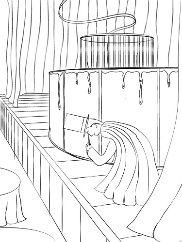
Here is the first in progress shot of my magic assignment. Basic line work with stroke and some blur effects.
Here is the second shot. Added images for texture, some more line work.

Final shot. Live traced the images, added additional effects to add emphasis to places such as character, tank.
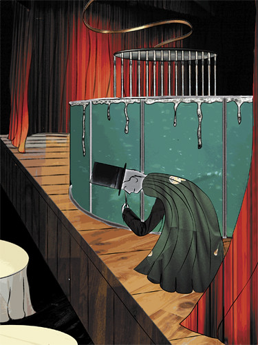
I find your artwork really charming! The textures you put in are quite nice. Something you could consider is varying the line work or taking it out in some areas. For example, I feel like the spillover on the pool doesn't necessarily need the black line. I like how you have the curtain in the bak reflecting onto the wood floor, it'd be really cool if you did that a bit more. The shine on the thing coming out the the cage is really nice, I can really sense a sort of copper. I really enjoy this, but as one more suggestion, I would consider including some of the crowd that he is bowing to.
ReplyDeleteNIce work!
This is really nice, and I agree completely charming. I do also like all of the textures, and your perspective, although not super accurate, works really well for the whimsy in this piece. I agree that the water spilling over the side should not be outlined in black, and i also think that some of the line work in the front most curtains is a little too strong. It's taking away from the magician. But everything else looks solid. It's Great!
ReplyDelete+: I love the idea of your piece. It's the end of his show, right? I think that you capture a great still of the story behind the piece.
ReplyDeleteAdditionally, the textures you are using are really interesting and bring a strange realism to the pieces in your illustration.
I think that the way you're using them gives it a very cut-paper type feeling. Mabye you could put another layer of color on top as a 15% or 10% opacity to help bring all the colors together?
-: I think you could work on integrating your linework a little more. It seems that the stark black-ness of these pieces could be helped with a color change?
I can't really see the glows and things, but I know that this is something that you might not have exaggerated in this piece - rather, you went for the subject of magic. It would be neat for you to may use it as a hazy glow around the fish-tank?
Also - would you consider making his face a color? Everything else is so saturated, I think it would be good to give him some life!
Your use of textures in this is really nice! I love the wood on the stage. The highlights you have on the curtains and wire above the stage are really nice. I also agree that the magician gets a little lost, but changing the color of his cape is an easy fix. I think that if you added a spotlight somehow on the magician, it would pull it all together. After all, he is the star on stage.
ReplyDeleteIt looks really story bookish, nice. I really like the water tank. The lighting looks very natural. It reminds me of Courage the Cowardly Dog. If you want some more glowy stuff, maybe some candles on the tables shining on the guy's face. Maybe the magician could be a tiny bit bigger and moved down. I love the textures.
ReplyDeleteGood stuff here. I really like the way you use the contrasting wood textures.
ReplyDeleteTo further push the use of effects you could add a glow to the outside of the magician and lower the opacity on it so it's not too much.
Wow this is awesome! all the textures fit really well and that shine on the spilled cord is superb! Maybe add some glow on those bars on the cage like u did with the spilled cord. Also it might b cool to see a little reflection from the water tank on the floor and/or his cape. Awesome piece!!
ReplyDelete