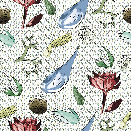
+: Great use of pattern/sub pattern concept. I like how you're making more interest in the bkgrd of the more detailed pattern by including this small texture. You could potentially take the contrast of these little shapes down a bit so that they don't stand out as much - it seems like they might fight with the flowers in the foreground a little.
Fantastic theme as well. I like the use of different shapes and colors. It seems very spring-y - or very botanical. Your icons seem to be developed up to the same level throughout the pieces as well.
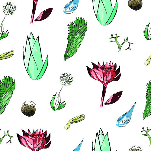
The first pattern on white looks great. It has a nice and even flow, and the color usage is also well placed. Great job on the spacing and the composition of large elements - to small elements as well.
-: for the repeat of the pattern, it might look more like a solid field of texture if the large blue piece in the detailed pattern was smaller. Right now it stands out a little bit, and I can't help but focus on it while I see the repeat.
I also think that darkening the colors in a couple of your foreground elements (getting closer to mid-tones for some of the lighter pieces, would help push them forward off of the textured bkgrd in the second pattern.
Your Icons look nice, it's clear you spent a lot of time on each of them individually. my main critique is just how unclear an overall theme, it says spring in the title, but I'm getting a bunch of different reads. sushi, wales and beach?
I'm sure if you reduced the size of the raindrop, it would help.
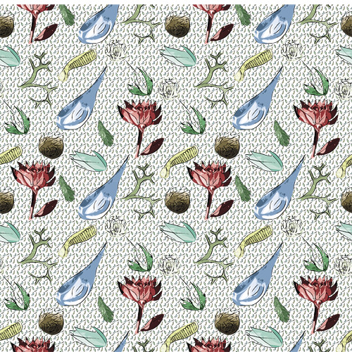
color relationships: I appreciate the colors that you chose in your second pattern, they feel very natural, and they work nicely together. In your first pattern I feel that the red is a bit too powerful in the bed of green. I think the red may work better in your second pattern because you have the brown tones to help tie in the red more.
They read pretty well, but I'd like to see you play with having the objects closer together, and maybe play with rotating the objects a bit more, this would also help push the toss effect.
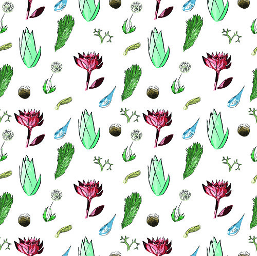
The relationship is very clear between the two patterns. They look nearly identical, aside from the background and colors. To make one a more simplified version of the others, I'd suggest maybe taking out the more obvious, eye catching objects, like the red flower.
Your coloring work is very cool, it feels like you used a dry brush in some of your shapes!
I like how you used color on your icons, they are very vibrant. Your use of the effects looks great too. I would try playing around the a background color for both of them. Maybe a nice off white would meld everything together more. One the second pattern, I like the use of the sub pattern, but it gets a little busy for my eyes. Maybe make the sub pattern with more white space around the shapes so it isn't so condense.
I really like your icons as well as the pacing of your pattern! The water color looking icons you used are very cohesive with one another. My biggest critique is that the background is a such a busy pattern itself that it distracts from your imagery. I feel like a more textured background or a solid color would present itself a lot better. Overall though I really like the imagery used.
I think you should consider proportion in the size of your icons. You do seem to have some size variation, but I think having just one or two bigger icons, and maybe a couple icons even smaller than the ones you already have would make the pattern easier to read. As it is they are a little too busy. Reducing the number of colors you use would also help with this. For your second pattern if you take out the large elements and just leave the leaves/branches (mostly the green and brown elements) then it won't compete with your primary pattern so much. I think you've rendered you icons in a really consistent way though and they work well in conveying your theme.

+: Great use of pattern/sub pattern concept. I like how you're making more interest in the bkgrd of the more detailed pattern by including this small texture. You could potentially take the contrast of these little shapes down a bit so that they don't stand out as much - it seems like they might fight with the flowers in the foreground a little.
ReplyDeleteFantastic theme as well. I like the use of different shapes and colors. It seems very spring-y - or very botanical. Your icons seem to be developed up to the same level throughout the pieces as well.
The first pattern on white looks great. It has a nice and even flow, and the color usage is also well placed. Great job on the spacing and the composition of large elements - to small elements as well.
-:
for the repeat of the pattern, it might look more like a solid field of texture if the large blue piece in the detailed pattern was smaller. Right now it stands out a little bit, and I can't help but focus on it while I see the repeat.
I also think that darkening the colors in a couple of your foreground elements (getting closer to mid-tones for some of the lighter pieces, would help push them forward off of the textured bkgrd in the second pattern.
Your Icons look nice, it's clear you spent a lot of time on each of them individually. my main critique is just how unclear an overall theme, it says spring in the title, but I'm getting a bunch of different reads. sushi, wales and beach?
ReplyDeleteI'm sure if you reduced the size of the raindrop, it would help.
color relationships: I appreciate the colors that you chose in your second pattern, they feel very natural, and they work nicely together. In your first pattern I feel that the red is a bit too powerful in the bed of green. I think the red may work better in your second pattern because you have the brown tones to help tie in the red more.
ReplyDeleteThey read pretty well, but I'd like to see you play with having the objects closer together, and maybe play with rotating the objects a bit more, this would also help push the toss effect.
The relationship is very clear between the two patterns. They look nearly identical, aside from the background and colors. To make one a more simplified version of the others, I'd suggest maybe taking out the more obvious, eye catching objects, like the red flower.
Your coloring work is very cool, it feels like you used a dry brush in some of your shapes!
I like how you used color on your icons, they are very vibrant. Your use of the effects looks great too. I would try playing around the a background color for both of them. Maybe a nice off white would meld everything together more. One the second pattern, I like the use of the sub pattern, but it gets a little busy for my eyes. Maybe make the sub pattern with more white space around the shapes so it isn't so condense.
ReplyDeleteI really like your icons as well as the pacing of your pattern! The water color looking icons you used are very cohesive with one another. My biggest critique is that the background is a such a busy pattern itself that it distracts from your imagery. I feel like a more textured background or a solid color would present itself a lot better. Overall though I really like the imagery used.
ReplyDeleteI think you should consider proportion in the size of your icons. You do seem to have some size variation, but I think having just one or two bigger icons, and maybe a couple icons even smaller than the ones you already have would make the pattern easier to read. As it is they are a little too busy. Reducing the number of colors you use would also help with this. For your second pattern if you take out the large elements and just leave the leaves/branches (mostly the green and brown elements) then it won't compete with your primary pattern so much. I think you've rendered you icons in a really consistent way though and they work well in conveying your theme.
ReplyDelete