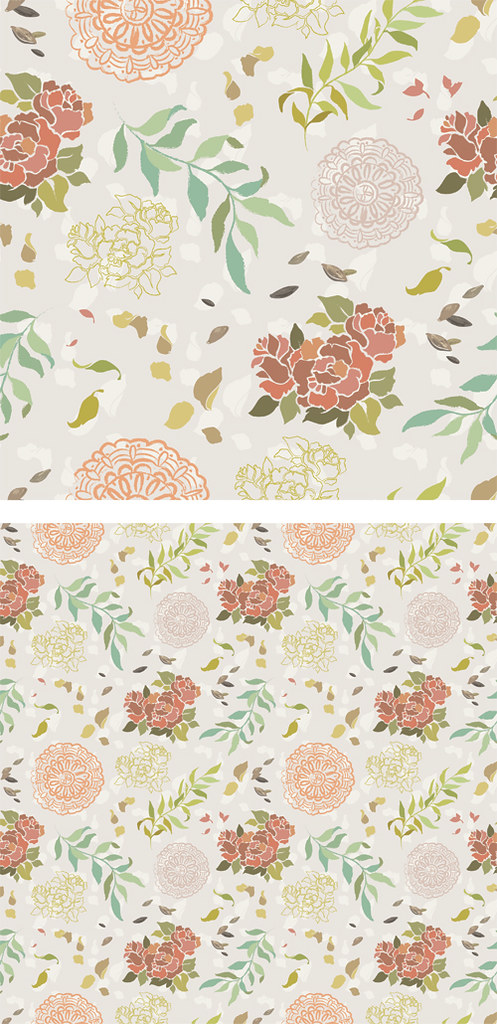
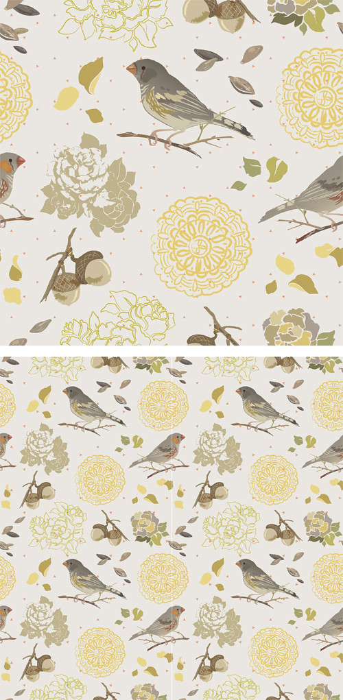
All of these patterns are very pretty. They all have great flow and a nice hierarchy of importance among the icons. The bird pattern though isn't aligned down the center but that is an easy fix. For the last pattern I would maybe play around with adding some faint pattern in the background like you did for the bird. something subtle to break up the large shapes. I think this last one will translate well into many different colors!
Your flowers and birds are really nice but I feel like you could poke them around a biiiit more to hide the tiling a bit. I notice the roses and birds making a grid in those. Your second pattern is really cool, it leads the eye around a lot. The last one I feel like should be arranged more like a damask, the offset is weirding me out for some reason. I love yo colors
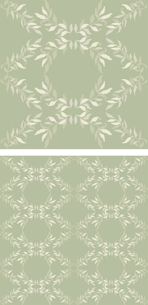
The icons tile/flow so nicely in the first one, and although there are tons of different elements it's not overwhelming at all. The others are super nice as well, I would just say mess around with the arrangement of your icons/the tiling on the green one, it seems like they are separate vertical panels.
Other than that, these are gorgeous and I want them plastered everywhere. Even my face.
I really like your center pattern, it has a really great affect on the eye. I wish that there was a little bit more to the bottom pattern, even if you just added those dots that you have in the center with the birds I think it would help it out a lot.
All of these patterns turned out very beautifully. They all seem very cohesive with one another, your icons lend beautifully to patterns as well. The color choices for each are very fitting I especially like your floral icon the colors are very pretty. These seem very professional, the use of more intricate icons with single toned icons allow you to travel across the pattern without getting to caught up in one area.
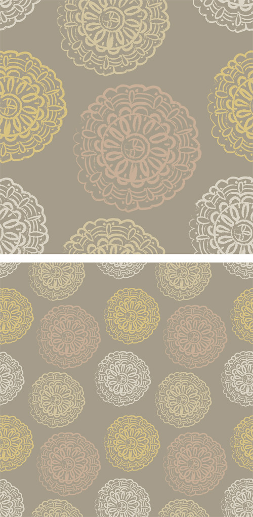
The first and third pattern are just amazing and have such great details. The other two function and could be pushed further with a just a few small icons added. The color pallets all work well but I think it'd be great to see you switch it up for fun.
I like the theme too because its not like typical spring colors where the colors are really bright. It's more like a vintage version of spring.
For the secondary patterns, I like that you just used one icon but made them look like new ones just by changing the color.
My favorite part about the finch pattern are the finches (of course) and the little polka dots because they remind me of seeds. The polka dots are a simple detail, but I'm glad that they are there.
+: Great collection of coordinating patterns! I love how you're using bits and pieces of the other patterns to help tie them together! I think that you use of color is really nice throughout - some patterns ( the lacey one ) look great with limited color palettes because they act more like coordinates for the busier, more intricate patterns.
I think your method of working with icons that are similar in style, but not necessarily more of "the same" is really great and refreshing. Complementing icons is a great method - please continue to use it!
It is very easy for me to see these within a real-life application (scrapbooking, gift bags, etc) and it would be nice to see you create more!
I like how you're challenging yourself to include a sub-pattern in a couple of these as well, it helps move the eye around as well as give a subtle texture to the body of your patterns.
-: The only pattern that seems different (unfinished?) is the leaf pattern. It has a great start and looks kind of like a damask! Still, it would be great for you to maybe add a subtle organic texture in the background, or maybe another leafy shape (subtly? tonally?) inside the large diamond shapes? I Think it would be fantastic for you to attempt to do an entirely botanical damask, (including the central crest-type thing).
Finally, I think it would also be nice for you to switch out the bkgrd color in one of the two more involved patterns so that you get credit for it reading as a very different pattern since the scale and intricacy is similar to the other pattern. Try an alternate and see if it helps!! Great job!

All of these patterns are very pretty. They all have great flow and a nice hierarchy of importance among the icons. The bird pattern though isn't aligned down the center but that is an easy fix. For the last pattern I would maybe play around with adding some faint pattern in the background like you did for the bird. something subtle to break up the large shapes. I think this last one will translate well into many different colors!
ReplyDeleteYour flowers and birds are really nice but I feel like you could poke them around a biiiit more to hide the tiling a bit. I notice the roses and birds making a grid in those.
ReplyDeleteYour second pattern is really cool, it leads the eye around a lot.
The last one I feel like should be arranged more like a damask, the offset is weirding me out for some reason. I love yo colors
Amazing. As usual. No surprise. I like the bird one the best and I have a sudden urge to drink tea......No suggestions--Just keep doin' what you do!
ReplyDeleteThese are all so pretty!
ReplyDeleteThe icons tile/flow so nicely in the first one, and although there are tons of different elements it's not overwhelming at all. The others are super nice as well, I would just say mess around with the arrangement of your icons/the tiling on the green one, it seems like they are separate vertical panels.
Other than that, these are gorgeous and I want them plastered everywhere. Even my face.
I really like your center pattern, it has a really great affect on the eye. I wish that there was a little bit more to the bottom pattern, even if you just added those dots that you have in the center with the birds I think it would help it out a lot.
ReplyDeleteAll of these patterns turned out very beautifully. They all seem very cohesive with one another, your icons lend beautifully to patterns as well. The color choices for each are very fitting I especially like your floral icon the colors are very pretty. These seem very professional, the use of more intricate icons with single toned icons allow you to travel across the pattern without getting to caught up in one area.
ReplyDeleteWhoa.
ReplyDeleteThe first and third pattern are just amazing and have such great details. The other two function and could be pushed further with a just a few small icons added. The color pallets all work well but I think it'd be great to see you switch it up for fun.
I definitely see the color/theme relationship.
ReplyDeleteI like the theme too because its not like typical spring colors where the colors are really bright. It's more like a vintage version of spring.
For the secondary patterns, I like that you just used one icon but made them look like new ones just by changing the color.
My favorite part about the finch pattern are the finches (of course) and the little polka dots because they remind me of seeds. The polka dots are a simple detail, but I'm glad that they are there.
+: Great collection of coordinating patterns!
ReplyDeleteI love how you're using bits and pieces of the other patterns to help tie them together! I think that you use of color is really nice throughout - some patterns ( the lacey one ) look great with limited color palettes because they act more like coordinates for the busier, more intricate patterns.
I think your method of working with icons that are similar in style, but not necessarily more of "the same" is really great and refreshing. Complementing icons is a great method - please continue to use it!
It is very easy for me to see these within a real-life application (scrapbooking, gift bags, etc) and it would be nice to see you create more!
I like how you're challenging yourself to include a sub-pattern in a couple of these as well, it helps move the eye around as well as give a subtle texture to the body of your patterns.
-:
The only pattern that seems different (unfinished?) is the leaf pattern. It has a great start and looks kind of like a damask! Still, it would be great for you to maybe add a subtle organic texture in the background, or maybe another leafy shape (subtly? tonally?) inside the large diamond shapes? I Think it would be fantastic for you to attempt to do an entirely botanical damask, (including the central crest-type thing).
Finally, I think it would also be nice for you to switch out the bkgrd color in one of the two more involved patterns so that you get credit for it reading as a very different pattern since the scale and intricacy is similar to the other pattern. Try an alternate and see if it helps!!
Great job!