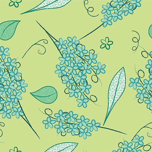
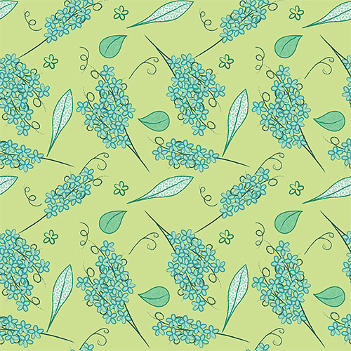
I get a really good sense of primary and secondary pattern because your second one is a lot more subdued. You did a good job hiding the tiling by using only a few icons, especially the second one.
Your secondary pattern isn't to over done, which is good. Everything is super whimsical in this, it looks like it would be used in a greeting card store.
Color relationship is good i like how you reverse the main color to secondary color on both patterns. I could definitely see top pattern as a vintage wallpaper or something. Great flow throughout both works.
These are pretty. I really like how you balanced the intricacy of the flower bunches with the sparseness of the leaves in the first one. I feel like the second one could maybe use one more tiny, simple icon to tie things together.
I like the colors you have used. I think both of these patterns would read much better if they were blocked out 8 times so we could get a better idea of how it looks. Your icons are pretty large in your original square so I'd try blocking it out to see a larger field of pattern.
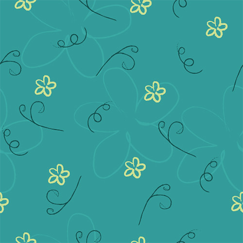
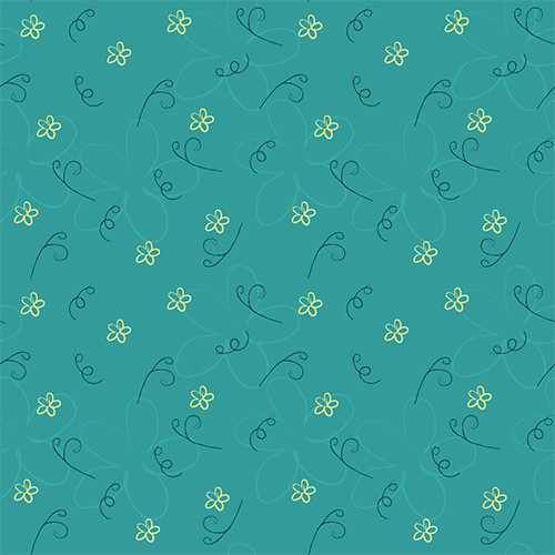
Definitely see the color relationship-- the colors are really nice!
Readability is good-- I'm not getting caught up/lost in it.
I think the toss in the main pattern is stronger than the secondary one because it is more even. On the second pattern, there are some blank spots where there should be some more yellow flowers.
I really like the faint flower in the second pattern, but I think it is a little too faint because I didn't see it right away. It might compete a little bit with the little flowers if its too bright.
I like the color choices as well as the just fun pattern you have. The pace is really nice and I feel like would produce a very interesting print. They for sure have a connected tone between the two and overall have a very nice sense of movement to them.
+: Great stylization of your elements! It definitely has a really nice, soft, whimsical and feminine feeling! I think you have a pretty good handle on making them feel related and complementary as well! I would love to see you play with adding a pop of color into both patterns (maybe in a small way?) - maybe it's just a hint more of white! It's really nice where you have it in the main pattern!
I think the pattern inside the shapes is also really innovative and interesting!
Great tossing! I think these are also really nice and even!! -: I think you might be able to play a little with color ( I said this above with a pop of color!) maybe it's just doing an alternate option for the bkgrd on the teal one to see if you could lighten it up for springtime!!

I get a really good sense of primary and secondary pattern because your second one is a lot more subdued. You did a good job hiding the tiling by using only a few icons, especially the second one.
ReplyDeleteYour secondary pattern isn't to over done, which is good. Everything is super whimsical in this, it looks like it would be used in a greeting card store.
ReplyDeleteColor relationship is good i like how you reverse the main color to secondary color on both patterns. I could definitely see top pattern as a vintage wallpaper or something. Great flow throughout both works.
ReplyDeleteThese are pretty. I really like how you balanced the intricacy of the flower bunches with the sparseness of the leaves in the first one. I feel like the second one could maybe use one more tiny, simple icon to tie things together.
ReplyDeleteI like the colors you have used. I think both of these patterns would read much better if they were blocked out 8 times so we could get a better idea of how it looks. Your icons are pretty large in your original square so I'd try blocking it out to see a larger field of pattern.
ReplyDeleteDefinitely see the color relationship-- the colors are really nice!
ReplyDeleteReadability is good-- I'm not getting caught up/lost in it.
I think the toss in the main pattern is stronger than the secondary one because it is more even. On the second pattern, there are some blank spots where there should be some more yellow flowers.
I really like the faint flower in the second pattern, but I think it is a little too faint because I didn't see it right away. It might compete a little bit with the little flowers if its too bright.
I like the color choices as well as the just fun pattern you have. The pace is really nice and I feel like would produce a very interesting print. They for sure have a connected tone between the two and overall have a very nice sense of movement to them.
ReplyDeletegreat color schemes!
ReplyDeleteperhaps one more element in the second pattern would bring it up to the next level?
+:
ReplyDeleteGreat stylization of your elements! It definitely has a really nice, soft, whimsical and feminine feeling! I think you have a pretty good handle on making them feel related and complementary as well!
I would love to see you play with adding a pop of color into both patterns (maybe in a small way?) - maybe it's just a hint more of white! It's really nice where you have it in the main pattern!
I think the pattern inside the shapes is also really innovative and interesting!
Great tossing! I think these are also really nice and even!!
-:
I think you might be able to play a little with color ( I said this above with a pop of color!)
maybe it's just doing an alternate option for the bkgrd on the teal one to see if you could lighten it up for springtime!!
I think these work really good in relationship to each other as primary and secondary patterns.
ReplyDelete