The way you rendered her dress is just beautiful. It's a really great and non-cheesy way to use gradients, and it's convincingly/realistically lit.
But the background kinds of takes away from it.. It was much easier to see what was going on in the piece before you added it, and engage with the details. Maybe it just needs to be lightened slightly, or made to be a different color so that things don't get lost?
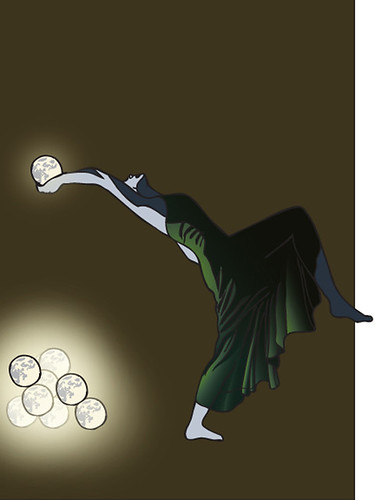
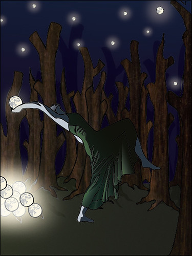
I know you had to include an atmosphere for the final piece, but I honestly think that at stage 2, the color with some gradients, looks the best! The effects aren't over done in that and it looks really nice! The final piece is cool, i feel like its on a stage due to the backdrops of the trees. The tree texture is also nice!
This is a really cool idea! Is she throwing star type things into the sky? Good job working with the lighting on the girl from those white objects, it really is so wonderful. I would consider playing with the glow efect on the objects a bit more, that glow feels just a bit too intense for me. Since the pallet is so dark, the pile of little moon things is all I can really look at. Good work!
you did a really nice job on the glow here. If really feels as if those globes are glowing. The background and middleground seem a bit bare. I think thats because your textures make the piece feel real and net to the digital tones and gradients it's a bit jarring. I would also think about lighting on the trees and ground, really look and see where the light would hit because if it's hitting that body so hard it's gonna spill over to other places. The pose is really interesting and the fabric folds look really realistic. Nice work
I think the dress is definitely the most successful area. Great concept. Experimenting with perspective variations might be helpful and fun. I would tone down the outline on some of moons (or stars?) in the pile. Some seem a bit thick and stick out unnaturally from the rest.
I love the lighting you were able to accomplish with the tones of color on the figure especially her farthest right calve turned out really well. The figure itself has a really great body language to her which works well with the toned down background and charged foreground.
Great job on the folds of the dress. It looks good, this lady must live on giant planet where they throw moons into the universe. This is pretty use of the glow affect though, and your sense of lighting on the figure is fantastic.
Very atmospheric. The shadows cast by the trees make it look like a theater set, not sure if that's what you were going for. The lighting is very believable. Her pose seems a biiiit unstable.
+: you did an awesome job with the character. the way that you're using planes and shape on her is fantastic. Keep doing this! I also like subtle shifts in your gradient use throughout the piece. The magical aspects of your piece are well done. the way that you're using color to define the mood is also super helpful in highlighting the magical parts - as well as the really interesting pose.
-: I do think that your texture in the trees, although a really cool idea, doesn't really match with the way that you've rendered the character? Maybe you could subdue it a bit so that it isn't so loud? I also think that since you spent so much time on the analysis of her dress, that the solid shaped trees just seem a little too plain? Maybe adding a linework texture could help? or additional tones.? maybe getting rid of the texture all together and just drawing them would be cool too.


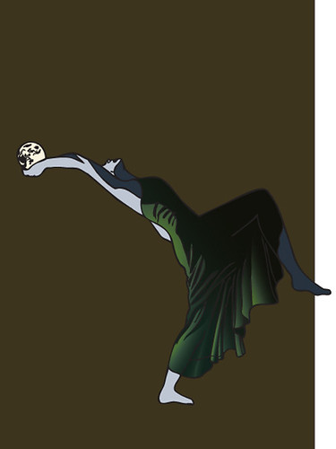
The way you rendered her dress is just beautiful. It's a really great and non-cheesy way to use gradients, and it's convincingly/realistically lit.
ReplyDeleteBut the background kinds of takes away from it.. It was much easier to see what was going on in the piece before you added it, and engage with the details. Maybe it just needs to be lightened slightly, or made to be a different color so that things don't get lost?
I know you had to include an atmosphere for the final piece, but I honestly think that at stage 2, the color with some gradients, looks the best! The effects aren't over done in that and it looks really nice!
ReplyDeleteThe final piece is cool, i feel like its on a stage due to the backdrops of the trees. The tree texture is also nice!
This is a really cool idea! Is she throwing star type things into the sky? Good job working with the lighting on the girl from those white objects, it really is so wonderful. I would consider playing with the glow efect on the objects a bit more, that glow feels just a bit too intense for me. Since the pallet is so dark, the pile of little moon things is all I can really look at. Good work!
ReplyDeleteThis comment has been removed by the author.
ReplyDeleteyou did a really nice job on the glow here. If really feels as if those globes are glowing. The background and middleground seem a bit bare. I think thats because your textures make the piece feel real and net to the digital tones and gradients it's a bit jarring. I would also think about lighting on the trees and ground, really look and see where the light would hit because if it's hitting that body so hard it's gonna spill over to other places. The pose is really interesting and the fabric folds look really realistic. Nice work
ReplyDeleteI think the dress is definitely the most successful area. Great concept. Experimenting with perspective variations might be helpful and fun. I would tone down the outline on some of moons (or stars?) in the pile. Some seem a bit thick and stick out unnaturally from the rest.
ReplyDeleteI love the lighting you were able to accomplish with the tones of color on the figure especially her farthest right calve turned out really well. The figure itself has a really great body language to her which works well with the toned down background and charged foreground.
ReplyDeleteGreat job on the folds of the dress. It looks good, this lady must live on giant planet where they throw moons into the universe. This is pretty use of the glow affect though, and your sense of lighting on the figure is fantastic.
ReplyDeleteVery atmospheric. The shadows cast by the trees make it look like a theater set, not sure if that's what you were going for. The lighting is very believable. Her pose seems a biiiit unstable.
ReplyDelete+: you did an awesome job with the character. the way that you're using planes and shape on her is fantastic. Keep doing this! I also like subtle shifts in your gradient use throughout the piece.
ReplyDeleteThe magical aspects of your piece are well done.
the way that you're using color to define the mood is also super helpful in highlighting the magical parts - as well as the really interesting pose.
-: I do think that your texture in the trees, although a really cool idea, doesn't really match with the way that you've rendered the character? Maybe you could subdue it a bit so that it isn't so loud? I also think that since you spent so much time on the analysis of her dress, that the solid shaped trees just seem a little too plain?
Maybe adding a linework texture could help? or additional tones.? maybe getting rid of the texture all together and just drawing them would be cool too.