I really love the gradient moon clouds thing. It's a clever solution and it reads very well! I also for some reason like the black and white one a super bunch!
Beautiful as usual. It would be nice to see more gradient-like highlights on his knees and legs rather than vector shapes. Instead of hard lines maybe more of a feather?
I might suggest replacing or supplementing some of the line-work with thin gradient shadows and/or glows. For example, the highlight strokes on the buildings feel a little flat considering the buildings are silhouetted directly against a setting sun.
This is insanely wonderful. The way you handled the lighting is really well done! It would be awesome to see one more darkness layer on the figure to give him a bit more depth. I don't think you need such thick lines on the buildings to put your point across, they kind of contrast with the soft, flowy lines of the guy.
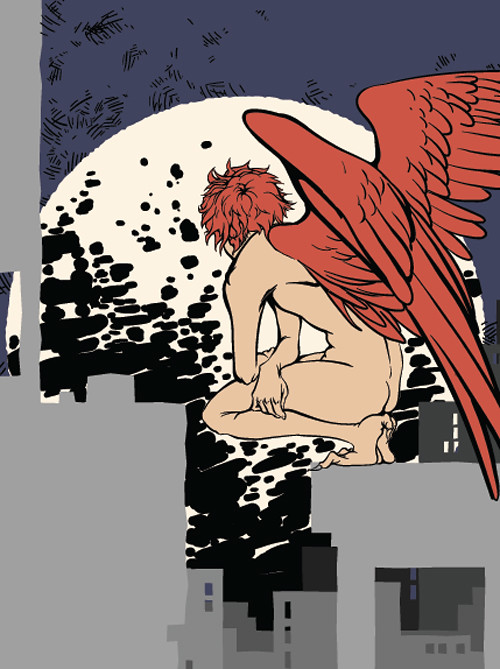
I love the basic shapes throughout the buildings and then the super detailed naked wing dude. I love how you designed the super bright moon for your background lots of volume and excellent use of lighting.
I am so proud of you. this looks fantastic. I love the way you've handled the light in his skin - it looks really fluid, very organic. same with the texture in the wings, it looks like mottled, soft light. Overall, I think you've done a fantastic job on this. I love the way you're using the same type of texture to do the disturbance in front of the giant sun/moon/explosion. It really helps bring the at texture throughout the piece. I wonder if there is a way to hint at a little bit of it in the buildings? I know they're in silhouette in the foreground, but i could evensee cracks of light peeking around to give them a little more life? Mbaye it's just beacuse they' have such a uniform line around them -- what if you added just a couple areas here and there where the light peeked around near the middle of the page? know what I mean? maybe even a little bit of hte crosshatching your'e using in the sky would be nice. you did a great job with the glows and effects on this. awesome work. really awesome.
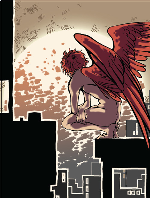
This looks fantastic! I really love the sense of lighting. I think the dark blob shapes in the background maybe could have been lightened a bit or made more cool or something because they are sort of pushing into the foreground right now, but this still looks just amazing! I think you could play more with temperatures, because right now they are conflicting a bit. Everything in the foreground is cooler than the background, which could work if you really pushed it, but the wings are red, which is warmer than the background, so that is confusing your space!

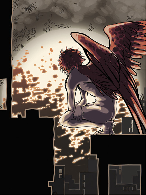
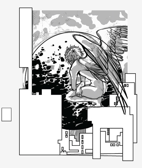
I really love the gradient moon clouds thing. It's a clever solution and it reads very well! I also for some reason like the black and white one a super bunch!
ReplyDeleteBeautiful as usual. It would be nice to see more gradient-like highlights on his knees and legs rather than vector shapes. Instead of hard lines maybe more of a feather?
ReplyDeleteI might suggest replacing or supplementing some of the line-work with thin gradient shadows and/or glows. For example, the highlight strokes on the buildings feel a little flat considering the buildings are silhouetted directly against a setting sun.
ReplyDeleteThis is insanely wonderful. The way you handled the lighting is really well done! It would be awesome to see one more darkness layer on the figure to give him a bit more depth. I don't think you need such thick lines on the buildings to put your point across, they kind of contrast with the soft, flowy lines of the guy.
ReplyDeleteI love the basic shapes throughout the buildings and then the super detailed naked wing dude. I love how you designed the super bright moon for your background lots of volume and excellent use of lighting.
ReplyDeleteI am so proud of you. this looks fantastic. I love the way you've handled the light in his skin - it looks really fluid, very organic. same with the texture in the wings, it looks like mottled, soft light. Overall, I think you've done a fantastic job on this. I love the way you're using the same type of texture to do the disturbance in front of the giant sun/moon/explosion. It really helps bring the at texture throughout the piece. I wonder if there is a way to hint at a little bit of it in the buildings? I know they're in silhouette in the foreground, but i could evensee cracks of light peeking around to give them a little more life? Mbaye it's just beacuse they' have such a uniform line around them -- what if you added just a couple areas here and there where the light peeked around near the middle of the page? know what I mean? maybe even a little bit of hte crosshatching your'e using in the sky would be nice. you did a great job with the glows and effects on this. awesome work. really awesome.
ReplyDeleteThis looks fantastic! I really love the sense of lighting. I think the dark blob shapes in the background maybe could have been lightened a bit or made more cool or something because they are sort of pushing into the foreground right now, but this still looks just amazing! I think you could play more with temperatures, because right now they are conflicting a bit. Everything in the foreground is cooler than the background, which could work if you really pushed it, but the wings are red, which is warmer than the background, so that is confusing your space!
ReplyDelete