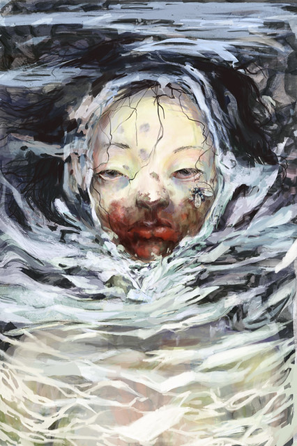
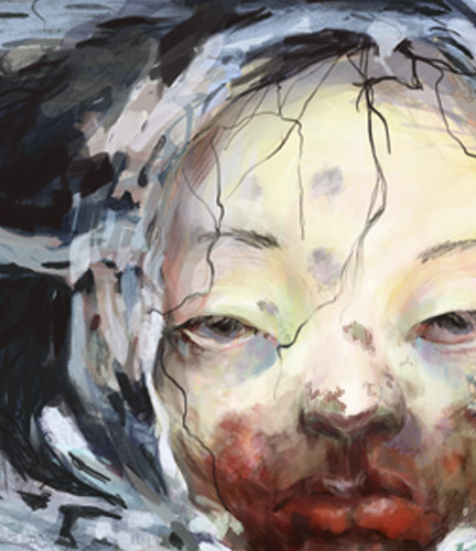
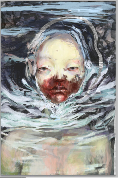
This just looks completely gorgeous, like I can't even handle. I really love the way the face was painted - especially the bottom half, with the blood. It is super difficult to read photoshop into this, and that is awesome! I definitely get the feeling of the plague from this.
This is soooo gross. You did a great job. All the textures, colors and movement make me feel a little sick. I love all the line work and the detailed focal point with the large strokes around it.
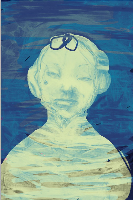
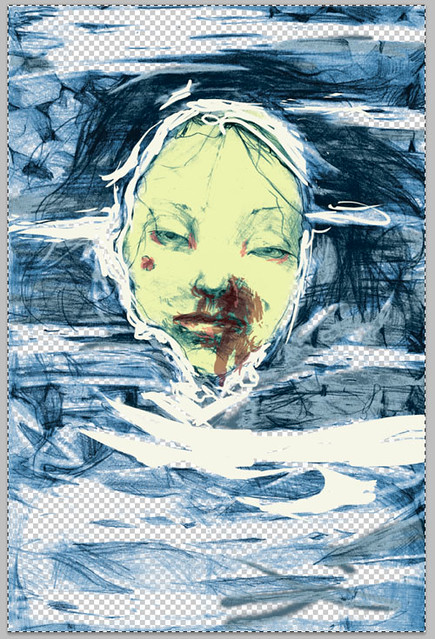
This is really effing creepy. I think the message of plague communicates very well through this illustration. Your process is interesting too. From what I can see is that you erased some of the pencil work before making the final piece to give it that layered feeling. Nice work
This is absolutely fantastic. As always, I love all the different colors you're bringing into your work. The reflections/surface covering everything except for her face are wonderfully done. The little purpleish smudges on her forehead, the fly on her cheek, and the stray hairs all really add a lot to this.
i absolutely love the way you paint on the computer. the lines work and how you handle the brush stoke really make the piece so strong. the image is really gross but in a way thats the point of this assignment. awesome job, love all the detail!
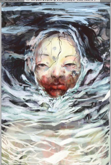
Freaken Awesome! I can't imagine how many hours you must have put into this image. It is by far one of the best digital illustrations i've seen in awhile. I even like some of the development images they seem to have that screen print style to them. The line work merges very well with the rest of the color. The placement of the character is well balanced as well.
For some reason this makes me think of the move E.T.
great mix of brushwork and textures. I like the creepy childlike face and the way you gave the skin a sickly pale look with the pink in the eyelids. The fly definitely adds a touch of gruesomeness to the piece. Awesome
This is a great piece. Your colors are fantastic, the way that your'e drawing focus to her face is super nice with the little bits of color you'er adding to her skin (not to mention the red area on her mouth) - Love the dark areas around her head as well. the textures your'e creating in the water looks great with that addition of the greens and purples. I love that. Way to add those really nice extra colors!!! It really makes the skin so interesting to look at and super cool. It's also really neat to see your process and the way that youer' layering the colors up. I actually really love seeing yoru pencil drawing that you started with - it's awesome. I love hte hair and I think it coudl be really cool to bring back a little bit of it and it's textural quality into the hair in your final piece. Maybe instead of , or in addition to some of the black hair on the left hand side. I love the way that - in your pencil sketch- it looks floaty, and it looks really naturally wavy in the water. ther's something really cool about how the thickness of your pencil really gives it a nice "hair "quality. Maybe it's just the texture! Please see how you could bring that back!! It would be amazing! This is super cool, zoya- you're going to love painter. i can feel it : )

This just looks completely gorgeous, like I can't even handle. I really love the way the face was painted - especially the bottom half, with the blood. It is super difficult to read photoshop into this, and that is awesome! I definitely get the feeling of the plague from this.
ReplyDeleteThe textures are fantastic! The blood is especially gruesome.
ReplyDeleteThis is soooo gross. You did a great job. All the textures, colors and movement make me feel a little sick. I love all the line work and the detailed focal point with the large strokes around it.
ReplyDeleteThis is really effing creepy. I think the message of plague communicates very well through this illustration. Your process is interesting too. From what I can see is that you erased some of the pencil work before making the final piece to give it that layered feeling. Nice work
ReplyDeletehahaha, it is so cool, it really looks like an oil painting or something, hahahaha, so nice
ReplyDeleteThis is absolutely fantastic. As always, I love all the different colors you're bringing into your work. The reflections/surface covering everything except for her face are wonderfully done. The little purpleish smudges on her forehead, the fly on her cheek, and the stray hairs all really add a lot to this.
ReplyDeleteINTENSE. I wouldn't want to be anywhere near whoever this is. hahah, Good job!
ReplyDeletei absolutely love the way you paint on the computer. the lines work and how you handle the brush stoke really make the piece so strong. the image is really gross but in a way thats the point of this assignment. awesome job, love all the detail!
ReplyDeleteFreaken Awesome! I can't imagine how many hours you must have put into this image. It is by far one of the best digital illustrations i've seen in awhile. I even like some of the development images they seem to have that screen print style to them. The line work merges very well with the rest of the color. The placement of the character is well balanced as well.
ReplyDeleteFor some reason this makes me think of the move E.T.
Great Work.
great mix of brushwork and textures. I like the creepy childlike face and the way you gave the skin a sickly pale look with the pink in the eyelids. The fly definitely adds a touch of gruesomeness to the piece. Awesome
ReplyDeleteThis is a great piece. Your colors are fantastic, the way that your'e drawing focus to her face is super nice with the little bits of color you'er adding to her skin (not to mention the red area on her mouth) - Love the dark areas around her head as well. the textures your'e creating in the water looks great with that addition of the greens and purples. I love that. Way to add those really nice extra colors!!! It really makes the skin so interesting to look at and super cool.
ReplyDeleteIt's also really neat to see your process and the way that youer' layering the colors up. I actually really love seeing yoru pencil drawing that you started with - it's awesome. I love hte hair and I think it coudl be really cool to bring back a little bit of it and it's textural quality into the hair in your final piece. Maybe instead of , or in addition to some of the black hair on the left hand side. I love the way that - in your pencil sketch- it looks floaty, and it looks really naturally wavy in the water. ther's something really cool about how the thickness of your pencil really gives it a nice "hair "quality. Maybe it's just the texture! Please see how you could bring that back!! It would be amazing! This is super cool, zoya- you're going to love painter. i can feel it : )