I would add some more color variation to the line work it stands out as being similar to the original form. I like what you did with the green highlights so maybe you could add some similar tones in your line work. Nice use of character design works well for this assignment. I would play with the background some more such as creating some more images like a broken down car or plane just something to move the eye around a bit doesn't have to be super detailed. The use of background texture works as well I know you made some for the bottom it would be nice to see that. Great work on the plague sickly feel of the image.
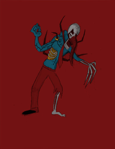
What a creepy lookin fella... haha. I think the atmosphere of the piece can be improved by giving him a surface to stand on. Your touches of green linework gives a really great start to a light source, maybe add some lighting and shadows to the guy to push that more.
I like the design of the weird guy! His elephant nose is a really nice touch. the green that you changed some of the line work helps create an interesting light especially with the background color. I think paying more attention to the specific forms and planes would be helpful though, really make a space decision!
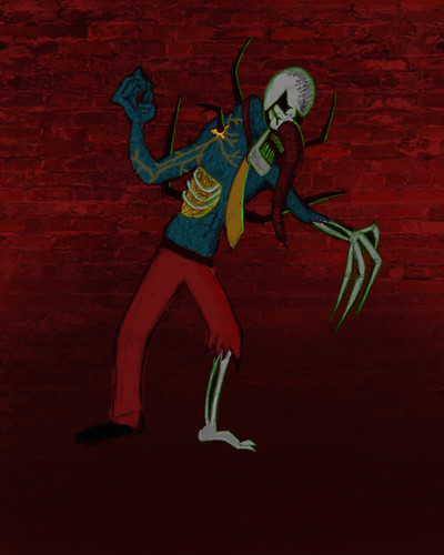
the brick background works okay, but its the only intelligible "photographic" element, and therefore feels out of place. Since the ground fades to such darkness, I think it would look good if you worked some lighting/shading into the figure so that it doesn't float as much. Otherwise you could try the opposite and make the background reflect the flat "cartoony" (for lack of better word) style of the figure.
I like how yo'ure beginning to give this guy a green back-light. I think it's like there is something off the page that is creating that glow that is hitting the edge of his body. I could see you playing with the other colors of this guy, too - maybe switching up the linework color in the rest of him to be more tonal with the other body parts. Like maybe dark red for the line around his pants -- know what I mean? It could give him a more rounded appearance. I also think it would be worth seeing if you could draw in a little bit of a ground under him - it seems like he's floating a little! Maybe if there was a color down there - or a hint of a shadow, that he would feel more grounded? I think it would also be cool to try and add some highlights on him in a couple places to give him some more volume, too!

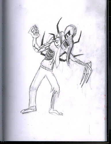
I would add some more color variation to the line work it stands out as being similar to the original form. I like what you did with the green highlights so maybe you could add some similar tones in your line work.
ReplyDeleteNice use of character design works well for this assignment. I would play with the background some more such as creating some more images like a broken down car or plane just something to move the eye around a bit doesn't have to be super detailed. The use of background texture works as well I know you made some for the bottom it would be nice to see that.
Great work on the plague sickly feel of the image.
What a creepy lookin fella... haha. I think the atmosphere of the piece can be improved by giving him a surface to stand on. Your touches of green linework gives a really great start to a light source, maybe add some lighting and shadows to the guy to push that more.
ReplyDeleteI like the design of the weird guy! His elephant nose is a really nice touch. the green that you changed some of the line work helps create an interesting light especially with the background color. I think paying more attention to the specific forms and planes would be helpful though, really make a space decision!
ReplyDeletethe brick background works okay, but its the only intelligible "photographic" element, and therefore feels out of place. Since the ground fades to such darkness, I think it would look good if you worked some lighting/shading into the figure so that it doesn't float as much. Otherwise you could try the opposite and make the background reflect the flat "cartoony" (for lack of better word) style of the figure.
ReplyDeleteI like how yo'ure beginning to give this guy a green back-light. I think it's like there is something off the page that is creating that glow that is hitting the edge of his body. I could see you playing with the other colors of this guy, too - maybe switching up the linework color in the rest of him to be more tonal with the other body parts. Like maybe dark red for the line around his pants -- know what I mean? It could give him a more rounded appearance. I also think it would be worth seeing if you could draw in a little bit of a ground under him - it seems like he's floating a little! Maybe if there was a color down there - or a hint of a shadow, that he would feel more grounded? I think it would also be cool to try and add some highlights on him in a couple places to give him some more volume, too!
ReplyDelete