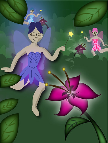
The leaves all have an inner glow to them, the fairy in the foreground has a drop shadow, the wand tips and flowers all have outer glows, and the light coming from the wands was created with a gradient mesh.
I really like what you did with the leaves and flowers here! I think you could move the purple fairy down a bit. I think you could use more of the space at the bottom since it's in the foreground. It'd be nice to see a bit of texture too
I love the flower in this piece I want to see a whole forest of them! The fairies I think could be pushed further with the layering and shapes of the body.
Love the glows coming from the fairies. you did a great job diffusing it - it looks nice being blue and purple - from the two fairies on the left. The pink one could use a glow herself, she doesn't seem to be as magical as the other ones! Did she have a glow, too? I also think that you might be able to add a glow to the magic swirl that is coming off of the wands - maybe diffusing that a little would make it look like light was sprinkling down more. It seems like a streamer a little bit right now since it's so flat. I love that there is some of the light from the fairies that it hitting the limbs of the purple fairy. I coudl se some of the white light - or even pink light coming off of the flower - hitting the purple fairy on the leg. Same with the leaves - it would be nice to have some of that vibrant light reflecting off the leaves.
I like the way you're handling the leaves in the background - it could be cool to see if you could add some texture to the large green space in the foreground, too - so it doesn't look as flat! Maybe a couple tonal leaves could be there as well?
I really like the colors you are using and the way the flower is glowing. I would take a second look at the figures. Some of the shadows don't quite fit. For example if the flower is glowing the dark area should be on the back of the leg not the front.
By just looking back at the shadows and shifting them around this can be a very nice piece.
Also I love the glow you got on the leaves. Its very rich.
Great job on creating a well balanced background and characters. I do feel the flowers are but more refined then the fairies if you could match the two a bit more it help them blend together more. Great colors and glow effects.
To push the depth a little, you could make that green color on the back layer darker and have the greens get lighter as the leaves and grass get closer. I like that you make the fairies wings a little bit transparent but I would push it a little further and make it more transparent. And last thing, the fairy to the right doesn't seem to have as much glow as the other two fairies. I would boost the glow on that one more.
I would suggest trying the gradient mesh more. For example it would easier to control shadows than the using the inner glow on the leaves, and would make them seem less flat. Also, using a drop shadow on the fairy makes it look like a flat shape on a flat green background and negates the depth created by the gradating vegetation.

I really like what you did with the leaves and flowers here!
ReplyDeleteI think you could move the purple fairy down a bit. I think you could use more of the space at the bottom since it's in the foreground. It'd be nice to see a bit of texture too
I like the background in this. The black on the leaves looks out of place however. Also maybe the fairies could have a value shift.
ReplyDeleteI love the flower in this piece I want to see a whole forest of them! The fairies I think could be pushed further with the layering and shapes of the body.
ReplyDeleteLove the glows coming from the fairies. you did a great job diffusing it - it looks nice being blue and purple - from the two fairies on the left. The pink one could use a glow herself, she doesn't seem to be as magical as the other ones! Did she have a glow, too? I also think that you might be able to add a glow to the magic swirl that is coming off of the wands - maybe diffusing that a little would make it look like light was sprinkling down more. It seems like a streamer a little bit right now since it's so flat. I love that there is some of the light from the fairies that it hitting the limbs of the purple fairy. I coudl se some of the white light - or even pink light coming off of the flower - hitting the purple fairy on the leg. Same with the leaves - it would be nice to have some of that vibrant light reflecting off the leaves.
ReplyDeleteI like the way you're handling the leaves in the background - it could be cool to see if you could add some texture to the large green space in the foreground, too - so it doesn't look as flat! Maybe a couple tonal leaves could be there as well?
I really like the colors you are using and the way the flower is glowing. I would take a second look at the figures. Some of the shadows don't quite fit. For example if the flower is glowing the dark area should be on the back of the leg not the front.
ReplyDeleteBy just looking back at the shadows and shifting them around this can be a very nice piece.
Also I love the glow you got on the leaves. Its very rich.
Great job on creating a well balanced background and characters. I do feel the flowers are but more refined then the fairies if you could match the two a bit more it help them blend together more. Great colors and glow effects.
ReplyDeleteTo push the depth a little, you could make that green color on the back layer darker and have the greens get lighter as the leaves and grass get closer. I like that you make the fairies wings a little bit transparent but I would push it a little further and make it more transparent. And last thing, the fairy to the right doesn't seem to have as much glow as the other two fairies. I would boost the glow on that one more.
ReplyDeleteI would suggest trying the gradient mesh more. For example it would easier to control shadows than the using the inner glow on the leaves, and would make them seem less flat. Also, using a drop shadow on the fairy makes it look like a flat shape on a flat green background and negates the depth created by the gradating vegetation.
ReplyDelete